I am sick. And it’s not the flu.
I am sick to my stomach looking at all those amazing new ideas from sharp entrepreneurs going up online. Ideas that are as varied as they could possibly be, all nurtured by a revolution in online fundraising and fueled by an economy that is looking for the next big thing. Many of those ideas I see are truly revolutionary, but it still makes me sick looking at them. They all seem identical and I can not differentiate one site experience from another.
The internet gave entrepreneurs the ability to use cheap, often free, templates and it happens that everybody chose the same ones. I can’t blame them, these are robust templates taking advantage of responsive web design, while being equipped with all the features necessary for most entrepreneurs this day and age. They look and feel modern and they represent what I’d call a MVW – A Minimum Viable Website.
One thing gets lost though, sometimes is even missing from the get-go: A big brand entrance through a unique visual language that differentiates the brand enough to stay in the audience’s minds.

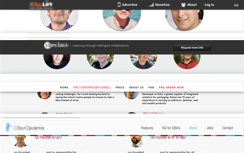
Above: Four startup sites I came across recently. Who is who? Which product is which? Wait, was that the site of that company I liked so much?
Conceptual and visual creativity used to be the integral ingredient of any brand introduction in the heyday of printed communications – they now are missing in action. To many of today’s entrepreneurs it is the product/service idea alone that counts, but sadly that idea gets lost without being embedded into a branded environment. The internet provides free tools; it does not mean that those fit into your company’s launch strategy. Leverage them when appropriate, avoid them when launching a brand. Consumers will get lost and your unique idea will look like a standard idea by using standard templates.
Be bold, be different, be conceptual. Go ahead and inject your enormous amount of creativity, strategy and moxie into your online presence, because it will be the place most people will meet your product/service first. And as far as I can tell it’s anything but standard.
CATEGORIES: Blog Your Brand Launch: Digital
TAGS: Brand Launch, Brand Launches, Branding, Digital Design, templates, website, wordpress
3 COMMENTS
Simon Gornick
You’re absolutely right that differentiation is getting harder and harder. But off the shelf templates usually mean an off the shelf backend too, with a company’s unique selling point being a twist on an innovation rather than an innovation in itself.
It’s important to be aware though that innovation and creativity carry their own dangers. Early adopters might “get it” but viability comes from mass acceptance and increasing the size of your addressable market. True innovation takes time to make it along the bell curve.
Fabian Geyrhalter
Thank you Simon for those thoughts. Many new ideas are actually only twists, I agree, but not all. Regardless, both need to stand out, especially the ones that are just a twist, need to make that twist look like an innovation. Perhaps the twist in itself is innovation.
A startup web site design does not need to go above and beyond though, it can simply infuse brand-coherent colors and add small design details to, even free, templates in order to create ‘risk-free’ brand differentiation. Many tools ensure that entrepreneurs (who are not coders nor UI/UX designers) launch with proven web literacy on board, which is an absolute blessing and no risk needs to be taken in order to differentiate, but you need to differentiate, especially to attract the masses.
Pingback: How to Leverage the 3 Core Components of Your Brand Identity For Stronger Messaging | FINIEN