Granted, the subject of creative agency clients wanting to make their logos as large as possible to ‘get more bang for the buck’ and to ensure people ‘will notice’ their logo on their brand marketing efforts has been beaten to death and plentiful poked fun at (The Product, The Song, Etc). With new brand introductions this notion feels more in line with reality than any other marketing efforts as you have not only an urge to see your (often first, but definitely brand new) logo large, but you are also under a lot of pressure to ensure the customer notices and recalls your new identity design and brand name.
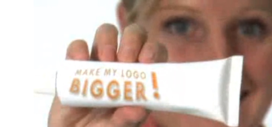
Above: Still from the hilarious ‘Make Your Logo Bigger‘ ‘infomercial’ (2007)
Instead of opting for the ginormous logo though, introduce your brand identity as part of a visually strong and unique design language. Brand is much more than a logo. Of course it is also much more than color and layout, but unique colors with specific application manners (Eg: a vertical bar or a cropped circle of consistently same proportions, within the same locations across all initial communications) not only creates brand design consistency but it makes your marketing efforts be truly your brand.
More so than an existing brand you need to penetrate the market (however small that penetration effort is, may it only be an e-marketing campaign and your web site) with a very unique and consistent design and color approach to get your new brand into consumer’s minds. Upon creation of that distinct visual brand language, step and repeat is the best way to stay in your consumer’s heads in the first phases of your brand introduction. You can slowly minimize the branded aspect and introduce campaigns over the course of time.
After 17 or so years of introducing brand identities, I can attest that this approach works well while using a completely normal sized logo. Guaranteed.
Once you have established a solid brand platform, name, and identity design, you are ready to breathe life into your brand by expanding it through tangible materials and experiences. At FINIEN, we call these your Brand Atmosphere® Touch Points. Each company has unique needs in terms of developing branded elements for print, display, digital, and environment.
Regardless of which ones your strategy calls for, remember that all brands should focus on how their Brand Platform is integrated into each touch point through consistency in visual cues and messaging. Seemingly small details in layout and design can have a huge impact on your brand’s cohesiveness and success.
“Design choices like color, layout, and font, can compel the right audience to buy when they are used correctly—or repel your audience from buying when they are not,” states Maria Ross, author of Branding Basics (2010). Furthermore, these design choices will speak volumes about the values of your brand. “Visual expression often reveals the unspoken intentions behind corporate strategy” (2007) confirm both Uli Mayor-johanssen and Klaus-peter Johanssen in World Branding. How do your business cards, storefronts, and social media outlets harmonize to tell a larger story about your brand?
Here are 3 points to pin to your desk (standing desk, I hope!) and to follow religiously when at this stage in your (next) brand launch process:
Cohesive/Holistic/Systematic: Call it what you want. Your brand and all of the elements that make up your brand need to visually speak the same language and communicate the same message. It will make or break a Brand Atmosphere.
Don’t try to be on all social media platforms at the outset. Strategize where it is most relevant for your brand to exist and apply a cohesive look-and-feel and brand voice to those channels first. You can always expand to other channels as time allows and needs arise. Also focus on only a few select traditional marketing pieces to get your brand started. Ensure that these pieces communicate the essence of your brand and are well designed.
Each touch point associated with your brand has the power to diminish or enhance your Brand Atmosphere. Never rush through creating your touch points, and do sweat the small stuff.
Adapted from our bestselling book “How To Launch a Brand.”
Catering this post to those of you who target a new brand launch towards the Hispanic segment makes me aware that you will likely assume you know your niche audience. True that. But what I have deciphered for you are nuances and slight shifts in behavioral patterns based on Thinknow’s U.S. Hispanic Cultural Values 2013 study that, when applied to specific brand identity tasks, can make a big difference in your approach and the success of your next brand identity project launch.
Brand tonality is where you have to read between the lines when it comes to understanding the new Hispanic audience. If you craft a brand name for the 18-34 audience, be aware that they seek community with other Hispanics more than the above 35 group. Launching a brand for that group lends itself to creating a ‘spanglish’ name as the preferred language (especially amongst males) is English. The need for family unity and Hispanic community is also high on their list, so a Latin touch would go a long way for your brand name. Creating a name for male Hispanics (of all ages) can drift into English as they emphasize the aspiration of living the American dream and your new brand would piggy back on that aspirational connotation. With about 40% of surveyed Hispanics speaking primarily or only Spanish, a nod to both languages recognizes their multicultural experience and is the advised way to creating a new brand name for the Hispanic of 2013.

Above: Branding project we recently conducted for an American corporation offering (mainly) American brand products to the Latin American market. We derived the name ‘Yesimo’ and its correlating brand identity. Both serve as a good example of a name and identity that combine an American with a Latin feel in a warm yet sophisticated manner.
When designing a brand identity be sure to add one important keyword to your list of things you want to convey, pretty much regardless of your specific offering: Family Unity. The idea of familia is on the rise, especially with females and the under $30k income brackets. Combining warmth (warm colors, round sans serif typefaces and round shapes), with aspirations of the new, integrated and more monetary focused US based Hispanic (icons of growth and wealth, modern color hues and a corporate & trustworthy look) will resonate well across product and service offerings.
Think usability times four. As simplicity in navigation design and content is on the rise in the US, you can ride that wave while simplifying your digital design even more so based on the added language barrier. Use infographics and icons to explain steps to take or sequential storytelling. Don’t be obvious when catering your content tonality towards Hispanics as it may conflict with the rise in a need to control their own destinies. Speak to the modern Hispanic in ways you would with any other US counterpart, otherwise you might not be heard at all. Integrate and maximize social sharing tools to enable an easy viral spread of your brand amongst friends and family (#1, 2 and 10 on the revised cultural values list of 2013!) and make sure your site is created in a responsive manner (accessible and scalable for all devices from desktop to iPad to smartphone). If you have the capabilities to create a bilingual site, offer the option of Español in a drop down.
As we see the US based Hispanic audience integrate exponentially, let’s not lose track of the nuances. As we all know, the devil lies in the details, so let’s get ready to create devilish smart and detailed brands!
I have a ritual where I take a bath Wednesday nights (there may be a glass of wine involved, yes) to ponder what I will write about in the New Brand Post the following day. I have a flexible editorial calendar I work with, but it has holes and can be arranged to my liking or to encompass spontaneous thoughts. Last night I realized how insane and equally wonderful it is to write what hundreds of people expect in their mailboxes every Friday morning (sign up if you haven’t) just the day before. As daring as it may sound, strangely I never encounter “writer’s block.”
If you can not find the soul of your new brand, don’t launch it. [Tweet]
When a dear friend of mine first convinced me to start using Twitter, I told him that I was not sure I had enough brand-related content to share with the world. 3,654 tweets later (follow our new account) I realize I have a lot to share. If you create a brand that has soul, it will have a voice. If you are passionate about the subject, you will always have something to say. If you create a new brand and feel like you might not have enough content, analyze your Brand Platform and go soul searching again. If you can not find the soul of your new brand, don’t launch it. It’s that simple. Today’s consumer listens, absorbs, and responds. You will be part of an open conversation and as a new brand you need to be the one starting it.
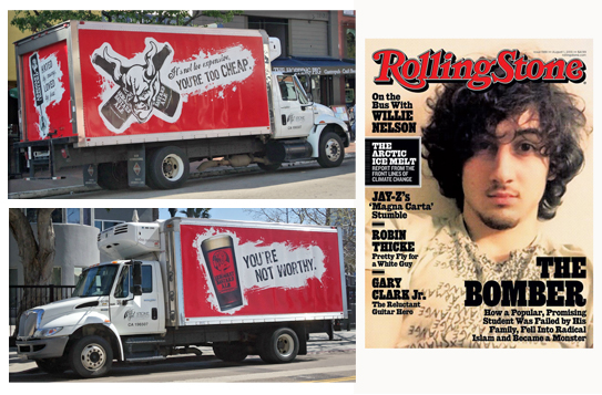
Arrogant Bastard Ale found its soul, reflected it in its name and hence has no problem voicing and monetizing on it. The highly controversial cover design of the latest issue of Rolling Stone magazine is a timely example of the power of brand and consumer voice. You can sometimes push it and might at times abuse it (as I see it being the case in RS magazine). As a new brand you need to clearly establish what you will focus your conversation on and how you will speak not only to, but more importantly with your audience. Use your Brand Platform as your brand launch manifesto and brand voice guide. Share a synopsis of it with your extended team, and refer back to it religiously. Pin it to your wall and stare at it every time you (or your content manager) start writing content or engaging with your audience. As much as consumers will buy into your new product or service, they will just as much buy into your brand voice. If Arrogant Bastard suddenly writes a cute statement or Rolling Stone Magazine publishes a boring cover, the brand voice fails the brand’s soul and the brand as a whole will subsequently, over time, lose its power. Make sure your new brand’s voice is consistent. Consistent with your brand’s soul, and hopefully consistently engaging.
We get asked this question a lot. The simple answer is: You can’t. Will a strategic and design-driven brand launch generate ROI? Definitely. As you have no before/after metrics and are dealing with a new, often innovative and disruptive brand, this is a tough nut to crack.
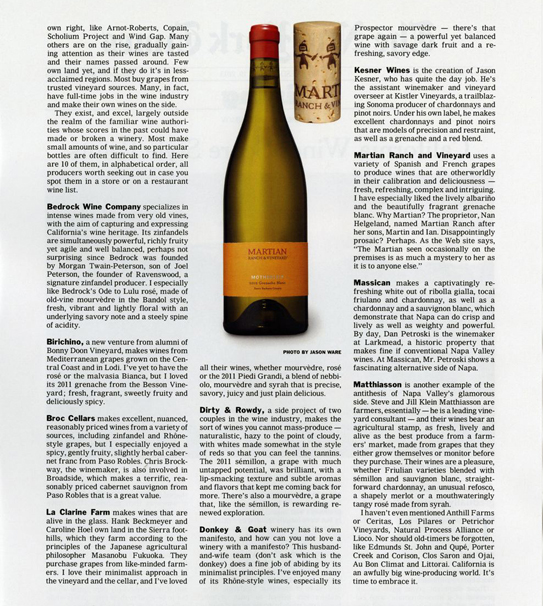
Yesterday, FINIEN client Martian Ranch & Vineyard sent us above reprint of a New York Times article that ran a couple of weeks ago, entitled “California Wines Score Style Points.” We were grateful and proud of our collaborative achievements. Their wines are truly other worldly so it comes as no surprise that the winery receives praise on the highest media levels. But as one of ten featured wineries, their product is the one that has been picked by the editors to be featured with a rather large photo of the product packaging, including…the cork.
Now that is true ROI on a strategic and design driven brand launch. Seeing the wine brand rather than just reading about it creates immediate product recognition, leading to impulse buys and elevated brand perception. Most wineries make their branding effort the last agenda item with the smallest piece of the overall budget left over and they wing it days prior to bottling their wines. Martian hired us to create a brand with a focus on product packaging that stands out on the shelves and has a cohesive brand story to tell that is unique and interesting.
It showed…and now it sells.

As we descend into a holiday weekend here in the US, we thought we’d keep this week’s New Brand Post on the light side. A great time for our second Punny Brand Name Showdown. This time we chose two brands named after their founders, with an added pun.
An added pun with a dash of sugar in this case. Sugarpova is tennis star Maria Sharapova‘s step from endorsements into entrepreneurship with a line of gourmet candy. The 25-year old is targeting a market “that doesn’t have a premium segment” (Bloomberg Businessweek) and she has translated her own brand name into a sugary pun. (How they got away with using ‘Lips like sugar’ as a product name remains an open question. Did Echo & The Bunnymen receive tons of free sugar power to keep them awake at their age on stage when performing their biggest hit by the same name?)
What you might not know is that the established greeting card company Hallmark was actually named for its founder, Joyce Hall. Hallmark also means a mark indicating quality or excellence (Wiki). Voila, an excellent punny brand name has been born.
 But there are winners and there are losers and you can’t be both, or can you? In our second Punny Brand Name Showdown we have two winners and two losers. Sugarpova is a great pun, leveraging the person behind the brand in a memorable and fun way. Yet, it does feel a bit bittersweet by elevating sugar to become the new star of the fun, but not quite healthy brand. Hallmark is a great pun with a personal touch, but if it was a brand launch in 2013 we would stray away from it based on online search and IP ownership difficulties.
CATEGORIES: Blog Your Brand Launch: Naming
Over the past 2 weeks I’ve given 4 presentations on ‘How to Launch a Brand‘, coinciding with our upcoming book release of the same title, which consisted of a combined 3 hours of Q&A with startup entrepreneurs ages 16 to approximately 54. I also conducted 12 one-on-one mentoring sessions. I felt it was time to reflect and share what I’ve learned through talking with these ambitious and energetic innovators and disruptors:
When you have only 60 seconds to pitch – and there’s a whole lot to convey in that time – it seems to make sense to learn it by heart. Wrong. If you present your passion project it should not sound like it comes from an automated machine. It will lack heart and soul…and the most important asset: your pitch will be missing you. The same holds true for anyone giving any sort of presentation. Know your stuff and definitely prepare your speaking points, but don’t read it all off your notes or have it memorized sentence-by-sentence. You will never be able to truly connect with your audience that way. In whatever business presentation you find yourself in, your audience will always want to get to know a little bit about the person behind the speech.

How To Launch a Brand – Founder Institute 06/24/2013
A defensive person in an advisory conversation is most unappealing. As a trained Graphic Designer, this lesson took me over a decade to learn and almost another one to perfect. If you walk into a conversation with an open mind, ready to listen and learn, thinking to yourself that you know nothing (or ‘You Suck‘ as a fellow mentor at The Founder Institute put it), you will allow yourself to absorb. What you do with the gained knowledge is up to you in the end – it’s a take it or leave it. If you are never open to taking it in the first place you will only be left out.
You listened to a speaker, you leave the room inspired and get started implementing his or her advice. Or you could walk up to them, introduce yourself, and start a conversation. Or connect via LinkedIn the day after and request a quick call. It happens all the time. Approximately 20% of attendees connect with me and ask for a couple of minutes of my time. Could I say no? Yes. Is there a big chance I won’t? Yes. All it takes is courage. Ask and you shall receive. The next generation is doing this, they are the bold connectors and will soon steer the ships we all think we are captains of. Let’s adapt that boldness.

Santa Monica Youth Tech Program Mentoring – Coloft 06/25/2013
Stay in the loop about future events and additional thoughts on brand launches by following us on Facebook.
CATEGORIES: Blog Startup Advice
In case you were stuck in an all afternoon meeting, or took an afternoon off during yesterday’s WWDC 2013 announcement, Apple revealed its new Operating System design. Even if you are not an Apple Brand Advocate (anymore), your brand (launch) will be feeling the aftermath of the design language Apple just unleashed on millions of earthlings. Here is how I predict it will affect your brand design:
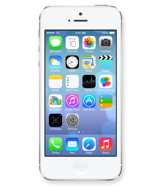
Icons lost their 3D look and this will finally spill back into the design of corporate identities. Days of pricey re-designs of Fortune 500 logos that basically added a 3D effect (AT&T, Capital One, Etc) are finally gone and simplicity in identity design will reign once again.
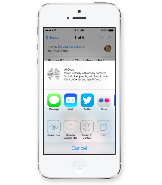
Apple’s use of transparency for navigational panels will trigger a move towards multiple translucent layers creating depth within digital interfaces. This would allow for multitasking and kill the traditional ‘top level navigation’ bar, allowing users to open multiple levels of navigational hierarchies based on transparency levels. Users will see the ‘page’ they are on while transparent layers will allow for unobtrusive ways of navigating down a couple of levels without ever leaving sight of your current ‘screen’.
Long gone are the days of black being the go-to color to convey luxury and sophistication. I predict layers of transparency quickly moving off screen and popping up across all media from print to on-air commercials, making white the predominant color (Is white a color you ask?) despite Pantone’s color predictions for 2014.
Images Courtesy Of Apple.
CATEGORIES: Blog Your Brand Launch: Brand Atmosphere Your Brand Launch: Digital Your Brand Launch: Identity
You call it logo. We call it brand identity. Just sounds so much more important. Why? Because it is darn important. It is the visual platform to all of your new brand’s communications. It is the visual foundation of the house you are about to build; the eye candy and sex appeal; the quick read ‘know it all’ brand identifier. Getting it right is an art. If I can give you only 3 pieces of advice before you dive head first into crafting this – did I say important? – piece of design with your agency or freelance design partner, these are the ones to keep up front and center on your dashboard throughout your journey:
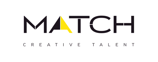
You (will) have many ideas for how your new brand’s logo should look and what it should convey. I am here to tell you, sorry, you can’t fit them all into an identity design. You can try, but you will fail and you will suddenly find yourself not communicating anything at all. Your logo will look more like a painting of sorts and it will confuse rather than educate. Great identities convey one or two messages and they work because they do just that: They have a focus. They focus on the most important message through concept and visual target audience appeal through colors and typography. Ask yourself ‘What is the big idea and who should it cater to?’ A brand identity is a simple mark not a canvas. At times you are able to convey multiple concepts by refining areas of the logotype or mark, but it’s a lengthy and diligent process. When we re-branded Creative Talent Agency Match a few years back, we were able to communicate the symbiotic relationship between client and talent agency as well as talent and talent agency through typography that is co-dependent. We further use the letter A as a stand alone mark that signifies a computer cursor, which describes the online nature of the agency in a subliminal manner. Yet the identity does not look busy or complex. It’s a simple concept that is hiding subliminal messages within.
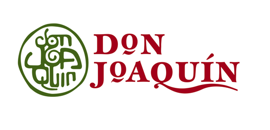
Don’t think of today. Think of tomorrow. Create an identity that not only will convey who you (company/product/service) will be in a couple years down the line, but also will keep connecting with your audience three to five years down the road. Don’t make it hip. Create something that has the ingredients to be timeless. We created the below identity for Don Joaquin’s line of Guacamole eight years ago and it works just as well in today’s overly crowded marketplace as it did back then because we focused stylistically on tradition while forming timeless emotional connections with the consumer. There was nothing hip about it then and there’s nothing hip about it now, and that is why it works.
Your identity should surprise the segment you are about to disrupt. Show your competitors and consumers alike that there is a new player in the field. That alone is often the key ingredient for the initial purchase, or call – out of intrigue. Just like that funky tasting soft drink you tried out the other day because it looked so different and enticing, you just had to give it a shot. If your product or service is not like all the others, your logo needs to stand tall behind that claim and represent it visually as the key creative element that will be on all your outreach materials. When we crafted the identity for an online music service that promised to shake things up amongst traditional record labels, we decided to return the power of music to the hands of the individual, may that be the artist or the listener. It made a statement and conveyed disruption. Soon after launch the CEO told me that a complete stranger stopped him while wearing a company T-Shirt and said ‘The power of music, that’s a great shirt man.’ Little did he know it was a brand mark.

CATEGORIES: Your Brand Launch: Identity

Alex Osterwalder is the lead author of the global best seller Business Model Generation and inventor of the Business Model Canvas. Currently, working on Strategyzer.com, a strategy and innovation platform. Blogging at http://www.businessmodelalchemist.com
“I was pretty impressed by the launch of Sifteo Cubes. The online presentation, the packaging, and the product itself are great. I’m a big fan of the “unboxing experience” I got used to with Apple products. Sifteo provides the same for their cubes. The packaging is so beautiful, well designed, and practical that you can only love unpacking their product. So what about the product itself? My kids, the final users, simply love playing with the cubes.”

We did not expect anything less inventive coming from Alex after hearing him deliver the keynote address at the Front End Innovation Symposium in Boston two weeks ago, Sifteo Cubes are just plain cool. “Sifteo Cubes are small computers that display graphics on their top surface and sense one another and how they are being moved….were developed as a platform for hands-on interactions with digital information and media (Wiki)” No surprise that they were derived by two MIT grads. OK, let’s talk brand.
We love names without preconceived notions. They eliminate domain name fights and they are ready to be branded by the sole marketing of themselves. Sifteo is easy to say, but it’s not the easiest to remember. For a kid, it’s not sticky, a kid wants something fun to say that evokes an emotion or recollection of the product. Sifteo sounds latin, which is to say rather serious. So what does Sifteo mean? It is not clear if much sifting is going on, unless we go deep down into metaphor abyss of which we will spare you. Siftables was the name of the prototype product, which must have turned into Sifteo, the company and then Sifteo Cubes, the product. What’s next? If their product offering grows in the future, will all product names be sifted through the same siev? Matching names between a parent company and its product lines can limit expansion opportunities and create a dynamic between products in which successes and failures hinge upon one another. A short term solution that is missing long term naming and expansion strategy.

The identity design is as uninspired as the product itself is inspired, and inspiring. The type is bland (very ‘techie’), the colors are expected and as a combo it simply fails to stand out. The attempt of a somewhat, not really square typeface could have been explored further and as such starting with the letter ‘o’ (aka a real square) a story could have been told by integrating the three cubes (aka the product) into the logotype. It would have served as a strong foundation of the brand identity as a whole. A lost opportunity.
Alex praised the packaging, to say the least, it nearly sounded erotic, so we take his word for it. From the outside, the packaging takes the same straight forward, clean and product focused path that the web site promises. The online experience often being the first touch point of parent as well as offspring (aka ‘end user‘), the site fails to connect with the target audience on an emotional level though, may it be with the kids looking for a fun and engaging element or the parents looking for an online experience that matches the product price point. An experience needed to be crafted and content catered to a specific audience. The sifteo web site feels like a site where strategy and design were derived by an overwhelmed developer and content strategy by the sales team. All of it organically, so it seems. With that being sa(i)d, we do prefer its clean and to the point design over bad design and UX altogether. Gotta go and play with these shiftable, ah, siftable cubes now.