Your Brand Launch: Brand Atmosphere
New Brand Adopter: Steven Balaban Adopts The Samsung Galaxy Gear Smartwatch

Steven Balaban is the founder and CIO of Mink Capital. He has read over seventy business books in the last six years and has recently launched the site Best Business Books To Read to share his knowledge.
Our burning question: Which recent brand launch do you admire?
“I am fascinated by the launch of the Samsung Galaxy Gear Smartwatch. I first learned about the watch through a social media campaign that focused on a video that shows characters in TV shows, such as The Jetsons and Star Trek, using futuristic watches. The campaign claims that “The Next Big Thing is Here” and the video definitely gives that impression!
I remember the days when I was backpacking around Europe with my old camera and eight rolls of film. Now, I can travel with a 1.9 megapixel digital camera around my wrist. Am I really that old?”
Samsung Galaxy Gear- A Long Time Coming on Vimeo.
FINIEN Weighs In
Although launched only about 3 months ago, in the cell phone and gadget market, the Galaxy Note 3 is by now light years away from being a ‘new brand.’ Steven selected a truly innovative product, one I was curious about for a while and one that makes it hard to do our job; discussing the name, identity and digital brand atmosphere. We like to be challenged:
The Name
Cell phones fall into the category Fax and Copy machines once fell into. The inaugural product name (The iPhone, The Galaxy) sound sexy and/or inspirational, and at the time the iPhone 5c and the Galaxy Note 3 launch, they turn into fax machine names. More troublesome for Samsung though is the naming strategy behind the truly innovative part, the introduction of its Smartwatch. It has been degraded to ‘Gear’. Verbatim: The Samsung Galaxy Gear. Representing the only such ‘gear’ (there is only the watch), the choice is baffling to myself and confusing to the consumer, when all they want to call it is ‘the watch’.
FINIEN Brand Happiness Barometer: Name 2 (out of 10)

The Brand Identity Design
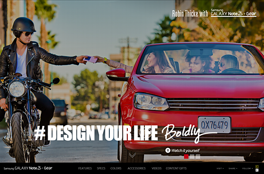
The name is the first step to defining a brand’s identity, and with a 4-part name the brand identity design is quite a train wreck that is as hard on the eyes as it is on your tongue. You won’t fall in love with the name, nor the logotype, so what to do? Throw in Robin Thicke, add a hashtag (#DesignYourLife) and let’s not bring up ‘Samsung Galaxy Note 3 + Gear’ too often. Nor the Jetsons, Thicke replaced you and Knight Rider as of now.
FINIEN Brand Happiness Barometer: Brand Identity Design 1 (out of 10)
The Digital Design
Seems as though the majority of the budget was spent on the highly produced Robin Thicke commercials, hence they occupy the landing page in its entirety. A bold move, one that leaves the user ‘interacting’ with the brand and ‘exploring’ the site, but truthfully, it means that they are lost looking for details on what the SGN3+G (Forgive me for not spelling out the full name) can really do for them. We soon learn that the site itself has been overproduced as well, taking advantage of many bells and whistles of today’s web design yet leaving functionality and plain product info, features and calls to action behind. The web site is the number one informational source for gadgets, being so cumbersome to navigate, it leaves me thinking that the SGN3+G might offer the same clunky experience.
From a brand experience perspective I might leave the ‘gear’ behind and wait for a ‘smartwatch’ after all, as there will be many to chose from shortly. For now I, and perhaps Steven, will hold off on Robin Thicke and wait patiently to live the Jetsons’ life instead.
FINIEN Brand Happiness Barometer: Digital Design 3 (out of 10)
CATEGORIES: Your Brand Launch: Brand Atmosphere
Building Your Brand From The Ground Up (A Fireside Chat With Yours Truly)
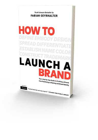
A couple of weeks ago, Bob Garlick, host of Business Book Talk (poking through below), contacted me to schedule an interview about our book ‘How to Launch a Brand.’ With Bob sitting in Vancouver and myself in Los Angeles, I was immediately taken by surprise as there was no script that he shared with me, no canned answers to prep, no warmup chatter and no edits were made to our conversation.

The result is an honest and stimulating conversation between two individuals with a keen interest in design, branding and entrepreneurship, which I’d like to share with you. Below audio not only gives you a peek into our book, but also covers topics such as misconceptions of branding, brand strategy, how brands need to be different than 15 years ago and how to connect with your customers through branding:
Audio clip: Adobe Flash Player (version 9 or above) is required to play this audio clip. Download the latest version here. You also need to have JavaScript enabled in your browser.
(Can’t see above audio player in your E-Mail? Please listen to the audio via our site)
Now that I crossed the bridge by posting audio (how adventurous), I might as well share a quick video in which I further define ‘brand’ specifically for startups, filmed at a mentoring session (how advantageous) at the Founder Institute in San Diego two weeks ago.
Damage Control For The Misused And Abused Word ‘Brand’
“The word ‘brand’ needs a re-branding – due to its brand longevity the brand legacy is not brand-correct anymore,” I heard myself say unexpectedly in an interview earlier this week. It has been on my mind for a while. To no surprise, running a brand consultancy I am using the word a hundred times a day. Furthermore I just published a book titled ‘How to Launch a Brand’. The word gets tiring, especially since it leaves a bad aftertaste and I feel the need to first convince people that it is not a bad term before I start talking about it any further. Brand is not a four letter word.
Despite the negative connotations with the term, branding is more important today than it has ever been before and it is not only consumed, but furthermore created and curated by the masses through their very own personal (public/social media) brand. Brand is alive and kicking and we will not be able to change the term, but one can change the perception away from luxury good logos (Gucci, Chanel) and larger-than-life corporations seen as evil-doers (Exxon, Walmart) to a modern necessity, which, if created and nurtured in an honest and authentic way, turns ‘brand’ into a holistic ‘aura’ of a product/service provider (or person) that we are allowed to have admiration for (From an iPhone to a Celebrity), aspiration towards (From a Nonprofit to a highly ranked University) and sometimes draw inspiration from (From Ted Talk to Oprah).
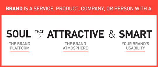
To me, a brand is a service, product, company, or person with soul, that is attractive and smart.
1. Soul is the beating heart, the reason a company should exist and why your initial attraction matures into love. You put your trust in brands with a soul and most often your money follows soon thereafter. Not much different than with human relationships, soul is the reason why we care for each other, or a particular brand.
2. Attractive is the brand aura that allows for the gut instinct emotional connection you feel when getting in contact with the brand. It is the design and the voice that is carefully created and curated over time in a particularly consistent manner. Attraction is not to be mistaken by shallow beauty.
3. Smart is its usability. How easy is it to engage with the company/product/service/person? In the tech industry it is User Interface and User Experience, with consumer products it is the product and packaging design and with services it is often the design of key offerings combined with its delivery.
Now that we ‘talked’ about the complex strategy that creates the beautiful simplicity that makes a brand, maybe we should give the word another chance?
The Importance of Branding At Time of Launch For Tech Startup, B2C/Retail And B2B Company Founders
‘Is branding the key for a successful start-up?‘ is the topic for a speech I was asked to give at Internet Hungary this week. I could make it a 5 second speech and say ‘Yes, it is one of the most important factors,’ but lucky for me the topic is broader and will go deeper into the keys of creating a successful brand. Let me use this opportunity though to dive knee deep into this question as some brand elements are more important to certain types of companies at time of launch than to others:
No one shall skip the Brand Platform creation at the onset of a new venture, unless you want to compete on price, be boring and unattractive to work for, and are not keen on acquiring the right target audience at time of launch. You tackle the Brand Platform right after you draft your business plan (from fully fleshed out to napkin version – all are acceptable forms of business plans at this stage, depending on your own comfort level).

Launching with a meaningful and unique Name and Brand Identity Design seems like a no-brainer, a must for all entrepreneurs. If for whatever logical reason (budget not being part of that logic) you feel forced to launch with a sub-par name and logo, knowing you will have to go through a (more costly) re-naming and re-branding exercise upon showing first successes, it is the easiest to do for a tech startup or B2B venture that requires solely test users or relies on a very small niche audience, which will make it easier to educate them on this big and disruptive brand change down the road. Some Tech Startups (especially apps) are prototyping until the day of launch, making it an easy excuse to skip this essential step, whereas it is much more advisable to work on a prototype whilst formulating the brand platform, that way you are educating yourself about the target audience while you see them use the actual product, enabling you to create a meaningful brand that will not have to be rebuild soon thereafter. A win – win.
Needs for Brand Atmosphere Touch Points vary in importance and specifics from company to company with retail and other mainly offline B2C companies leading the list, E-Commerce and Tech Startups surviving off some basic, consistent touch points bundled with heavy E-Marketing template creations, while most B2B brands fall anywhere in-between, depending on their structure and audience. If bootstrap is your motto, these can be rolled out over time, making it essentially more pricey, but allowing you to spread the cost.
It only makes sense that ventures leading with digital need to make UI/UX Design part of their strategic brand implementation. Most companies – B2C/Retail and B2B – rely heavily on brand-centric (responsive) web sites to attract and convert leads of different types. For Online Retailers and Tech Startups where the web site also is the product, the prototyping should be addressed in parallel with the Brand Platform creation as it will educate the branding process as a whole. Some companies are able to save on development costs using existing WordPress templates (and such), but brand will still be key at launch.
To conclude, whenever a startup founder tells me (and they tell me all the time) “I can not afford branding at this early stage of my company formation” I reply with “No, you cannot afford not to brand at this early stage of your company formation. Unless you think a strong brand is worth less at time of sale or IPO than an ugly yet functional prototype.‘ This often marks the end of our conversation, until they call a few weeks later to get started with branding their new venture.
I Am With The B(r)and: 5 Ways Your Next Brand Launch Can Benefit From My Obsession With An 80’s Band
I was 8 when I purchased my first Depeche Mode record. I was fooling myself. I did not make this (rather big at the time) purchase because of their music; instead it was the first colored vinyl record I have seen and I fell for the surprise and sheer beauty of it. It was different. A couple of colored Depeche Mode records later I actually started enjoying their innovative electronic sound, because that too was different. And as all of the b(r)and touch points started lining up for me over the years, I turned into a fan.
When I was 18 I took my first step into entrepreneurship by organizing, designing and hosting a concert After-Party in Austria making my first $20,000 (and since had the opportunity of sharing a drink or two with the band on several occasions). The band’s visual design language was mainly crafted by photographer/director Anton Corbijn, who I cite as a major reason I turned to study Graphic Design, enabling me to do what I am doing today. Corbijn also later served as a key inspiration for my photography. Needless to say, my interest in this band for the past 30 years has a deep and personal meaning as it helped inform and somehow shape my own identity.
Over the past weeks I have watched the band perform on its current tour (yes, they are still around) and it gave me time to reflect and think about the sheer power, and design-driven innovation of this band, and how any new brand could benefit from it.
Generally, any band launches a new ‘sub-brand’ every 2-4 years. They call it an album release, but really it is a sub-brand with many objectives that need to be met. The design language needs to introduce a new era of the band that conveys the purpose, signifies change and disruption (‘growth’), yet remains close to the brand’s manifesto. It needs to be able to gain new followers while giving the loyal brand enthusiasts enough nostalgia to hold on to. And of course it requires to be highly adaptable, inspiring the visuals and merchandise for a world tour (a major financial reason for the introduction of the sub-brand) and single releases while being simple enough to turn into an avatar or a fan’s tattoo. Not a short list of brand launch objectives.
Here are some tricks of the trade that I witnessed following a b(r)and over this peculiar long period of time. The least my strange addiction can do is help you create a better brand. Here’s what you can learn and instantly implement during your new brand introduction:
1. Announce A New Era
Your new brand is put in place to do something that has not been done before, or at least not in this particular configuration. Make sure your Brand Atmosphere shows that you are here to disrupt.
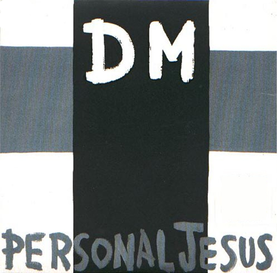
Depeche Mode kicked off their most successful album of all times (Violator, 1990), with the single Personal Jesus, which was highly controversial by its name alone. The simple cross added to it, making DM the crucified. After a big breakthrough record (‘sub-brand’), releasing the first single without the b(r)and’s name on the cover showed attitude, confidence and promised innovation.
2. Allow For Easy Adaptability
Ensure your brand identity stands out, is meaningful and relevant, but always keep it extremely simple to allow for easy application by brand adopters, employees, vendors and of course your groupies.
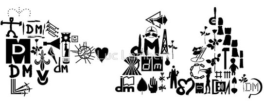
Over the years the band created variations of its b(r)and initials coupled with simple icons that allowed for versatility with stage projections and merchandise, but above all enabled fans to easily create art and avatars to turn into adopters of this particular time of the band’s journey. Above shows a collection of these icons as put together by fan Luce Lambert to form the DM initials of the band’s current record.
3. Create Buzz Through Innovation
If you innovate through your brand marketing, people will notice, and that’s the first step to create a following. The more unique, the more interest it will generate and the more press your brand will receive in return. Yes, unique design will lead to sales.
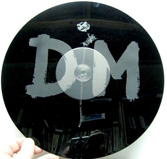
For a limited edition of the band’s mega hit ‘Enjoy the Silence‘, it featured a 15 minute remix of the song on one side while the b-side featured no music at all, but an etching of the band’s identity instead.
4. Explain Value Through Imagery
“Words are very unnecessary, they can only do harm,” is the chorus of the band’s biggest hit, which you may recognize. Music art relies on imagery and imagery alone. In a world of infographics, A.D.D. and information overload, your new brand should adopt that mantra and say less with more…imagery.
5. Create a Brand With Charisma
Nearly a given for any band leader, it also holds true for your brand launch. If you strategically infuse a brand character into your launch, it will instantly make your brand more likable. That persona could be the CEO (‘Richard Branson‘), a fictional character (‘Mr. Clean‘) or a spokesperson hire (‘The most interesting man in the world‘) that embodies what your brand stands for.
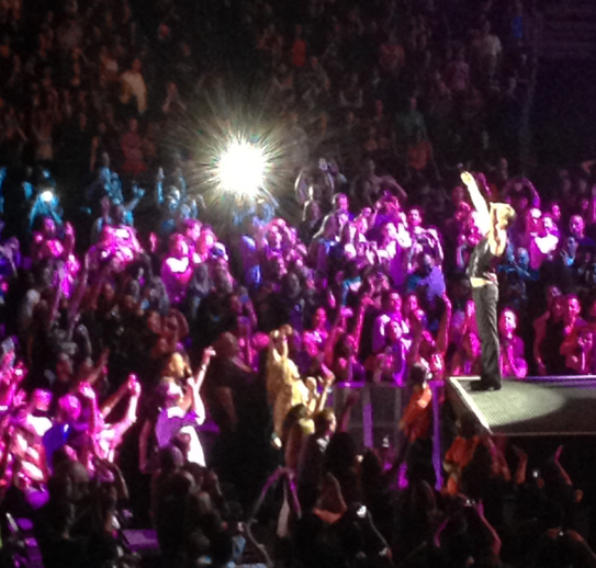
I took this photo of Depeche Mode’s lead singer, Dave Gahan last night at the Staples Center in Los Angeles. Gahan is working the stage and the female audience alike, and became a major driver in the b(r)and’s longevity.
5 b(r)and takeaways that I firmly believe will make your brand stronger at launch. Now look at your own small obsessions and find out why it makes you say ‘I am with the brand,’ then share your findings with us.
Why You Don’t Have To Make The Logo Bigger, Even During Your Brand Introduction
Granted, the subject of creative agency clients wanting to make their logos as large as possible to ‘get more bang for the buck’ and to ensure people ‘will notice’ their logo on their brand marketing efforts has been beaten to death and plentiful poked fun at (The Product, The Song, Etc). With new brand introductions this notion feels more in line with reality than any other marketing efforts as you have not only an urge to see your (often first, but definitely brand new) logo large, but you are also under a lot of pressure to ensure the customer notices and recalls your new identity design and brand name.
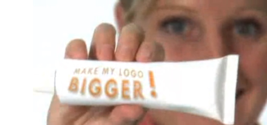
Above: Still from the hilarious ‘Make Your Logo Bigger‘ ‘infomercial’ (2007)
Instead of opting for the ginormous logo though, introduce your brand identity as part of a visually strong and unique design language. Brand is much more than a logo. Of course it is also much more than color and layout, but unique colors with specific application manners (Eg: a vertical bar or a cropped circle of consistently same proportions, within the same locations across all initial communications) not only creates brand design consistency but it makes your marketing efforts be truly your brand.
More so than an existing brand you need to penetrate the market (however small that penetration effort is, may it only be an e-marketing campaign and your web site) with a very unique and consistent design and color approach to get your new brand into consumer’s minds. Upon creation of that distinct visual brand language, step and repeat is the best way to stay in your consumer’s heads in the first phases of your brand introduction. You can slowly minimize the branded aspect and introduce campaigns over the course of time.
After 17 or so years of introducing brand identities, I can attest that this approach works well while using a completely normal sized logo. Guaranteed.
3 Ways to Create a Strong Brand Atmosphere From The Get-Go
Once you have established a solid brand platform, name, and identity design, you are ready to breathe life into your brand by expanding it through tangible materials and experiences. At FINIEN, we call these your Brand Atmosphere® Touch Points. Each company has unique needs in terms of developing branded elements for print, display, digital, and environment.
Regardless of which ones your strategy calls for, remember that all brands should focus on how their Brand Platform is integrated into each touch point through consistency in visual cues and messaging. Seemingly small details in layout and design can have a huge impact on your brand’s cohesiveness and success.
“Design choices like color, layout, and font, can compel the right audience to buy when they are used correctly—or repel your audience from buying when they are not,” states Maria Ross, author of Branding Basics (2010). Furthermore, these design choices will speak volumes about the values of your brand. “Visual expression often reveals the unspoken intentions behind corporate strategy” (2007) confirm both Uli Mayor-johanssen and Klaus-peter Johanssen in World Branding. How do your business cards, storefronts, and social media outlets harmonize to tell a larger story about your brand?
Here are 3 points to pin to your desk (standing desk, I hope!) and to follow religiously when at this stage in your (next) brand launch process:
1. Be Consistent
Cohesive/Holistic/Systematic: Call it what you want. Your brand and all of the elements that make up your brand need to visually speak the same language and communicate the same message. It will make or break a Brand Atmosphere.
2. Be Selective
Don’t try to be on all social media platforms at the outset. Strategize where it is most relevant for your brand to exist and apply a cohesive look-and-feel and brand voice to those channels first. You can always expand to other channels as time allows and needs arise. Also focus on only a few select traditional marketing pieces to get your brand started. Ensure that these pieces communicate the essence of your brand and are well designed.
3. Do Sweat the Details
Each touch point associated with your brand has the power to diminish or enhance your Brand Atmosphere. Never rush through creating your touch points, and do sweat the small stuff.
Adapted from our bestselling book “How To Launch a Brand.”
CATEGORIES: Your Brand Launch: Brand Atmosphere
If Your New Brand Lacks Soul, It Lacks Voice (Which Makes It Rather Difficult To Be Heard)
I have a ritual where I take a bath Wednesday nights (there may be a glass of wine involved, yes) to ponder what I will write about in the New Brand Post the following day. I have a flexible editorial calendar I work with, but it has holes and can be arranged to my liking or to encompass spontaneous thoughts. Last night I realized how insane and equally wonderful it is to write what hundreds of people expect in their mailboxes every Friday morning (sign up if you haven’t) just the day before. As daring as it may sound, strangely I never encounter “writer’s block.”
If you can not find the soul of your new brand, don’t launch it. [Tweet]
When a dear friend of mine first convinced me to start using Twitter, I told him that I was not sure I had enough brand-related content to share with the world. 3,654 tweets later (follow our new account) I realize I have a lot to share. If you create a brand that has soul, it will have a voice. If you are passionate about the subject, you will always have something to say. If you create a new brand and feel like you might not have enough content, analyze your Brand Platform and go soul searching again. If you can not find the soul of your new brand, don’t launch it. It’s that simple. Today’s consumer listens, absorbs, and responds. You will be part of an open conversation and as a new brand you need to be the one starting it.
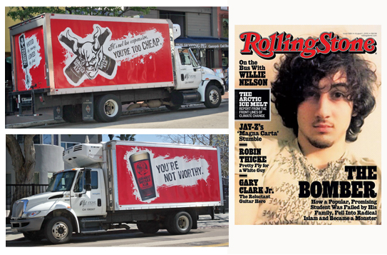
Arrogant Bastard Ale found its soul, reflected it in its name and hence has no problem voicing and monetizing on it. The highly controversial cover design of the latest issue of Rolling Stone magazine is a timely example of the power of brand and consumer voice. You can sometimes push it and might at times abuse it (as I see it being the case in RS magazine). As a new brand you need to clearly establish what you will focus your conversation on and how you will speak not only to, but more importantly with your audience. Use your Brand Platform as your brand launch manifesto and brand voice guide. Share a synopsis of it with your extended team, and refer back to it religiously. Pin it to your wall and stare at it every time you (or your content manager) start writing content or engaging with your audience. As much as consumers will buy into your new product or service, they will just as much buy into your brand voice. If Arrogant Bastard suddenly writes a cute statement or Rolling Stone Magazine publishes a boring cover, the brand voice fails the brand’s soul and the brand as a whole will subsequently, over time, lose its power. Make sure your new brand’s voice is consistent. Consistent with your brand’s soul, and hopefully consistently engaging.
How Do You Measure Brand & Design ROI On A New Brand Launch?
We get asked this question a lot. The simple answer is: You can’t. Will a strategic and design-driven brand launch generate ROI? Definitely. As you have no before/after metrics and are dealing with a new, often innovative and disruptive brand, this is a tough nut to crack.
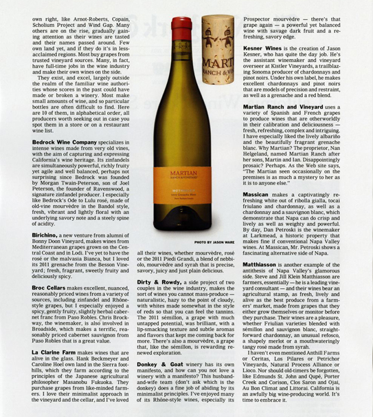
Yesterday, FINIEN client Martian Ranch & Vineyard sent us above reprint of a New York Times article that ran a couple of weeks ago, entitled “California Wines Score Style Points.” We were grateful and proud of our collaborative achievements. Their wines are truly other worldly so it comes as no surprise that the winery receives praise on the highest media levels. But as one of ten featured wineries, their product is the one that has been picked by the editors to be featured with a rather large photo of the product packaging, including…the cork.
Now that is true ROI on a strategic and design driven brand launch. Seeing the wine brand rather than just reading about it creates immediate product recognition, leading to impulse buys and elevated brand perception. Most wineries make their branding effort the last agenda item with the smallest piece of the overall budget left over and they wing it days prior to bottling their wines. Martian hired us to create a brand with a focus on product packaging that stands out on the shelves and has a cohesive brand story to tell that is unique and interesting.
It showed…and now it sells.
CATEGORIES: Blog Your Brand Launch: Brand Atmosphere
3 Design Trend Predictions Based On Apple’s New iOS (And How It Will Affect Your Brand Design)
In case you were stuck in an all afternoon meeting, or took an afternoon off during yesterday’s WWDC 2013 announcement, Apple revealed its new Operating System design. Even if you are not an Apple Brand Advocate (anymore), your brand (launch) will be feeling the aftermath of the design language Apple just unleashed on millions of earthlings. Here is how I predict it will affect your brand design:
1. 2D is The New 3D
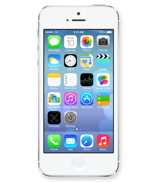
Icons lost their 3D look and this will finally spill back into the design of corporate identities. Days of pricey re-designs of Fortune 500 logos that basically added a 3D effect (AT&T, Capital One, Etc) are finally gone and simplicity in identity design will reign once again.
2. 50 Shades of Transparency
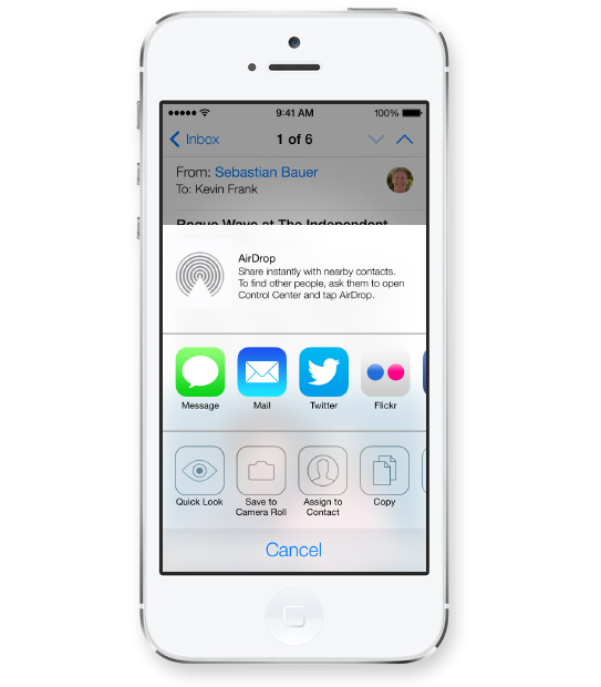
Apple’s use of transparency for navigational panels will trigger a move towards multiple translucent layers creating depth within digital interfaces. This would allow for multitasking and kill the traditional ‘top level navigation’ bar, allowing users to open multiple levels of navigational hierarchies based on transparency levels. Users will see the ‘page’ they are on while transparent layers will allow for unobtrusive ways of navigating down a couple of levels without ever leaving sight of your current ‘screen’.
3. White Is The New Black
Long gone are the days of black being the go-to color to convey luxury and sophistication. I predict layers of transparency quickly moving off screen and popping up across all media from print to on-air commercials, making white the predominant color (Is white a color you ask?) despite Pantone’s color predictions for 2014.
Images Courtesy Of Apple.

