Your Brand Launch: Brand Atmosphere
New Brand Adopter: Alex Osterwalder adopts Sifteo
Alex Osterwalder is the lead author of the global best seller Business Model Generation and inventor of the Business Model Canvas. Currently, working on Strategyzer.com, a strategy and innovation platform. Blogging at http://www.businessmodelalchemist.com
Our burning question: Which recent brand launch do you admire?
“I was pretty impressed by the launch of Sifteo Cubes. The online presentation, the packaging, and the product itself are great. I’m a big fan of the “unboxing experience” I got used to with Apple products. Sifteo provides the same for their cubes. The packaging is so beautiful, well designed, and practical that you can only love unpacking their product. So what about the product itself? My kids, the final users, simply love playing with the cubes.”
FINIEN Weighs In
We did not expect anything less inventive coming from Alex after hearing him deliver the keynote address at the Front End Innovation Symposium in Boston two weeks ago, Sifteo Cubes are just plain cool. “Sifteo Cubes are small computers that display graphics on their top surface and sense one another and how they are being moved….were developed as a platform for hands-on interactions with digital information and media (Wiki)” No surprise that they were derived by two MIT grads. OK, let’s talk brand.
The Name
We love names without preconceived notions. They eliminate domain name fights and they are ready to be branded by the sole marketing of themselves. Sifteo is easy to say, but it’s not the easiest to remember. For a kid, it’s not sticky, a kid wants something fun to say that evokes an emotion or recollection of the product. Sifteo sounds latin, which is to say rather serious. So what does Sifteo mean? It is not clear if much sifting is going on, unless we go deep down into metaphor abyss of which we will spare you. Siftables was the name of the prototype product, which must have turned into Sifteo, the company and then Sifteo Cubes, the product. What’s next? If their product offering grows in the future, will all product names be sifted through the same siev? Matching names between a parent company and its product lines can limit expansion opportunities and create a dynamic between products in which successes and failures hinge upon one another. A short term solution that is missing long term naming and expansion strategy.
FINIEN Brand Happiness Barometer: Name 2 (out of 10)
The Identity

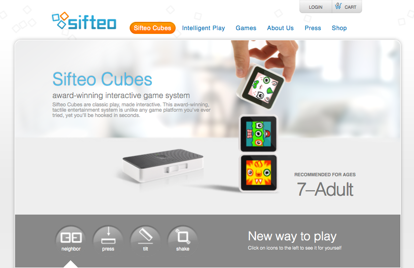
The identity design is as uninspired as the product itself is inspired, and inspiring. The type is bland (very ‘techie’), the colors are expected and as a combo it simply fails to stand out. The attempt of a somewhat, not really square typeface could have been explored further and as such starting with the letter ‘o’ (aka a real square) a story could have been told by integrating the three cubes (aka the product) into the logotype. It would have served as a strong foundation of the brand identity as a whole. A lost opportunity.
FINIEN Brand Happiness Barometer: Identity 4 (out of 10)
The Digital Design
Alex praised the packaging, to say the least, it nearly sounded erotic, so we take his word for it. From the outside, the packaging takes the same straight forward, clean and product focused path that the web site promises. The online experience often being the first touch point of parent as well as offspring (aka ‘end user‘), the site fails to connect with the target audience on an emotional level though, may it be with the kids looking for a fun and engaging element or the parents looking for an online experience that matches the product price point. An experience needed to be crafted and content catered to a specific audience. The sifteo web site feels like a site where strategy and design were derived by an overwhelmed developer and content strategy by the sales team. All of it organically, so it seems. With that being sa(i)d, we do prefer its clean and to the point design over bad design and UX altogether. Gotta go and play with these shiftable, ah, siftable cubes now.
FINIEN Brand Happiness Barometer: Digital 7 (out of 10)
CATEGORIES: Your Brand Launch: Brand Atmosphere
The top 5 must-do’s for your tech startup brand launch
![]() Jason Calacanis, founder of Silicon Alley Reporter, Engadget, TechCrunch 50, LAUNCH, This Week in Startups as well as his new venture, Inside.com, asked me ‘What are the most important things you’ve learned about launching?‘ Here is what I wrote him:
Jason Calacanis, founder of Silicon Alley Reporter, Engadget, TechCrunch 50, LAUNCH, This Week in Startups as well as his new venture, Inside.com, asked me ‘What are the most important things you’ve learned about launching?‘ Here is what I wrote him:
1. PICK A PROCESS
There are many processes to launching your tech startup. Choose one that works for your personality, budget and within the culture you are about to create.
2. TEST AND FAIL
Test and fail and test and fail. You should invest in creating your brand only once you really understand your target audience’s behavior and true needs.
3. LAUNCH AS A BRAND
Launch as a brand, not a startup that may develop into a brand. Launch by design. Design relates to the process you have to adhere to, but furthermore it truly is design that holds the key to early brand success. Graphic design, brand identity design, and web design will set your offering apart at the time of launch.
4. TAKE NAMING SERIOUSLY
Naming is crucial. You can’t change the name of your kid once they are in puberty. The name you choose at launch will remain with the brand forever, so don’t settle for a placeholder name that just happened to make it into beta because the domain was available. It’s an art, science, and legal matter, so make sure it doesn’t get overlooked.
5. LISTEN SELECTIVELY
‘Opinions are like @**holes, everybody has one‘ – choose wisely whom you listen to, which opinions you implement, whom you exclude from certain conversations and why. Have a ‘stakeholder opinion plan‘ in place from the start to make it easy for you to adhere to and eliminate the unease of hurting people’s feelings or having to re-do certain phases of your project because you did not listen to the right people at the right time.
Your new brand’s logo cannot be hip
I was asked the question, ‘What current trends in logo design do you truly hate?’ at a panel discussion at NYU back in December. I felt it was time to manifest my strong feelings towards trends in logo design. It’s an oxymoron. A logo shall never be trendy. Trends come and go, your brand identity is created to stick around for a mighty long time, hence ruling out even the remote possibility of making it trendy.
Your logo can still be modern, exciting and speak to a young audience – it just can not look like a trend. How would you know? Your idea might have been derived from something you saw, maybe you liked it because it looked hip – maybe you’ve seen similar logos before and you felt yours should follow the lead. Don’t. Lead rather than follow. First with your logo, then with the rest of your brand.
Hip logos? X that idea out.[Click to Tweet]
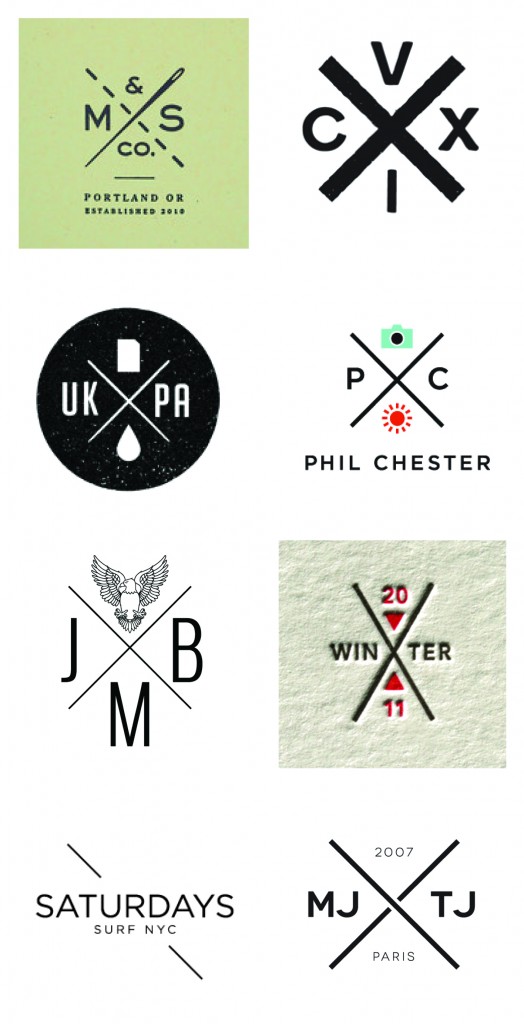
I hope the very painful overly retro compilation below will make the point even more convincing. If it’s a trend, others will follow and you will end up blending in, and there’s nothing hip about blending in. It’s tough because you thought you finally had the chance to jump on the hip bandwagon. Your logo is not the right channel for that, but you can always use a one-off campaign to do something trendy with your brand instead.

Hipster Logos
KISS 3 times during your next marketing effort
Creating a brand is only half the battle. Now you have to continuously keep building it. Over time, your brand requires carefully and well orchestrated crafting of one consumer message and marketing piece at a time. The truth is, this is where brands usually lose focus very early on. It’s time to KISS and make up. Our version of KISS (Keep it simple, stupid) is: Keep its soul, stupid!
As I have declared the death of the style guide in an earlier post, now that the brand is on its own two feet, there needs to be a constant reminder of why your brand came into existence in the first place. It’s about your brand’s soul and with all the talk about metrics, ROI and the latest shiny marketing gadgets being rolled out in front of your eyes, one tends to forget the why and instead focuses on the what. The what can feel like the sexier, easier and, often times, safer choice.
In a recent client meeting discussing creative round 1 of a website launch, the Marketing Team proudly shared our work for the first time with the CEO. She was delighted with the strategy and visuals, but having users go through a pop-over opt-in form prior to entering the site made her pause. ‘Whose decision was it to make the user go through this step prior to seeing our landing page?’, she asked, ‘Who was involved in that decision outside of our Marketing Team?’ The room fell into complete silence. For the duration of the project, the Marketing Team had been pushing for the form to take over the site prior to entering the site’s full content, in the hopes of receiving immediate ROI on the project upon launch. After a long pause, the CEO said ‘The only people who will like this idea is Marketing.’ It was an awkward, yet powerful moment as everyone in the room realized their error. If your project’s success is primarily measured by conversion rates, it may seem like a logical conclusion to push for the opt-in screen. However, this is the moment you lose sight of your brand’s soul. You no longer have your customer in mind first and foremost, instead your focus drifts towards your own success. That’s the time to take a step back and look at the brand’s broader success metrics, instead of the project brief.
In your next creative marketing project, we suggest you schedule 3 milestones labeled as “KISS” (Keep its soul, stupid) for the purpose of ensuring that your project stays in line with the brand’s soul. It is important to consider how a short-term campaign fulfills the brands’ values while also serving its long-term goals. Labeling them as “KISS” milestones will serve as a reminder of the true goal of the task. When it comes to brands, let’s keep its soul, stupid.
Your New Brand Shall Live without a Style Guide
I proclaim the death of the style guide. For decades new brands have been equipped by their branding agencies with expensive and thorough style guides explaining how design elements, such as the logo, typography and brand colors shall and shall not be used. Most are obvious and none will be followed, so why continue with the tradition?
Style guides are an important part of keeping your newly formed visual identity in check, one may argue, but does anyone care about using, or more importantly, reinforcing them? Over the past 11 years of running my branding agency I learned that it is more of a pricey exercise of ‘feel good’ and ‘make believe’ than an actionable tool. It will be presented to your employees in a big setting and over a period of 6 months it will be completely neglected. There is employee turnover mixed with new media adaptations and suddenly the lengthy and hard to navigate PDF is lost in some complex folder infrastructure and only gets found – and referenced – in order to point fingers, not to creatively implement.
Looking at a very traditional brand manual from 1970 for the New York Transit Authority (of the great design legend Massimo Vignelli), one can appreciate the ideology and craftsmanship, and one might even buy into the need for it. It seems logical, after all you just spent a good chunk of your marketing budget on establishing the brand, or re-establishing an organization, but this is not 1970, this is 2013 and your employees are spreading your brand through tens, often hundreds of channels. Channels change daily and new company cultures have changed from top down to hands-on employee empowered brands.
We stopped creating style guides at Finien, instead we create Brand Atmosphere© books for our clients. We highlight the language of the brand and focus on the flexibility of the just established identity rather than restricting it from the get-go. Different chapters provide actionable insights to jump-start the thinking process for usage in specific media types, the ones that are important to your specific brand based on your positioning and target audience. We show examples, in lose sketch form, that provide your staff an idea of what makes the brand strong within certain applications, but allows them to think and implement the brand’s voice in their own ways. I believe that leading by inspiring examples and providing the right tools and empowerment over the new brand will result in a better culture and a better, consistently evolving brand for your new company. You need simple, actionable tools that not only ensure a consistent brand, but more so, tools that ensure the brand can grow and adapt to new media channels.
It’s time to kill the style guide and provide new brands with actionable tools.[Click to Tweet]
Will your logo have the correct amount of white space around it and not get stretched beyond belief without the style guide? Yes, I think it will. Times have changed and style guide books get thicker and pricier without addressing your needs.
Spend your budget wisely – if your agency places a style guide as a budget line item, ask them why you will need it, how you will implement it during employee turnover and media outlet changes, and more importantly how they ensure the guide will fit your company’s specific needs and culture? Let me know what they say.
CATEGORIES: Your Brand Launch: Brand Atmosphere


