Your Brand Launch: Digital
Brand Identity For Hispanics in 2013: How Current Cultural Values Affect Your Brand Launch
Catering this post to those of you who target a new brand launch towards the Hispanic segment makes me aware that you will likely assume you know your niche audience. True that. But what I have deciphered for you are nuances and slight shifts in behavioral patterns based on Thinknow’s U.S. Hispanic Cultural Values 2013 study that, when applied to specific brand identity tasks, can make a big difference in your approach and the success of your next brand identity project launch.
Naming
Brand tonality is where you have to read between the lines when it comes to understanding the new Hispanic audience. If you craft a brand name for the 18-34 audience, be aware that they seek community with other Hispanics more than the above 35 group. Launching a brand for that group lends itself to creating a ‘spanglish’ name as the preferred language (especially amongst males) is English. The need for family unity and Hispanic community is also high on their list, so a Latin touch would go a long way for your brand name. Creating a name for male Hispanics (of all ages) can drift into English as they emphasize the aspiration of living the American dream and your new brand would piggy back on that aspirational connotation. With about 40% of surveyed Hispanics speaking primarily or only Spanish, a nod to both languages recognizes their multicultural experience and is the advised way to creating a new brand name for the Hispanic of 2013.

Above: Branding project we recently conducted for an American corporation offering (mainly) American brand products to the Latin American market. We derived the name ‘Yesimo’ and its correlating brand identity. Both serve as a good example of a name and identity that combine an American with a Latin feel in a warm yet sophisticated manner.
Identity Design
When designing a brand identity be sure to add one important keyword to your list of things you want to convey, pretty much regardless of your specific offering: Family Unity. The idea of familia is on the rise, especially with females and the under $30k income brackets. Combining warmth (warm colors, round sans serif typefaces and round shapes), with aspirations of the new, integrated and more monetary focused US based Hispanic (icons of growth and wealth, modern color hues and a corporate & trustworthy look) will resonate well across product and service offerings.
Digital User Interface and User Experience Design
Think usability times four. As simplicity in navigation design and content is on the rise in the US, you can ride that wave while simplifying your digital design even more so based on the added language barrier. Use infographics and icons to explain steps to take or sequential storytelling. Don’t be obvious when catering your content tonality towards Hispanics as it may conflict with the rise in a need to control their own destinies. Speak to the modern Hispanic in ways you would with any other US counterpart, otherwise you might not be heard at all. Integrate and maximize social sharing tools to enable an easy viral spread of your brand amongst friends and family (#1, 2 and 10 on the revised cultural values list of 2013!) and make sure your site is created in a responsive manner (accessible and scalable for all devices from desktop to iPad to smartphone). If you have the capabilities to create a bilingual site, offer the option of Español in a drop down.
As we see the US based Hispanic audience integrate exponentially, let’s not lose track of the nuances. As we all know, the devil lies in the details, so let’s get ready to create devilish smart and detailed brands!
3 Design Trend Predictions Based On Apple’s New iOS (And How It Will Affect Your Brand Design)
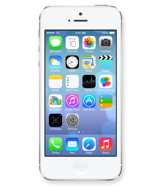
In case you were stuck in an all afternoon meeting, or took an afternoon off during yesterday’s WWDC 2013 announcement, Apple revealed its new Operating System design. Even if you are not an Apple Brand Advocate (anymore), your brand (launch) will be feeling the aftermath of the design language Apple just unleashed on millions of earthlings. Here is how I predict it will affect your brand design:
1. 2D is The New 3D

Icons lost their 3D look and this will finally spill back into the design of corporate identities. Days of pricey re-designs of Fortune 500 logos that basically added a 3D effect (AT&T, Capital One, Etc) are finally gone and simplicity in identity design will reign once again.
2. 50 Shades of Transparency

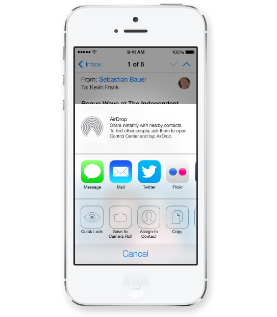
Apple’s use of transparency for navigational panels will trigger a move towards multiple translucent layers creating depth within digital interfaces. This would allow for multitasking and kill the traditional ‘top level navigation’ bar, allowing users to open multiple levels of navigational hierarchies based on transparency levels. Users will see the ‘page’ they are on while transparent layers will allow for unobtrusive ways of navigating down a couple of levels without ever leaving sight of your current ‘screen’.
3. White Is The New Black
Long gone are the days of black being the go-to color to convey luxury and sophistication. I predict layers of transparency quickly moving off screen and popping up across all media from print to on-air commercials, making white the predominant color (Is white a color you ask?) despite Pantone’s color predictions for 2014.
Images Courtesy Of Apple.
The top 5 must-do’s for your tech startup brand launch
![]() Jason Calacanis, founder of Silicon Alley Reporter, Engadget, TechCrunch 50, LAUNCH, This Week in Startups as well as his new venture, Inside.com, asked me ‘What are the most important things you’ve learned about launching?‘ Here is what I wrote him:
Jason Calacanis, founder of Silicon Alley Reporter, Engadget, TechCrunch 50, LAUNCH, This Week in Startups as well as his new venture, Inside.com, asked me ‘What are the most important things you’ve learned about launching?‘ Here is what I wrote him:
1. PICK A PROCESS
There are many processes to launching your tech startup. Choose one that works for your personality, budget and within the culture you are about to create.
2. TEST AND FAIL
Test and fail and test and fail. You should invest in creating your brand only once you really understand your target audience’s behavior and true needs.
3. LAUNCH AS A BRAND
Launch as a brand, not a startup that may develop into a brand. Launch by design. Design relates to the process you have to adhere to, but furthermore it truly is design that holds the key to early brand success. Graphic design, brand identity design, and web design will set your offering apart at the time of launch.
4. TAKE NAMING SERIOUSLY
Naming is crucial. You can’t change the name of your kid once they are in puberty. The name you choose at launch will remain with the brand forever, so don’t settle for a placeholder name that just happened to make it into beta because the domain was available. It’s an art, science, and legal matter, so make sure it doesn’t get overlooked.
5. LISTEN SELECTIVELY
‘Opinions are like @**holes, everybody has one‘ – choose wisely whom you listen to, which opinions you implement, whom you exclude from certain conversations and why. Have a ‘stakeholder opinion plan‘ in place from the start to make it easy for you to adhere to and eliminate the unease of hurting people’s feelings or having to re-do certain phases of your project because you did not listen to the right people at the right time.
KISS 3 times during your next marketing effort
Creating a brand is only half the battle. Now you have to continuously keep building it. Over time, your brand requires carefully and well orchestrated crafting of one consumer message and marketing piece at a time. The truth is, this is where brands usually lose focus very early on. It’s time to KISS and make up. Our version of KISS (Keep it simple, stupid) is: Keep its soul, stupid!
As I have declared the death of the style guide in an earlier post, now that the brand is on its own two feet, there needs to be a constant reminder of why your brand came into existence in the first place. It’s about your brand’s soul and with all the talk about metrics, ROI and the latest shiny marketing gadgets being rolled out in front of your eyes, one tends to forget the why and instead focuses on the what. The what can feel like the sexier, easier and, often times, safer choice.
In a recent client meeting discussing creative round 1 of a website launch, the Marketing Team proudly shared our work for the first time with the CEO. She was delighted with the strategy and visuals, but having users go through a pop-over opt-in form prior to entering the site made her pause. ‘Whose decision was it to make the user go through this step prior to seeing our landing page?’, she asked, ‘Who was involved in that decision outside of our Marketing Team?’ The room fell into complete silence. For the duration of the project, the Marketing Team had been pushing for the form to take over the site prior to entering the site’s full content, in the hopes of receiving immediate ROI on the project upon launch. After a long pause, the CEO said ‘The only people who will like this idea is Marketing.’ It was an awkward, yet powerful moment as everyone in the room realized their error. If your project’s success is primarily measured by conversion rates, it may seem like a logical conclusion to push for the opt-in screen. However, this is the moment you lose sight of your brand’s soul. You no longer have your customer in mind first and foremost, instead your focus drifts towards your own success. That’s the time to take a step back and look at the brand’s broader success metrics, instead of the project brief.
In your next creative marketing project, we suggest you schedule 3 milestones labeled as “KISS” (Keep its soul, stupid) for the purpose of ensuring that your project stays in line with the brand’s soul. It is important to consider how a short-term campaign fulfills the brands’ values while also serving its long-term goals. Labeling them as “KISS” milestones will serve as a reminder of the true goal of the task. When it comes to brands, let’s keep its soul, stupid.


