Your Brand Launch: Identity
3 Design Trend Predictions Based On Apple’s New iOS (And How It Will Affect Your Brand Design)
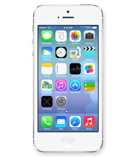
In case you were stuck in an all afternoon meeting, or took an afternoon off during yesterday’s WWDC 2013 announcement, Apple revealed its new Operating System design. Even if you are not an Apple Brand Advocate (anymore), your brand (launch) will be feeling the aftermath of the design language Apple just unleashed on millions of earthlings. Here is how I predict it will affect your brand design:
1. 2D is The New 3D

Icons lost their 3D look and this will finally spill back into the design of corporate identities. Days of pricey re-designs of Fortune 500 logos that basically added a 3D effect (AT&T, Capital One, Etc) are finally gone and simplicity in identity design will reign once again.
2. 50 Shades of Transparency

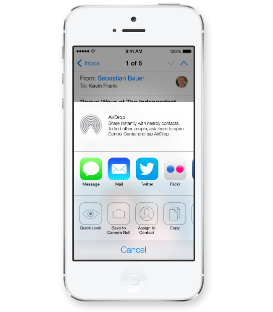
Apple’s use of transparency for navigational panels will trigger a move towards multiple translucent layers creating depth within digital interfaces. This would allow for multitasking and kill the traditional ‘top level navigation’ bar, allowing users to open multiple levels of navigational hierarchies based on transparency levels. Users will see the ‘page’ they are on while transparent layers will allow for unobtrusive ways of navigating down a couple of levels without ever leaving sight of your current ‘screen’.
3. White Is The New Black
Long gone are the days of black being the go-to color to convey luxury and sophistication. I predict layers of transparency quickly moving off screen and popping up across all media from print to on-air commercials, making white the predominant color (Is white a color you ask?) despite Pantone’s color predictions for 2014.
Images Courtesy Of Apple.
3 Crucial Brand Identity Mistakes You Can’t Afford To Make
You call it logo. We call it brand identity. Just sounds so much more important. Why? Because it is darn important. It is the visual platform to all of your new brand’s communications. It is the visual foundation of the house you are about to build; the eye candy and sex appeal; the quick read ‘know it all’ brand identifier. Getting it right is an art. If I can give you only 3 pieces of advice before you dive head first into crafting this – did I say important? – piece of design with your agency or freelance design partner, these are the ones to keep up front and center on your dashboard throughout your journey:
1. You Want It To Be Everything
You (will) have many ideas for how your new brand’s logo should look and what it should convey. I am here to tell you, sorry, you can’t fit them all into an identity design. You can try, but you will fail and you will suddenly find yourself not communicating anything at all. Your logo will look more like a painting of sorts and it will confuse rather than educate. Great identities convey one or two messages and they work because they do just that: They have a focus. They focus on the most important message through concept and visual target audience appeal through colors and typography. Ask yourself ‘What is the big idea and who should it cater to?’ A brand identity is a simple mark not a canvas. At times you are able to convey multiple concepts by refining areas of the logotype or mark, but it’s a lengthy and diligent process. When we re-branded Creative Talent Agency Match a few years back, we were able to communicate the symbiotic relationship between client and talent agency as well as talent and talent agency through typography that is co-dependent. We further use the letter A as a stand alone mark that signifies a computer cursor, which describes the online nature of the agency in a subliminal manner. Yet the identity does not look busy or complex. It’s a simple concept that is hiding subliminal messages within.
2. You Get Stuck In The Present
Don’t think of today. Think of tomorrow. Create an identity that not only will convey who you (company/product/service) will be in a couple years down the line, but also will keep connecting with your audience three to five years down the road. Don’t make it hip. Create something that has the ingredients to be timeless. We created the below identity for Don Joaquin’s line of Guacamole eight years ago and it works just as well in today’s overly crowded marketplace as it did back then because we focused stylistically on tradition while forming timeless emotional connections with the consumer. There was nothing hip about it then and there’s nothing hip about it now, and that is why it works.

3. You Want To Fit In
Your identity should surprise the segment you are about to disrupt. Show your competitors and consumers alike that there is a new player in the field. That alone is often the key ingredient for the initial purchase, or call – out of intrigue. Just like that funky tasting soft drink you tried out the other day because it looked so different and enticing, you just had to give it a shot. If your product or service is not like all the others, your logo needs to stand tall behind that claim and represent it visually as the key creative element that will be on all your outreach materials. When we crafted the identity for an online music service that promised to shake things up amongst traditional record labels, we decided to return the power of music to the hands of the individual, may that be the artist or the listener. It made a statement and conveyed disruption. Soon after launch the CEO told me that a complete stranger stopped him while wearing a company T-Shirt and said ‘The power of music, that’s a great shirt man.’ Little did he know it was a brand mark.

CATEGORIES: Your Brand Launch: Identity
The top 5 must-do’s for your tech startup brand launch
![]() Jason Calacanis, founder of Silicon Alley Reporter, Engadget, TechCrunch 50, LAUNCH, This Week in Startups as well as his new venture, Inside.com, asked me ‘What are the most important things you’ve learned about launching?‘ Here is what I wrote him:
Jason Calacanis, founder of Silicon Alley Reporter, Engadget, TechCrunch 50, LAUNCH, This Week in Startups as well as his new venture, Inside.com, asked me ‘What are the most important things you’ve learned about launching?‘ Here is what I wrote him:
1. PICK A PROCESS
There are many processes to launching your tech startup. Choose one that works for your personality, budget and within the culture you are about to create.
2. TEST AND FAIL
Test and fail and test and fail. You should invest in creating your brand only once you really understand your target audience’s behavior and true needs.
3. LAUNCH AS A BRAND
Launch as a brand, not a startup that may develop into a brand. Launch by design. Design relates to the process you have to adhere to, but furthermore it truly is design that holds the key to early brand success. Graphic design, brand identity design, and web design will set your offering apart at the time of launch.
4. TAKE NAMING SERIOUSLY
Naming is crucial. You can’t change the name of your kid once they are in puberty. The name you choose at launch will remain with the brand forever, so don’t settle for a placeholder name that just happened to make it into beta because the domain was available. It’s an art, science, and legal matter, so make sure it doesn’t get overlooked.
5. LISTEN SELECTIVELY
‘Opinions are like @**holes, everybody has one‘ – choose wisely whom you listen to, which opinions you implement, whom you exclude from certain conversations and why. Have a ‘stakeholder opinion plan‘ in place from the start to make it easy for you to adhere to and eliminate the unease of hurting people’s feelings or having to re-do certain phases of your project because you did not listen to the right people at the right time.
Your new brand’s logo cannot be hip
I was asked the question, ‘What current trends in logo design do you truly hate?’ at a panel discussion at NYU back in December. I felt it was time to manifest my strong feelings towards trends in logo design. It’s an oxymoron. A logo shall never be trendy. Trends come and go, your brand identity is created to stick around for a mighty long time, hence ruling out even the remote possibility of making it trendy.
Your logo can still be modern, exciting and speak to a young audience – it just can not look like a trend. How would you know? Your idea might have been derived from something you saw, maybe you liked it because it looked hip – maybe you’ve seen similar logos before and you felt yours should follow the lead. Don’t. Lead rather than follow. First with your logo, then with the rest of your brand.
Hip logos? X that idea out.[Click to Tweet]
I hope the very painful overly retro compilation below will make the point even more convincing. If it’s a trend, others will follow and you will end up blending in, and there’s nothing hip about blending in. It’s tough because you thought you finally had the chance to jump on the hip bandwagon. Your logo is not the right channel for that, but you can always use a one-off campaign to do something trendy with your brand instead.

Hipster Logos


