Tag Archives: Anton Corbijn
I Am With The B(r)and: 5 Ways Your Next Brand Launch Can Benefit From My Obsession With An 80’s Band
I was 8 when I purchased my first Depeche Mode record. I was fooling myself. I did not make this (rather big at the time) purchase because of their music; instead it was the first colored vinyl record I have seen and I fell for the surprise and sheer beauty of it. It was different. A couple of colored Depeche Mode records later I actually started enjoying their innovative electronic sound, because that too was different. And as all of the b(r)and touch points started lining up for me over the years, I turned into a fan.
When I was 18 I took my first step into entrepreneurship by organizing, designing and hosting a concert After-Party in Austria making my first $20,000 (and since had the opportunity of sharing a drink or two with the band on several occasions). The band’s visual design language was mainly crafted by photographer/director Anton Corbijn, who I cite as a major reason I turned to study Graphic Design, enabling me to do what I am doing today. Corbijn also later served as a key inspiration for my photography. Needless to say, my interest in this band for the past 30 years has a deep and personal meaning as it helped inform and somehow shape my own identity.
Over the past weeks I have watched the band perform on its current tour (yes, they are still around) and it gave me time to reflect and think about the sheer power, and design-driven innovation of this band, and how any new brand could benefit from it.
Generally, any band launches a new ‘sub-brand’ every 2-4 years. They call it an album release, but really it is a sub-brand with many objectives that need to be met. The design language needs to introduce a new era of the band that conveys the purpose, signifies change and disruption (‘growth’), yet remains close to the brand’s manifesto. It needs to be able to gain new followers while giving the loyal brand enthusiasts enough nostalgia to hold on to. And of course it requires to be highly adaptable, inspiring the visuals and merchandise for a world tour (a major financial reason for the introduction of the sub-brand) and single releases while being simple enough to turn into an avatar or a fan’s tattoo. Not a short list of brand launch objectives.
Here are some tricks of the trade that I witnessed following a b(r)and over this peculiar long period of time. The least my strange addiction can do is help you create a better brand. Here’s what you can learn and instantly implement during your new brand introduction:
1. Announce A New Era
Your new brand is put in place to do something that has not been done before, or at least not in this particular configuration. Make sure your Brand Atmosphere shows that you are here to disrupt.

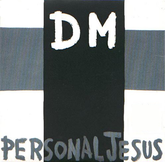
Depeche Mode kicked off their most successful album of all times (Violator, 1990), with the single Personal Jesus, which was highly controversial by its name alone. The simple cross added to it, making DM the crucified. After a big breakthrough record (‘sub-brand’), releasing the first single without the b(r)and’s name on the cover showed attitude, confidence and promised innovation.
2. Allow For Easy Adaptability
Ensure your brand identity stands out, is meaningful and relevant, but always keep it extremely simple to allow for easy application by brand adopters, employees, vendors and of course your groupies.

Over the years the band created variations of its b(r)and initials coupled with simple icons that allowed for versatility with stage projections and merchandise, but above all enabled fans to easily create art and avatars to turn into adopters of this particular time of the band’s journey. Above shows a collection of these icons as put together by fan Luce Lambert to form the DM initials of the band’s current record.
3. Create Buzz Through Innovation
If you innovate through your brand marketing, people will notice, and that’s the first step to create a following. The more unique, the more interest it will generate and the more press your brand will receive in return. Yes, unique design will lead to sales.

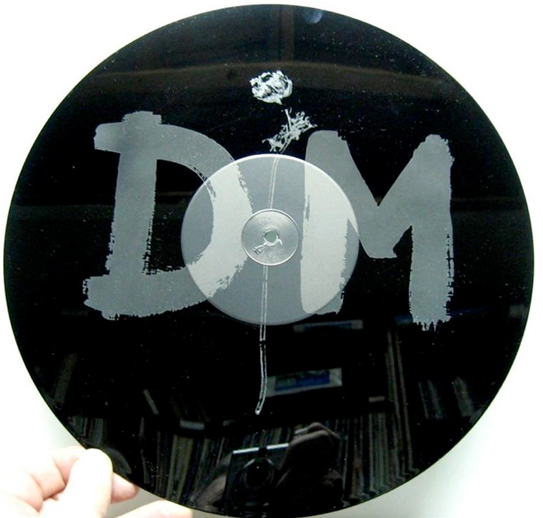
For a limited edition of the band’s mega hit ‘Enjoy the Silence‘, it featured a 15 minute remix of the song on one side while the b-side featured no music at all, but an etching of the band’s identity instead.
4. Explain Value Through Imagery
“Words are very unnecessary, they can only do harm,” is the chorus of the band’s biggest hit, which you may recognize. Music art relies on imagery and imagery alone. In a world of infographics, A.D.D. and information overload, your new brand should adopt that mantra and say less with more…imagery.
5. Create a Brand With Charisma
Nearly a given for any band leader, it also holds true for your brand launch. If you strategically infuse a brand character into your launch, it will instantly make your brand more likable. That persona could be the CEO (‘Richard Branson‘), a fictional character (‘Mr. Clean‘) or a spokesperson hire (‘The most interesting man in the world‘) that embodies what your brand stands for.

I took this photo of Depeche Mode’s lead singer, Dave Gahan last night at the Staples Center in Los Angeles. Gahan is working the stage and the female audience alike, and became a major driver in the b(r)and’s longevity.
5 b(r)and takeaways that I firmly believe will make your brand stronger at launch. Now look at your own small obsessions and find out why it makes you say ‘I am with the brand,’ then share your findings with us.


