Tag Archives: Brand Identity
Brand Colors – Not A Science Nor An Art, But A Strategy
Life is full of give and take, and so at times one finds himself partaking in experiences that one would usually not seek out on their own. My lovely wife convinced me to partake in one such experience last week. We visited the ‘guru of aura photography’ as she made a rare L.A. stop – in form of a popup inside a hip retail shop – and had our pictures taken. Yes, there is such a thing, and it’s apparently currently not just a thing, but the thing. Gwyneth Paltrow does it, need I say more? And now, so have I.
Please, go ahead, meet my aura:

As it goes more often than not when opening yourself up to new experiences, this actually was quite enriching. It was fun to partake in a mythical-visual experiment of sorts, and my aura seems to be in good shape too; can’t you tell? Well, perhaps you can, at least a little bit. As for me, without the detailed info (or shall I say ‘reading’) I received after the picture was taken, I only knew that blue/purple was about trust and loyalty, and comparing it to the many other aura portraits I looked at online, prior to receiving the professional insights, I realized that it had quite a personality of its own. Everything else that I learned about the meaning of these particular colors and their locations surrounding my image directly from the photographer, I would have never guessed by just looking at the colors without a full de-briefing.
That experience also quite nicely summed up my rule of thumb when it comes to the art and science of using colors in branding:
Many books have been written about how to use colors in logos, the meaning of colors and how colors make consumers feel. I even dedicated 3 pages of my book on branding to the significance of color. Color makes an impression and it matters, absolutely, but just how much should the deeper meaning of color, that us ‘branders’ know about, really influence you and your creative team when crafting your brand’s identity?
My advice to you: Don’t read too much into the meaning of colors. It’s less a science and an art than it is a strategy.
Just because blue stands for trust, your FinTech startup should not choose blue for its logo. Your restaurant franchise should not immediately pick yellow or orange as the key color ingredient because it evokes appetite. If you go by the book of colors, you will never stand out from your direct competitors as they read that very same book. As far as my book of branding is concerned, it’s all about you not blending in, and that includes the color choices you make.
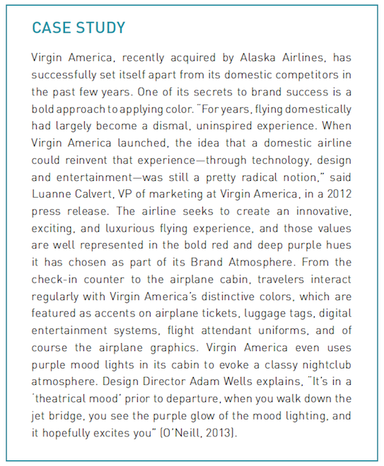
To celebrate Virgin America in light of the recent sad news, here is how they used color to stand out, via a case study from “How to Launch a Brand:”
Yes, colors matter, especially when you use them to stand out.
As you start researching the meaning of colors, stop. Instead spend ample time researching your competitor’s colors, then go the complete opposite route and pick colors that truly stand out within your vertical.
But, as most things in life go, this too is a give and take, so ensure the colors you and your creative team pick, as different as they may be from your competitors, will still support your brand’s personality and positioning. That may have been obvious, then again, so was my aura.
Does Your Innovative Brand Look…Innovative?

I see this sign every time I drive to my gym (I leave it up to you to guess how often that is, but let’s say it’s not as frequent as it should be). A tire company put it up and it always makes me smile and think about how wonderful of an industry I am working in; being able to collaborate with innovators, playing a part in what’s next, shaping the future one brand at a time. That sign also shows how, as an invention, the electric car category had to re-invent everything, including the industry terminology. (Electric cars do not have gas pedals, they have accelerator pedals).
And this brings me to my point: If you are starting an inventive, innovative – or may I even use the term – disruptive brand, does your visual (or verbal) identifier indicate that? Is your brand identity in line with your product or service, or is it falling right smack into the ‘Silicon Valley Crap Trap?’ What is that you ask?
Let me visualize it for you:
![]()
Now that is the Silicon Valley Crap Trap (pictured a few years back, a more modern take can be seen here).
All of these companies were innovative tech startups, all were real disruptors (yes, even vimeo). They worked hard to kick the status quo in its behind with their products, yet why did they all look the same, in that same crappy and uninspired way? Lack of money? Lack of inspiration? Lack of design skills? None make a good excuse given these are driven and highly talented entrepreneurs with a big vision. The answer of course is their determined focus on product (and product alone) that leaves all else, including the first thing people will see – the branding, crumbling in the dust.
Think about it (and this is where you come in): You are here to change things, to propel things forward. Shouldn’t your brand identity ache to stand out from the ‘competitors’, the landscape, the segment – just the way your product/service does? You can tell most of below brands from the unique shapes mixed with the specific color of their logos alone. Now picture a blue script font and ask: Which early tech startup comes to mind? Tough call…maybe Skype? Twitter? Any of the pictured above?
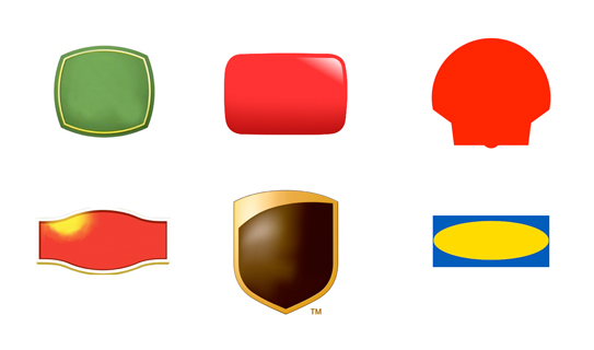
(You got it, but just to confirm, pictured from top left: John Deere, YouTube, Shell, Lipton, UPS, IKEA)
So let’s recap:
Your disruptive FinTech brand can not have a bank logo. Makes sense.
Your unique coffee bean brand can not have a hip coffee shop logo. Yup, we’d agree.
Your innovative…and on it goes – you get the point: Don’t fall into the trap and have your logo do what everyone else in your industry is doing unless your brand is doing exactly what everyone else in your industry is doing, in which case I digress and leave you to climb a mountain and ponder the bigger issues.
4 Crucial Steps You Need To Take Before Crafting Your New Venture’s Logo
Don’t hire us to create your logo. Not us, nor anyone else therefor. Sure, we could create a great logo for you. It would look timeless, be very well designed (I believe we are one of the best, and many agree), it would work across platforms and for years to come, and everybody would be telling you how much they love it. So why shouldn’t you hire us to create this important piece of branding for you?
Chances are you don’t need a logo designed. Not yet.
Chances are you need a brand built, and your logo is just a part of it. By creating a logo in a vacuum, and out of sync, you will likely fail. I don’t want you to fail. Nor be part of failure. I think we share this belief as entrepreneurs.
It’s the cart before the horse idiom: Why put the horse in place if we don’t know the message by the messenger yet?
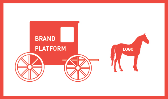
Below are 4 key elements you have to have in place prior to embarking on your logo design; they are the bare minimum requirements, the wheels of your cart so to speak:
1. You have a positioning statement in place that focuses on the ‘why’ and you stand tall behind it
2. You created 3 target audience personas that stand for who you are actually talking to/with
3. You know your brand personality and its associated keywords and are ready to act upon it
4. You have created a meaningful name that responds successfully to all of the above
If you don’t have these in place, creating a logo would be wasting your money, and (y)our time. It’s a lose-lose situation. How would any designer know what to design without these in place; how would the logo convey what it needed to convey; and finally, how could it connect with your audience? I don’t know, but I see it happen every day on the client’s expense.
Contact us if you need help getting there, as we love to assist and contribute, while speeding up that journey to your brand image.
The Main Obstacle That Stands Between You And A Successful Brand Identity
You created a robust business (or launch) plan and a solid brand platform. You hired a great branding firm to tackle the important task of creating a brand identity on time and on budget. What could possibly go wrong?
There’s one thing that can come between you and a winning brand identity: You.
Before you start your hate mails, think about it with me for a second. You have superior taste in art and design. You know your new service or product better than anyone else. You need to see it succeed. How could you possibly turn into a road block? Because of exactly these reasons you will want to create a brand identity that you will like. Colors that speak to you, shapes you like, a concept that resonates with you, fonts that feel current to you. That’s a whole lot of ‘you’ even though this is not at all about you, it’s about Julian, Rich and Adrienne. Your target personas. What you need to like is that your new brand identity will resonate and be liked by them.
Will you like the new brand identity design? You surely should. Does it matter if orange is your color and that you prefer sans serif typefaces? No, it does not. Nor does it matter what the Designer or Creative Director ‘likes’. What matters behind every creative decision is why it was made and how it will further improve adaptation by your customer. This is extremely difficult as an entrepreneur, or even CMO, to personally detach from, but it is what will make the brand ID a success for your audience and in turn for yourself.
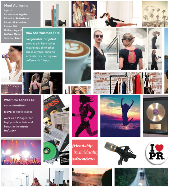
Meet Adrienne: Excerpts from a Brand Platform for a FINIEN client depicting Target Persona A
We advise our clients to dive deep into 3-5 target personas with us. We give them names, research and ‘listen’ to them. We encourage our more advantageous clients to create life size cardboard figures of them to place around the office. Next time you nod your head during a creative presentation and say ‘I like this, the colors are beautiful, the type is cool and the concept really resonates with me,’ take a step back and say ‘Adrienne would really like this, these colors disrupt her world just enough to stand out and I see her adopting the icon easily.’ You will like what you see say.
CATEGORIES: Blog Your Brand Launch: Identity
