Tag Archives: Brand Identity Design
Brand Colors – Not A Science Nor An Art, But A Strategy
Life is full of give and take, and so at times one finds himself partaking in experiences that one would usually not seek out on their own. My lovely wife convinced me to partake in one such experience last week. We visited the ‘guru of aura photography’ as she made a rare L.A. stop – in form of a popup inside a hip retail shop – and had our pictures taken. Yes, there is such a thing, and it’s apparently currently not just a thing, but the thing. Gwyneth Paltrow does it, need I say more? And now, so have I.
Please, go ahead, meet my aura:
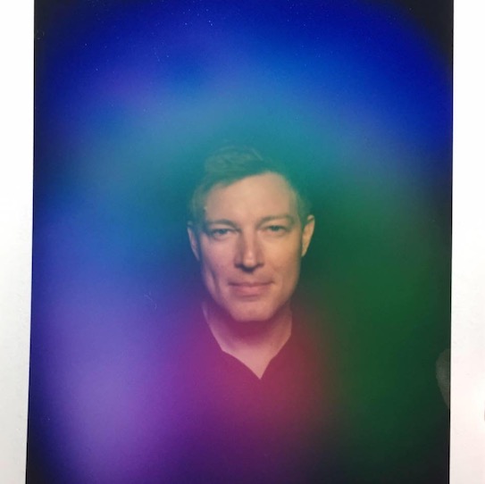
As it goes more often than not when opening yourself up to new experiences, this actually was quite enriching. It was fun to partake in a mythical-visual experiment of sorts, and my aura seems to be in good shape too; can’t you tell? Well, perhaps you can, at least a little bit. As for me, without the detailed info (or shall I say ‘reading’) I received after the picture was taken, I only knew that blue/purple was about trust and loyalty, and comparing it to the many other aura portraits I looked at online, prior to receiving the professional insights, I realized that it had quite a personality of its own. Everything else that I learned about the meaning of these particular colors and their locations surrounding my image directly from the photographer, I would have never guessed by just looking at the colors without a full de-briefing.
That experience also quite nicely summed up my rule of thumb when it comes to the art and science of using colors in branding:
Many books have been written about how to use colors in logos, the meaning of colors and how colors make consumers feel. I even dedicated 3 pages of my book on branding to the significance of color. Color makes an impression and it matters, absolutely, but just how much should the deeper meaning of color, that us ‘branders’ know about, really influence you and your creative team when crafting your brand’s identity?
My advice to you: Don’t read too much into the meaning of colors. It’s less a science and an art than it is a strategy.
Just because blue stands for trust, your FinTech startup should not choose blue for its logo. Your restaurant franchise should not immediately pick yellow or orange as the key color ingredient because it evokes appetite. If you go by the book of colors, you will never stand out from your direct competitors as they read that very same book. As far as my book of branding is concerned, it’s all about you not blending in, and that includes the color choices you make.
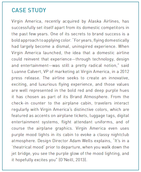
To celebrate Virgin America in light of the recent sad news, here is how they used color to stand out, via a case study from “How to Launch a Brand:”
Yes, colors matter, especially when you use them to stand out.
As you start researching the meaning of colors, stop. Instead spend ample time researching your competitor’s colors, then go the complete opposite route and pick colors that truly stand out within your vertical.
But, as most things in life go, this too is a give and take, so ensure the colors you and your creative team pick, as different as they may be from your competitors, will still support your brand’s personality and positioning. That may have been obvious, then again, so was my aura.
Does Your Innovative Brand Look…Innovative?
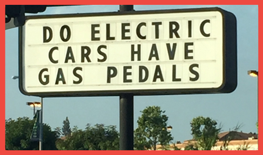
I see this sign every time I drive to my gym (I leave it up to you to guess how often that is, but let’s say it’s not as frequent as it should be). A tire company put it up and it always makes me smile and think about how wonderful of an industry I am working in; being able to collaborate with innovators, playing a part in what’s next, shaping the future one brand at a time. That sign also shows how, as an invention, the electric car category had to re-invent everything, including the industry terminology. (Electric cars do not have gas pedals, they have accelerator pedals).
And this brings me to my point: If you are starting an inventive, innovative – or may I even use the term – disruptive brand, does your visual (or verbal) identifier indicate that? Is your brand identity in line with your product or service, or is it falling right smack into the ‘Silicon Valley Crap Trap?’ What is that you ask?
Let me visualize it for you:
![]()
Now that is the Silicon Valley Crap Trap (pictured a few years back, a more modern take can be seen here).
All of these companies were innovative tech startups, all were real disruptors (yes, even vimeo). They worked hard to kick the status quo in its behind with their products, yet why did they all look the same, in that same crappy and uninspired way? Lack of money? Lack of inspiration? Lack of design skills? None make a good excuse given these are driven and highly talented entrepreneurs with a big vision. The answer of course is their determined focus on product (and product alone) that leaves all else, including the first thing people will see – the branding, crumbling in the dust.
Think about it (and this is where you come in): You are here to change things, to propel things forward. Shouldn’t your brand identity ache to stand out from the ‘competitors’, the landscape, the segment – just the way your product/service does? You can tell most of below brands from the unique shapes mixed with the specific color of their logos alone. Now picture a blue script font and ask: Which early tech startup comes to mind? Tough call…maybe Skype? Twitter? Any of the pictured above?
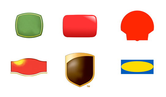
(You got it, but just to confirm, pictured from top left: John Deere, YouTube, Shell, Lipton, UPS, IKEA)
So let’s recap:
Your disruptive FinTech brand can not have a bank logo. Makes sense.
Your unique coffee bean brand can not have a hip coffee shop logo. Yup, we’d agree.
Your innovative…and on it goes – you get the point: Don’t fall into the trap and have your logo do what everyone else in your industry is doing unless your brand is doing exactly what everyone else in your industry is doing, in which case I digress and leave you to climb a mountain and ponder the bigger issues.
The ‘Concierge For The Masses’ Movement And Your Logo: 3 Ways To Partake Instead Of Being Left Unnoticed
Taking an Uber to my meeting I decide to stop on the way for coffee. 5 minutes ahead I use the Starbucks app to place my order. The app knows what I like, so creating my ‘warm’ double-tall-nonfat cappuccino with extra foam is a matter of one single tap. Rinse will swing by tonight to pick up my dry-cleaning for the week. By that time my living room furniture from Greycork should have arrived. All of it. I will assemble it without tools in 4 minutes, just before the dinner ingredients arrive at my door step. It’ll take me 10 minutes to make my farm-to-table dinner with Gobble tonight. My wife will be impressed.
Welcome to today. Slowly we adapt to a new way of doing things, and rather quickly are we getting used to it. Automation is the norm. Tech startups introduced us to what I dub ‘concierge service for the masses’. What used to be a luxury, is now expected. What used to be ‘disruption’, is now advancement.
Today we have very long brand memories of very short brand experiences. Those experiences are being supported by the icon we tapped, the actions we took, and the visual brand language that supported us along the way. Todays’ brands are built on the interaction of experience and flawless design. The first touchpoint more than ever is the logo/icon, which in many cases you simply tap to start your journey with a brand.
How much brand design remains with us after our experience? How much does a logo matter when we swiftly tap and move on? Here are 3 tips that will assist you when contemplating your next logo design, or current logo re-design, while keeping today’s consumer behavior up front and center:
1. You Have 8 Seconds To Communicate
Brand identities in today’s age need to focus on, and re-iterate, the essential qualities of a product or service in the simplest way possible while conveying more than ever before. Us humans are becoming more visual. Our attention span has dropped to 8 seconds before getting distracted. Put the two together and your logo turns into a key asset when communicating your overall brand, because it is one brand element users can not opt out of. Oftentimes it presents the only way to opt in.
2. Your Icon Has Its Name For a Reason: It Demands To Be Iconic
Since no one reads the marketing copy that went through twenty iterations to finally make it onto your web site (no one, but you, and perhaps your team since you are paying them for it), it just ends up turning into an annoyance to many users. It’s a road block to get to the images or the video that describe what you are trying to say verbally, in a stimulating visual way. In this visual journey, the logo mark and associated logotype turn into the focal point that is being associated with the brand experience when it comes to apps, and that spills over into our behavioral patterns outside the ‘digital realm.’ The more iconic your mark and typography, the more it’ll differentiate and stick in people’s minds. Today more than ever before, this becomes a do or die for logo designs, or call it an app icon if you will.
3. Make Your Logo Smaller. Even Smaller.
While brand identity designs needed to function at small scale, because they had to be fed through a fax machine in black and white and still be recognizable (hold their shape), yet convey the same meaning as when they were shouting from a billboard, the rules have not changed. The roles have changed: We can now, for the most part, skip the black and white version of your logo design, but your logo will live in the tiniest of social media avatars as well as (quite often) the app store. So small is – still – beautiful; it has to be.
As the consumer comes to expect simplicity and swift completion of tasks in a straight up user interface, we need to look at the creation and usage of a product or service logo in a different way to further evoke and support this experience. With lifestyles changing dramatically, so does our interaction with brands. Now that ‘the concierge service’ movement is turning mainstream, expectations of your brand are changing.
Make your logo your support during this change: A trusted friend that will bend over backwards for you and your followers; it will adjust during stormy weather; it will talk to even the ones that will only give it one second of their time. Most importantly, it will always strive to form a meaningful connection with each and everyone of them. And then when you hit the pillow at night it will keep on working for you while your Fitbit will be busy calculating your sleep pattern.
CATEGORIES: Blog Your Brand Launch: Identity
How Subliminal And Hidden Design Messages Can Boost Brand Engagement
This article was first published via Mashable.
A handful of brands keep their loyal advocates excited and engaged by using hidden design language to tell the bigger stories in a highly visual, yet subliminal manner. And that is exactly why we are drawn to them: We seek to be “in-the-know.”
Secretive design language is widely used on web sites as “Easter eggs,” within products as hidden features, as hidden offerings by food providers (In’N’Out’s secret menu or Bible citations on the packaging, for example) and even on passports as security enhancements, like Norway’s next passport design.
Utilizing design secrets to share underlying themes is a powerful brand statement — one that helps gain buzz and keeps believers lining up for more.

Very much like the speakeasy that has no sign out front and is incredibly hard to find, we are attracted to brands that challenge us intellectually and hide elements from plain sight. Seeing and connecting them makes us feel special, and that is one wonderful feeling that a brand can trigger within their audience.
Here are two ways your brand can turn to the subliminal to get its audience engaged.
Opportunity 1: Let Your Brand Identity Speak Through Design
Brand identities, or simply ‘logos,’ are the most common place to find hidden messages and deeper meaning at the very top of the visual brand pyramid. The arrow between the letters ‘E’ and ‘x’ in the FedEx logotype is the go-to example for subliminal messaging in logotypes, but you can find them all around you.
As shown by Amazon’s “delivering a smile and products from A-Z” and Baskin-Robbins’ “31 flavors,” key messages are often hidden within a logo. Today’s clever tech startups that understand the power of brand story telling are right on their heels.
A brand’s identity needs to say many things, and graphic designers go beyond the obvious to achieve all, or at least most, of the objectives, having to pull out some visual tricks to fit them all in. Once the audience finds out about a hidden element in the brand identity, it feels more connected to the brand itself, as if it’s part of their secret.
We love sharing that secret with others. Today, we call that virality. Your logo alone can get people talking about the deeper meaning behind your brand.
Opportunity 2: Add Unexpected Layers to Your Brand Atmosphere
Your Brand Atmosphere is your visual foot print. It is what your audience sees when they get in touch with your brand image. It’s everything from your collateral and online presence to trade show booths and your email signature. Brand Atmosphere represents another opportunity to tap into the power of hidden design language.
When my brand consultancy was asked to create the visual image for Martian Ranch and Vineyard a few years ago, we were thrilled to learn that the name actually stemmed from the founding couple’s sons, Martin and Ian. Cleverly, they put the two words together to formulate a name for their next big offering, the winery Martian.
Given the name, the client’s directive from the get-go was to craft a Martian character to grace the wine labels and represent the Martian brand. My agency, however, did not love the thought of being greeted by a Martian, not with a $22-$35 bottle of biodynamic California wine and a brand that stands for much more than what the name implies.
Ensuring a happy ending, or a happy landing so to speak, we allowed the Martian to make its way into the brand’s design, but we restricted its appearances in a refined manner. When a consumer opens the bottle, for example, Martians are dancing around the cork, drinking in a festive manner.
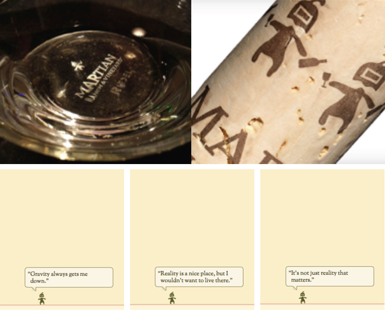
Then, when a site visitor goes to Martian’s landing page (no pun intended) for longer than 30 seconds, a tiny Martian character beams itself onto the site. It shares random thoughts like “Reality is a nice place, but I would not want to live there.” Needless to say, the Martian hunt was on and the buzz quickly spread, one glass at a time. All it took was one extra layer being subliminally added to the design language.
You need to dig deep into the core values of your brand. Is it humor, like Martian, or is it choice, like Baskin-Robbins? Incorporating hidden design language that speaks in unison with your brand values is useful and cost effective; you’re already going to pay to develop your brand’s identity and visual atmosphere.
Let the cleverness of your brand speak quietly, and you will hear the echo from your audience.
Make Your New Brand Image Bland And Unmemorable
…was the advice I gave an entrepreneur last week. Wait, did I just really say this out loud? Yes, and here is why:
Like many entrepreneurs at the early (very early) stage, he was at a point where he needed to have a brand presence, just enough to get him through meetings looking legit. A business card in hand, a Powerpoint design to show and a web site to link back to. He was at a point where he needed to discuss his new venture in a professional manner with potential collaborators to further shape his concept. There was no outside investment and the core of the company strategy could sway depending on these initial meetings. It was not a time to invest in brand design, it would put the cart in front of the horse. So what to do?
There was no way for him to create the brand design the right way, so instead of applying any kind of distinct design language (making it memorable), he thought to make it “meh.” Make it bland, make it colorless.
I sincerely agreed. In this very rare case you actually do not want your brand image to stick in your customers minds.
People should be educated about what you do and who you are, but you should not create a memorable brand design and language around a very early stage concept if you know it will all change, very soon. Once the startup strategy is formulated, the brand can be shaped.
So go out there and have them call your number rather than recall your brand image.
