Tag Archives: Brand Launch
How to Match Your New Brand Name with an Appropriate Domain Name
Naming your brand successfully (see our White Paper on this topic) and formulating your domain name go hand in hand. Every startup has different needs when it comes to domain ownership. Is owning your .com domain outright the only way to go? Or are there other ways you can have success with a creatively modified domain? Even if you have already answered these questions, factors such as domain availability, pricing, and trademark rights will all influence your final decision. In this white paper we offer a personalized guide to help you make strategic and informed decisions as you go through the process of choosing your new domain name.
Download our free white paper to learn about:
- Branding your domain name
- The process of choosing a domain
- Purchasing a domain from an existing owner
- What to do when the .com domain name for your brand is unavailable
- How much money is a .com domain worth?
- Alternatives to “brand.com” ownership
Simply enter your email address to download.
We will use the information you provide on this form to send you insights and, at times, marketing emails about our services. You can unsubscribe at any time through a link in the footer of any email from us. For more information, please read our Privacy Policy located at the bottom of this page.
CATEGORIES: White Papers
Launch Glocally – Not A Choice, But A Necessity
It is a fact, we have all gone completely glocal!
To think about cultural diversity means inclusivity, not exclusivity. It speaks to today’s Zeitgeist. You think globally, but you act locally – it’s how we live our lives today and it’s how we launch brands today, which leads me to your very own brand launch.
Your new brand will be exposed to a global audience from the get go even if you set out to create a very local or regional brand. Plan your brand launch around a very specific and narrow audience (you need that focus), but craft your brand name and design to have a unified global appeal in order to be embraced in other markets. Your positioning and core values should work globally, but a local strategy is where you touch communities.
Thinking global mitigates the risk of depending on one country or region’s economy for your success – you can easier move towards new markets if you think globally from the start. As a startup you don’t want to alienate future markets. Even if you intend to create a local-only brand, cultures within most regions are diverse, so by thinking global, you will ensure in a worst case not to offend, and in a best case to attract a larger, more diverse audience. Additional glocal incentive, if you needed it: Investors want to see global thinking and ambition and will likely make larger investments in your venture.
So how do you get there? Keep these 4 rules in mind as you develop your brand:
1. Craft and test
Carefully craft and test your brand name, brand identity design and brand voice to make sure it is globally accessible and acceptable
2. Position universally
Find universal values or truths that you can leverage with your brand positioning
3. Think 10 years
Think about how you want to have impacted mankind with your brand a decade from now. It will make you launch as a global brand, nearly guaranteed
4. Hire diversity
Employ staff with international experience and a global view, making you an authentic glocal venture from within
With these in mind, you should be in the right state to go completely glocal! You won’t regret it.
—
Marissa Hui, a key influencer of FINIEN’s naming and design strategies for our clients over the past years, is a contributor to this post. As Marissa is moving up North (onwards and upwards as they say), I want to take this opportunity to thank her for all her hard work, also on behalf of those readers who had a chance of working with her. Farewell Marissa!
CATEGORIES: Blog Your Brand Launch: Brand Strategy
Launch, Limited.
Swedish car maker Volvo sold all 1,927 First Edition XC90 models within 47 hours – online-only. Now you can get on the waiting list. Their mini site states:
Only 1,927 all-new XC90 First Edition cars will exist in the world, and each one will be individually numbered. More than a number, it’s your story. A moment in time marked on each First Edition. Made for you.
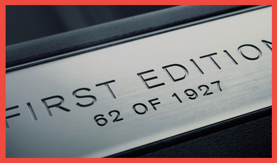
Taken from the Volvo XC90 Limited First Edition website
Limited sells.
Mankind has a fascination with exclusivity, it forms an immediate bond, one that is hard to establish through traditional marketing campaigns. As a startup you should think about ways in which you can promote your initial offering in an exclusive manner to make for that unlimited brand experience.
A powerful story and drool-worthy design will have to be at the foreground of your offering, word of mouth will stand tall behind it.
A limited splash, with expansive waves? It might just be the right strategy for your new venture.
The 3 W’s That Will Make Or Break Your Website Launch
What’s important when you launch your brand, besides your crystal clear vision and superb offering? Great brand strategy and positioning, a name that resonates with your target, a brand identity design that can grow with your new venture, and of course it all comes together in one crucial place: Your key online presence, your website.
Much can be read about user experience, information architecture, programming languages and SEO. None of which I will repeat, and much of it I see as knowledge that you will eventually receive from your web design and programming teams. And then comes the time where they will ask you for copy and assets, and that’s where it all breaks apart.
Today, I sum up the 3 most important questions you, as an entrepreneur, need to have clarity on in order to create your brand’s site, the www’s of www design:
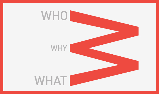
1. WHO
Who are you talking to, who will you engage with? Ensure you have them up front and center, and not your typical pitch talking points, product specs or service capabilities list. Think about them. Then write for them, talk to them.
2. WHY
Why should they care? Care to click further, care to leave their E-Mail with you, care to spread the word, care to contact you? What do you want them to care about? Focus on those questions and provide answers that make them care – the way you want them to care. Many online marketers make CTA’s (Call to Actions) larger. You instead, make the copy and visuals resonate. If they care, they will click. Guaranteed.
3. WHAT
What are you selling? No really, what is it that you are selling? We are selling branding for new ventures, but really we are selling brand launch enablement and peace of mind. What are you really selling?
Once you are clear on your 3 w’s, everything else will derive from it. If your consultants focus on CMS, responsive design, site architecture and everything else but these questions, make sure to put the breaks on the project. These 3 w’s will bring your brand launch online the right way. The rest is the engine of your car, which should be reliable and powerful, but if no one likes the design, the color, the badge and the comfort, no one will ever open the hood to take a closer look.
CATEGORIES: Startup Advice Your Brand Launch: Digital
Launch It Like You Mean It.
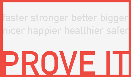
Are you working on a brand that will launch because the offering is faster? Bigger? Better? Nicer? Perhaps Healthier?
Likely, hopefully, your brand voice and messaging will reflect that claim just as much as your R&D, but if you have the guts (which most entrepreneurs don’t have when launching a new, especially their first, brand) don’t just say it, but prove it by setting it into action!
Now, badass as you are (what a word!), you will build your entire launch strategy around proving your promise. You are ready to be outrageous. If done well, you will stand out, rise to the top, and be remembered, even before your product launches. Yes, you will move tons of product while doing so.
Not a brand launch by any means, nor a unique claim, but T-Mobile is pushing those buttons with a current campaign entitled ‘Test Drive’. Sounds normal. Then you realize T-Mobile is willing to send you an iPhone so you can try their service for free for a week. We are talking “unlimited calls, texts, posts, likes, streams, and downloads,” then 7 days later you just drop it off at the nearest T-Mobile store. Boom! Done! Tested!
Now that’s convincing.
Best of all, the bigger the promise, the less people will actually take advantage of it. Instead, they will just believe you. Your claim turns into a tested reality just by you offering to live up to it in public. If you are ready to do something big that proves your big claims, the message your target audience will receive is simple: Full trust in the promise.
For a new brand to gain that trust pre- and mid-launch can mean nearly instantaneous success. Early brand success, built on founder’s guts.
PS: Make sure you can walk the walk – from a product/service claim as much as from an affiliated promotional offering POV: When Austrian dessous brand Palmers promised a free inner-Europe flight for every purchase made above €100 this September, they had an outrageous claim, which had nothing to do with their product, and on top it was completely miscalculated. Instead of delighting their customers with a jetsetter lifestyle, they sent their brand fans on 8 hour journeys from Vienna to Amsterdam, a typical 2 hour non-stop flight. Demand was high, and flight availability was (as it always will be) limited. They could have known, …and so can you. Now go make your big brand claim, live up to it and launch with a bang.
Your New Company’s ‘Stick’ – When Branding Helps Create And Save Your Venture
Ask yourself: Am I about to launch a product/service, or a brand?
How would you know?
You may not have a direct competitor yet, but you soon will. When the innovative, new and unique wears off, competitors will offer your product at a lower cost. How will you keep your customers from choosing their product instead? What will it be that will make your offering stick? Too many startups have to re-invent, re-brand and re-connect once they find traction – at a high cost.
If you have a unique offering combined with ‘the stick’ – the set of true differentiators, the emotional connectors that deliver from the inside out, consistently on message (visually and verbally) and on target – you know you have a brand. Having that foundational special ingredient is like a survival formula for your startup, it will make customers come sooner, faster and stay around even if they could save a few bucks elsewhere later on.
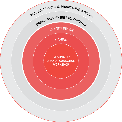
@i_mdoughboy tweeted the following last week about my consultancy’s process chart (see below): Guess where the value is? Here’s a hint – the graphic is eerily similar to a bullseye.
Imagine you are a gifted craftsman that has mastered a unique design that you developed over the course of years just to sell very few and at a high price as you don’t have the audience nor infrastructure. You created something truly unique that only you offer. After years of work, but only a few units sold, you see your design offered at a fraction of the cost at a large retail chain. It happens daily. Examples are too many to give, from apps to shoes to frozen yogurts, and all across B2B services. The only real life insurance you can have, besides a unique product/service to start out with, and its correlating trademarks, is to have that ‘stick’, those emotional brand differentiators that spread across product, service and your Brand Atmosphere. Those are hard to replicate.
If they like your product/service, they might come and purchase it.
If they love your brand, they will come and purchase it, return to it, and stay with it.
(Only read further if this hits home and you are an entrepreneur that is looking for their offering’s ‘stick’)
Avoiding the trap is hard to do for startups, being strapped thin on time and money, hence they often launch blindly, solely focusing on the uniqueness of their offering and not that of their brand. We saw this as a huge issue facing early stage entrepreneurs. Over the course of the last 6 months (based on our 12 years of experience running a branding and design agency, and with the help of writing a book on the subject) we were able to create an affordable ‘overnight’ remedy to avoid that trap. This is a huge reveal for us, which I am thrilled to share with you via this post: Meet our Resonaid™ Brand Foundation workshop, where I spend a full day with you, one-on-one working through a proven, proprietary process to find the path for your new brand to emotionally connect with your customers from the get-go and for the long term. I have one date left available this month and a few in April. Contact me via fgeyrhalter@finien.com if you are interested in learning more about this customized workshop to find the brand ‘stick’ for your startup.
PS: Yes, there is a great book entitled ‘Made To Stick.’ You should pick it up, it discusses why some ideas thrive while others die. Rather appropriate in this context.
Tackling Your New Brand’s About Page: 4 Tips On How To Say Less, Edit More, And Make It Resonate
I was born in Austria. English is my second language. Yes, I write a lot, but I do it because I want to share my expertise, not because I believe that I am a great writer. Yet today I set out to blur the lines of copy writing, branding, enthusiasm, content strategy, your target audience and content overload. Launching your brand puts an emphasis on the About section of your web site, no doubt about it. Even if you have a video and to-the-point messaging on the Landing Page(s), the About page will be sought-after. It needs to explain the following in a swift manner:
- What you do (Mission/Product Or Service Intro)
- Who you do it for (Target Audience)
- How you differ (Differentiators)
- Why I should care (Connect Emotionally/Value Proposition)
- What I should do next (Call To Action)
That’s a lot to convey on a single page and therein lies the problem for an enthusiastic entrepreneur who writes this important piece of content in a stream of consciousness (it is after all the subject you know best), then quickly proofs it, and by the push of a button publishes it. Rarely do they look back. Yet another item checked off the busy to-do list. Then the journey of marketing and metrics hits in and the About page, long forgotten, is like ‘a ghost employee’ in a well functioning company; it lives on yet it should have been let go and replaced a long time ago.
I know this feeling well. I see it on a nearly daily basis with our new clients, but I also fell victim to it myself. Here are my top 4 tips on how to go about deriving your About copy:
1. Find A Time And Place
It has to be right. You can’t just block off an hour on your busy calendar. It has to be more like that moment when you drive to the beach to just sit and breathe and think big thoughts. Make the time for that moment and don’t put a time limit on it. For myself that moment arrived during a 12 hour flight after I have answered ‘all’ E-Mails and there was no WI-FI for new ones to trickle in. I watched the Steve Jobs movie (Inspiration 1), had a glass of wine (Inspiration 2), the cabin lights went out so everyone could sleep (I was in Coach – Inspiration 3), and I knew if I started writing now that I had hours and hours to fine tune and contemplate. And so I did – the time and place were right. Best of all, even if I wanted to, I could not just push it live as I did not have WI-FI, so it forced me to sleep over it and make even more tiny edits when ‘back on the ground.’ It took me 3 hours to write.
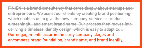
Edit, edit, pause, then edit some more.
2. Think In Words, Not Sentences
Words should not come easy (Ask F.R. David, he knew). If they do, consider it a brainstorm exercise, then work on a synopsis of that copy. Don’t cut paragraphs, don’t review sentences, dive deeper and focus on it word-by-word. In the end your About copy should be thought of as a lineup of tag lines, because in a tag line every word counts, has meaning, adds to your brand story. Think of each word as a strategic component to the whole.
3. Read It Like They Would
Once you feel you phrased it in just the right way, make sure it will resonate with them. Sounds logical, hence easy, but it is one tough role play: Write in an emotional and enthusiastic manner that conveys your brand’s soul, but then read it from the perspective of your target audience. It helps when you created target personas, that way you can read pretending you are that specific person. If time allows, run it by your target audience and conduct a mini focus group, or even A/B testing of different About pages, to see what sticks.
4. Edit, Then Edit Again
Make it as simple as possible. Make it as short as possible. If you need to, add links to further content below your CTA (Call To Action). No one reads a long About section. No one. Rather go through steps 1-3 and then edit it down again and have something your audience will actually be compelled to read, because it is short and approachable. This is about getting them excited to keep going further, to click deeper, it is not the page that needs to convey everything, but ensure it has the 5 components listed above embodied.
In a study of user tests it was discovered that users with higher literacy levels also fared better on web sites written for a lower level literacy audience. So keep it brief and keep it simple. I guess I should go back and edit this post, but I don’t feel too bad keeping it this length as someone just released the book ‘Brief: Make a Bigger Impact by Saying Less;’ it spans 256 pages.
CATEGORIES: Startup Advice Your Brand Launch: Digital
What Is An Entrepreneur’s Biggest Pain Point When Launching A Brand? The Answer May Surprise You.
Working with startups on developing new brands on a daily basis, we had a pretty good idea about our clients’ key struggles, but we reached out to entrepreneurs purchasing our book and asked them what they perceived their biggest hurdles to be. Here are their top 3 pain points:
1. Positioning my new brand (46%)
2. Developing a successful digital presence (21%)
3. Naming the Brand (14%)
Are you surprised?
I was.
Not about the fact that positioning is the most important component of a brand launch. After all, it is the one that takes the most out of entrepreneurs as it requires a refined mixture of many diverse skills – creativity, industry insight, foresight, process and honesty (among others), and it is something that is very hard to create in a silo. What did surprise me was that entrepreneurs see the importance of positioning so clearly and that they are humble enough to acknowledge the DIY approach might not suffice when it comes to this aspect of their brand launch.
Positioning is at the core of brand development, it forces you to answer the question Why, long after the questions What and How have been settled in your mind and you have decided that there was a need and you had the means to start that new business, or create that new product. The direction of the business has been set, but the direction for the brand has yet to be created (and synced). I believe most entrepreneurs start diving into positioning (and the overall creation of the Brand Platform), too far down the line, which adds to the fact that 46% of our respondents see it as their core branding issue.
What is, or was, your biggest pain point with your startup? Do you agree with our readers’ responses?
If you are struggling with positioning, we created a white paper on the subject (free download).
CATEGORIES: Blog Your Brand Launch: Brand Strategy
Why Our Brand Consultancy Doesn’t Have An In-Your-Face Splashy Logo
For a consultancy that has a clear focus on brand creation, you might have wondered at some point why we did not create a stunning icon or a splashy in-your-face logo for our own company. Are we not following our own rules, are we lazy, or is there a different strategy at play? Ask no more, the myths will be busted today.
 I decided early on, even with my former company, Geyrhalter & Co, that designing a logo in its truest form for a business that is in the business of designing logos would not be the right path – it could only back fire. It might be too ornamental, too colorful, too round, too square, too bold, too…anything really that does not fit our prospects’ bill of decorative wishes and likes. We do not want to attract clients based on a graphic style, nor would we want to scare them away using a specific style. We are in the business of creating your brand, ours should remain in the background.
In other words, it’s a bit like the design of a logo for an exclusive car seller that focuses on the newest and most luxurious models. He decides to have a visual representation of a Tesla turn into the logo. It represents a true cutting edge car while surely representing luxury. To him. And only today. A dumbed down comparison, I know, but you get the point. A brand identity design (through its 3 components) should describe what you are in business for, it should show your brand’s personality, touch on differentiators and your brand’s core values, but it does not need to, and most of the time should not show the actual product.
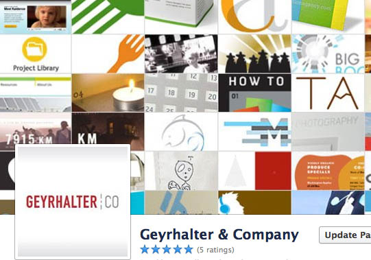
Our brand design needed to lead, it had to be professional and sophisticated, but simple, clean, and most important non-invasive. Below screenshot of my former brand agency’s Facebook page header shows how our simple logotype was floating above the work we did for our clients, making a clear statement of who was responsible for the brand visuals, yet distancing ourselves from all the colors and graphic shapes of our work.
When working on our brand identity design we took many paths before arriving at our current logo, which portrays innovation and disruption through sheer use of a bright and unusual poppy color, while the simple custom typography signifies openness and professionalism. When we launched FINIEN, it looked like an established company from day one, yet a disruptor with an open mind. It had fulfilled its purpose, matching strategic goals with final design. It has treated us well, even if it does not have a cool icon or splashy design, actually, because it does not have it.
CATEGORIES: Your Brand Launch: Identity
