Tag Archives: Brand Launch
New Brand Adopter: Steven Balaban Adopts The Samsung Galaxy Gear Smartwatch

Steven Balaban is the founder and CIO of Mink Capital. He has read over seventy business books in the last six years and has recently launched the site Best Business Books To Read to share his knowledge.
Our burning question: Which recent brand launch do you admire?
“I am fascinated by the launch of the Samsung Galaxy Gear Smartwatch. I first learned about the watch through a social media campaign that focused on a video that shows characters in TV shows, such as The Jetsons and Star Trek, using futuristic watches. The campaign claims that “The Next Big Thing is Here” and the video definitely gives that impression!
I remember the days when I was backpacking around Europe with my old camera and eight rolls of film. Now, I can travel with a 1.9 megapixel digital camera around my wrist. Am I really that old?”
Samsung Galaxy Gear- A Long Time Coming on Vimeo.
FINIEN Weighs In
Although launched only about 3 months ago, in the cell phone and gadget market, the Galaxy Note 3 is by now light years away from being a ‘new brand.’ Steven selected a truly innovative product, one I was curious about for a while and one that makes it hard to do our job; discussing the name, identity and digital brand atmosphere. We like to be challenged:
The Name
Cell phones fall into the category Fax and Copy machines once fell into. The inaugural product name (The iPhone, The Galaxy) sound sexy and/or inspirational, and at the time the iPhone 5c and the Galaxy Note 3 launch, they turn into fax machine names. More troublesome for Samsung though is the naming strategy behind the truly innovative part, the introduction of its Smartwatch. It has been degraded to ‘Gear’. Verbatim: The Samsung Galaxy Gear. Representing the only such ‘gear’ (there is only the watch), the choice is baffling to myself and confusing to the consumer, when all they want to call it is ‘the watch’.
FINIEN Brand Happiness Barometer: Name 2 (out of 10)

The Brand Identity Design
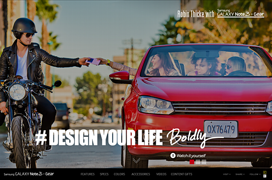
The name is the first step to defining a brand’s identity, and with a 4-part name the brand identity design is quite a train wreck that is as hard on the eyes as it is on your tongue. You won’t fall in love with the name, nor the logotype, so what to do? Throw in Robin Thicke, add a hashtag (#DesignYourLife) and let’s not bring up ‘Samsung Galaxy Note 3 + Gear’ too often. Nor the Jetsons, Thicke replaced you and Knight Rider as of now.
FINIEN Brand Happiness Barometer: Brand Identity Design 1 (out of 10)
The Digital Design
Seems as though the majority of the budget was spent on the highly produced Robin Thicke commercials, hence they occupy the landing page in its entirety. A bold move, one that leaves the user ‘interacting’ with the brand and ‘exploring’ the site, but truthfully, it means that they are lost looking for details on what the SGN3+G (Forgive me for not spelling out the full name) can really do for them. We soon learn that the site itself has been overproduced as well, taking advantage of many bells and whistles of today’s web design yet leaving functionality and plain product info, features and calls to action behind. The web site is the number one informational source for gadgets, being so cumbersome to navigate, it leaves me thinking that the SGN3+G might offer the same clunky experience.
From a brand experience perspective I might leave the ‘gear’ behind and wait for a ‘smartwatch’ after all, as there will be many to chose from shortly. For now I, and perhaps Steven, will hold off on Robin Thicke and wait patiently to live the Jetsons’ life instead.
FINIEN Brand Happiness Barometer: Digital Design 3 (out of 10)
CATEGORIES: Your Brand Launch: Brand Atmosphere
Launching Brands Online in 2013: One Step Forward, Two Steps Back
I am sick. And it’s not the flu.
I am sick to my stomach looking at all those amazing new ideas from sharp entrepreneurs going up online. Ideas that are as varied as they could possibly be, all nurtured by a revolution in online fundraising and fueled by an economy that is looking for the next big thing. Many of those ideas I see are truly revolutionary, but it still makes me sick looking at them. They all seem identical and I can not differentiate one site experience from another.
The internet gave entrepreneurs the ability to use cheap, often free, templates and it happens that everybody chose the same ones. I can’t blame them, these are robust templates taking advantage of responsive web design, while being equipped with all the features necessary for most entrepreneurs this day and age. They look and feel modern and they represent what I’d call a MVW – A Minimum Viable Website.
One thing gets lost though, sometimes is even missing from the get-go: A big brand entrance through a unique visual language that differentiates the brand enough to stay in the audience’s minds.
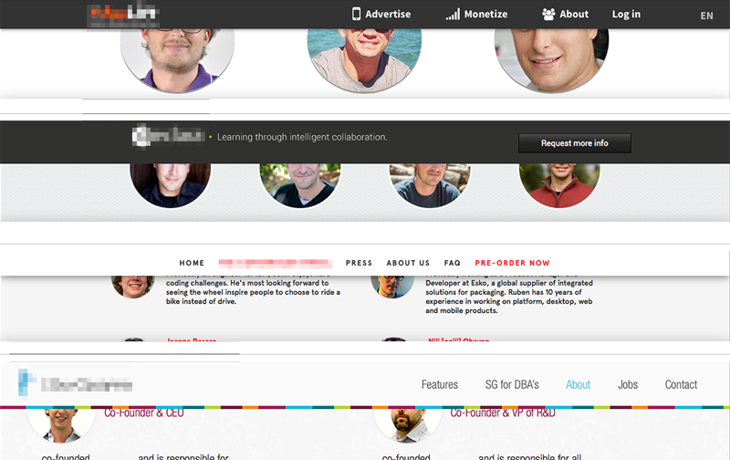
Above: Four startup sites I came across recently. Who is who? Which product is which? Wait, was that the site of that company I liked so much?
Conceptual and visual creativity used to be the integral ingredient of any brand introduction in the heyday of printed communications – they now are missing in action. To many of today’s entrepreneurs it is the product/service idea alone that counts, but sadly that idea gets lost without being embedded into a branded environment. The internet provides free tools; it does not mean that those fit into your company’s launch strategy. Leverage them when appropriate, avoid them when launching a brand. Consumers will get lost and your unique idea will look like a standard idea by using standard templates.
Be bold, be different, be conceptual. Go ahead and inject your enormous amount of creativity, strategy and moxie into your online presence, because it will be the place most people will meet your product/service first. And as far as I can tell it’s anything but standard.
CATEGORIES: Blog Your Brand Launch: Digital
Damage Control For The Misused And Abused Word ‘Brand’
“The word ‘brand’ needs a re-branding – due to its brand longevity the brand legacy is not brand-correct anymore,” I heard myself say unexpectedly in an interview earlier this week. It has been on my mind for a while. To no surprise, running a brand consultancy I am using the word a hundred times a day. Furthermore I just published a book titled ‘How to Launch a Brand’. The word gets tiring, especially since it leaves a bad aftertaste and I feel the need to first convince people that it is not a bad term before I start talking about it any further. Brand is not a four letter word.
Despite the negative connotations with the term, branding is more important today than it has ever been before and it is not only consumed, but furthermore created and curated by the masses through their very own personal (public/social media) brand. Brand is alive and kicking and we will not be able to change the term, but one can change the perception away from luxury good logos (Gucci, Chanel) and larger-than-life corporations seen as evil-doers (Exxon, Walmart) to a modern necessity, which, if created and nurtured in an honest and authentic way, turns ‘brand’ into a holistic ‘aura’ of a product/service provider (or person) that we are allowed to have admiration for (From an iPhone to a Celebrity), aspiration towards (From a Nonprofit to a highly ranked University) and sometimes draw inspiration from (From Ted Talk to Oprah).
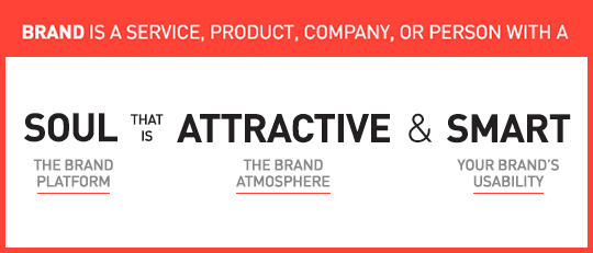
To me, a brand is a service, product, company, or person with soul, that is attractive and smart.
1. Soul is the beating heart, the reason a company should exist and why your initial attraction matures into love. You put your trust in brands with a soul and most often your money follows soon thereafter. Not much different than with human relationships, soul is the reason why we care for each other, or a particular brand.
2. Attractive is the brand aura that allows for the gut instinct emotional connection you feel when getting in contact with the brand. It is the design and the voice that is carefully created and curated over time in a particularly consistent manner. Attraction is not to be mistaken by shallow beauty.
3. Smart is its usability. How easy is it to engage with the company/product/service/person? In the tech industry it is User Interface and User Experience, with consumer products it is the product and packaging design and with services it is often the design of key offerings combined with its delivery.
Now that we ‘talked’ about the complex strategy that creates the beautiful simplicity that makes a brand, maybe we should give the word another chance?
The Importance of Branding At Time of Launch For Tech Startup, B2C/Retail And B2B Company Founders
‘Is branding the key for a successful start-up?‘ is the topic for a speech I was asked to give at Internet Hungary this week. I could make it a 5 second speech and say ‘Yes, it is one of the most important factors,’ but lucky for me the topic is broader and will go deeper into the keys of creating a successful brand. Let me use this opportunity though to dive knee deep into this question as some brand elements are more important to certain types of companies at time of launch than to others:
No one shall skip the Brand Platform creation at the onset of a new venture, unless you want to compete on price, be boring and unattractive to work for, and are not keen on acquiring the right target audience at time of launch. You tackle the Brand Platform right after you draft your business plan (from fully fleshed out to napkin version – all are acceptable forms of business plans at this stage, depending on your own comfort level).

Launching with a meaningful and unique Name and Brand Identity Design seems like a no-brainer, a must for all entrepreneurs. If for whatever logical reason (budget not being part of that logic) you feel forced to launch with a sub-par name and logo, knowing you will have to go through a (more costly) re-naming and re-branding exercise upon showing first successes, it is the easiest to do for a tech startup or B2B venture that requires solely test users or relies on a very small niche audience, which will make it easier to educate them on this big and disruptive brand change down the road. Some Tech Startups (especially apps) are prototyping until the day of launch, making it an easy excuse to skip this essential step, whereas it is much more advisable to work on a prototype whilst formulating the brand platform, that way you are educating yourself about the target audience while you see them use the actual product, enabling you to create a meaningful brand that will not have to be rebuild soon thereafter. A win – win.
Needs for Brand Atmosphere Touch Points vary in importance and specifics from company to company with retail and other mainly offline B2C companies leading the list, E-Commerce and Tech Startups surviving off some basic, consistent touch points bundled with heavy E-Marketing template creations, while most B2B brands fall anywhere in-between, depending on their structure and audience. If bootstrap is your motto, these can be rolled out over time, making it essentially more pricey, but allowing you to spread the cost.
It only makes sense that ventures leading with digital need to make UI/UX Design part of their strategic brand implementation. Most companies – B2C/Retail and B2B – rely heavily on brand-centric (responsive) web sites to attract and convert leads of different types. For Online Retailers and Tech Startups where the web site also is the product, the prototyping should be addressed in parallel with the Brand Platform creation as it will educate the branding process as a whole. Some companies are able to save on development costs using existing WordPress templates (and such), but brand will still be key at launch.
To conclude, whenever a startup founder tells me (and they tell me all the time) “I can not afford branding at this early stage of my company formation” I reply with “No, you cannot afford not to brand at this early stage of your company formation. Unless you think a strong brand is worth less at time of sale or IPO than an ugly yet functional prototype.‘ This often marks the end of our conversation, until they call a few weeks later to get started with branding their new venture.
I Am With The B(r)and: 5 Ways Your Next Brand Launch Can Benefit From My Obsession With An 80’s Band
I was 8 when I purchased my first Depeche Mode record. I was fooling myself. I did not make this (rather big at the time) purchase because of their music; instead it was the first colored vinyl record I have seen and I fell for the surprise and sheer beauty of it. It was different. A couple of colored Depeche Mode records later I actually started enjoying their innovative electronic sound, because that too was different. And as all of the b(r)and touch points started lining up for me over the years, I turned into a fan.
When I was 18 I took my first step into entrepreneurship by organizing, designing and hosting a concert After-Party in Austria making my first $20,000 (and since had the opportunity of sharing a drink or two with the band on several occasions). The band’s visual design language was mainly crafted by photographer/director Anton Corbijn, who I cite as a major reason I turned to study Graphic Design, enabling me to do what I am doing today. Corbijn also later served as a key inspiration for my photography. Needless to say, my interest in this band for the past 30 years has a deep and personal meaning as it helped inform and somehow shape my own identity.
Over the past weeks I have watched the band perform on its current tour (yes, they are still around) and it gave me time to reflect and think about the sheer power, and design-driven innovation of this band, and how any new brand could benefit from it.
Generally, any band launches a new ‘sub-brand’ every 2-4 years. They call it an album release, but really it is a sub-brand with many objectives that need to be met. The design language needs to introduce a new era of the band that conveys the purpose, signifies change and disruption (‘growth’), yet remains close to the brand’s manifesto. It needs to be able to gain new followers while giving the loyal brand enthusiasts enough nostalgia to hold on to. And of course it requires to be highly adaptable, inspiring the visuals and merchandise for a world tour (a major financial reason for the introduction of the sub-brand) and single releases while being simple enough to turn into an avatar or a fan’s tattoo. Not a short list of brand launch objectives.
Here are some tricks of the trade that I witnessed following a b(r)and over this peculiar long period of time. The least my strange addiction can do is help you create a better brand. Here’s what you can learn and instantly implement during your new brand introduction:
1. Announce A New Era
Your new brand is put in place to do something that has not been done before, or at least not in this particular configuration. Make sure your Brand Atmosphere shows that you are here to disrupt.
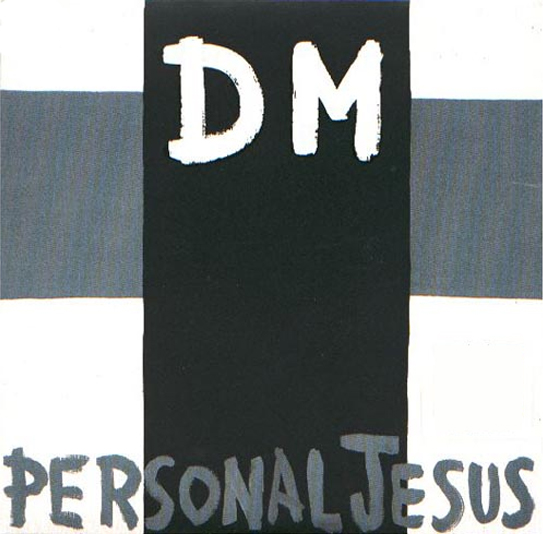
Depeche Mode kicked off their most successful album of all times (Violator, 1990), with the single Personal Jesus, which was highly controversial by its name alone. The simple cross added to it, making DM the crucified. After a big breakthrough record (‘sub-brand’), releasing the first single without the b(r)and’s name on the cover showed attitude, confidence and promised innovation.
2. Allow For Easy Adaptability
Ensure your brand identity stands out, is meaningful and relevant, but always keep it extremely simple to allow for easy application by brand adopters, employees, vendors and of course your groupies.
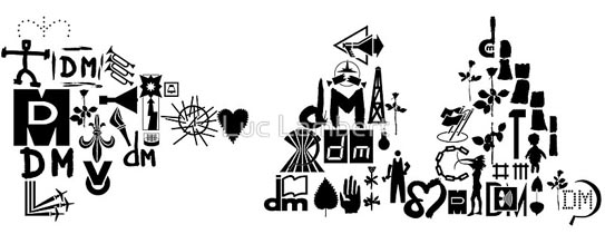
Over the years the band created variations of its b(r)and initials coupled with simple icons that allowed for versatility with stage projections and merchandise, but above all enabled fans to easily create art and avatars to turn into adopters of this particular time of the band’s journey. Above shows a collection of these icons as put together by fan Luce Lambert to form the DM initials of the band’s current record.
3. Create Buzz Through Innovation
If you innovate through your brand marketing, people will notice, and that’s the first step to create a following. The more unique, the more interest it will generate and the more press your brand will receive in return. Yes, unique design will lead to sales.
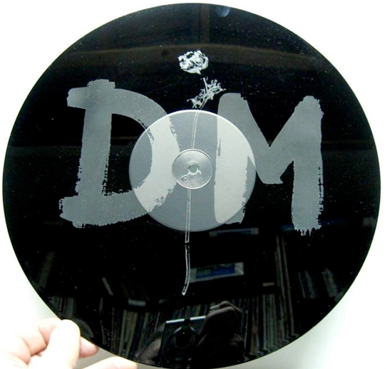
For a limited edition of the band’s mega hit ‘Enjoy the Silence‘, it featured a 15 minute remix of the song on one side while the b-side featured no music at all, but an etching of the band’s identity instead.
4. Explain Value Through Imagery
“Words are very unnecessary, they can only do harm,” is the chorus of the band’s biggest hit, which you may recognize. Music art relies on imagery and imagery alone. In a world of infographics, A.D.D. and information overload, your new brand should adopt that mantra and say less with more…imagery.
5. Create a Brand With Charisma
Nearly a given for any band leader, it also holds true for your brand launch. If you strategically infuse a brand character into your launch, it will instantly make your brand more likable. That persona could be the CEO (‘Richard Branson‘), a fictional character (‘Mr. Clean‘) or a spokesperson hire (‘The most interesting man in the world‘) that embodies what your brand stands for.

I took this photo of Depeche Mode’s lead singer, Dave Gahan last night at the Staples Center in Los Angeles. Gahan is working the stage and the female audience alike, and became a major driver in the b(r)and’s longevity.
5 b(r)and takeaways that I firmly believe will make your brand stronger at launch. Now look at your own small obsessions and find out why it makes you say ‘I am with the brand,’ then share your findings with us.
The Main Obstacle That Stands Between You And A Successful Brand Identity
You created a robust business (or launch) plan and a solid brand platform. You hired a great branding firm to tackle the important task of creating a brand identity on time and on budget. What could possibly go wrong?
There’s one thing that can come between you and a winning brand identity: You.
Before you start your hate mails, think about it with me for a second. You have superior taste in art and design. You know your new service or product better than anyone else. You need to see it succeed. How could you possibly turn into a road block? Because of exactly these reasons you will want to create a brand identity that you will like. Colors that speak to you, shapes you like, a concept that resonates with you, fonts that feel current to you. That’s a whole lot of ‘you’ even though this is not at all about you, it’s about Julian, Rich and Adrienne. Your target personas. What you need to like is that your new brand identity will resonate and be liked by them.
Will you like the new brand identity design? You surely should. Does it matter if orange is your color and that you prefer sans serif typefaces? No, it does not. Nor does it matter what the Designer or Creative Director ‘likes’. What matters behind every creative decision is why it was made and how it will further improve adaptation by your customer. This is extremely difficult as an entrepreneur, or even CMO, to personally detach from, but it is what will make the brand ID a success for your audience and in turn for yourself.
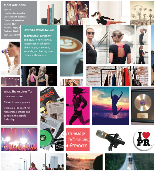
Meet Adrienne: Excerpts from a Brand Platform for a FINIEN client depicting Target Persona A
We advise our clients to dive deep into 3-5 target personas with us. We give them names, research and ‘listen’ to them. We encourage our more advantageous clients to create life size cardboard figures of them to place around the office. Next time you nod your head during a creative presentation and say ‘I like this, the colors are beautiful, the type is cool and the concept really resonates with me,’ take a step back and say ‘Adrienne would really like this, these colors disrupt her world just enough to stand out and I see her adopting the icon easily.’ You will like what you see say.
CATEGORIES: Blog Your Brand Launch: Identity
Maximize Your Tagline When Introducing a New Product or Service
Just Do It? Not so fast we say.
When introducing a disruptive, innovative or different type of product or service to the market, your tagline presents a huge opportunity to convey not how the new brand makes you feel, but instead what it actually does.
Using a descriptor in place of a traditional tagline can get you further, faster at the time of your launch. You can, and should, over time transition into a tagline that dives deeper into the emotions consumers should feel when using your product or service. For Nike, a descriptor may have been something along the lines of “Peak Performance Running Shoes Driven by Design,” and as the brand gained traction, it would have eventually changed to the famous three words “Just do it.” 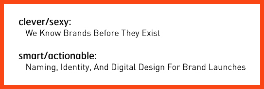
Our brand consultancy nearly launched with the tagline “We know brands before they exist” (which I felt was clever), but decided to hold off and use it only in company presentations instead. As our offering is highly specialized and unique, we now clearly spell out what we are in business for: “Naming, Identity, and Digital Design for Brand Launches.” It enables us to immediately set expectations with our target audience whereas a clever tagline would have been just another piece leading to the actual answer your target is seeking: What is this new brand doing exactly and is it what I am in the market for?
An additional startup benefit? If you choose the descriptor path, there is no need to get overly creative; just clearly spell out what your brand delivers to its user in the simplest, shortest way possible. It’s not sexy, but they will be grateful, and so will you when looking at your incoming leads.
CATEGORIES: Blog Your Brand Launch: Brand Strategy
Why You Don’t Have To Make The Logo Bigger, Even During Your Brand Introduction
Granted, the subject of creative agency clients wanting to make their logos as large as possible to ‘get more bang for the buck’ and to ensure people ‘will notice’ their logo on their brand marketing efforts has been beaten to death and plentiful poked fun at (The Product, The Song, Etc). With new brand introductions this notion feels more in line with reality than any other marketing efforts as you have not only an urge to see your (often first, but definitely brand new) logo large, but you are also under a lot of pressure to ensure the customer notices and recalls your new identity design and brand name.
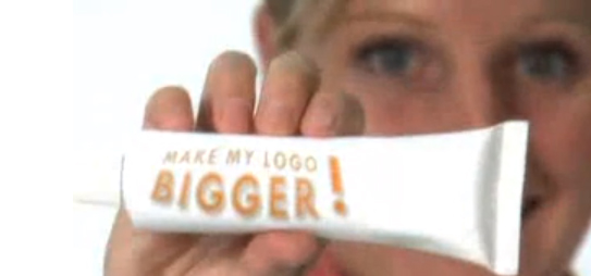
Above: Still from the hilarious ‘Make Your Logo Bigger‘ ‘infomercial’ (2007)
Instead of opting for the ginormous logo though, introduce your brand identity as part of a visually strong and unique design language. Brand is much more than a logo. Of course it is also much more than color and layout, but unique colors with specific application manners (Eg: a vertical bar or a cropped circle of consistently same proportions, within the same locations across all initial communications) not only creates brand design consistency but it makes your marketing efforts be truly your brand.
More so than an existing brand you need to penetrate the market (however small that penetration effort is, may it only be an e-marketing campaign and your web site) with a very unique and consistent design and color approach to get your new brand into consumer’s minds. Upon creation of that distinct visual brand language, step and repeat is the best way to stay in your consumer’s heads in the first phases of your brand introduction. You can slowly minimize the branded aspect and introduce campaigns over the course of time.
After 17 or so years of introducing brand identities, I can attest that this approach works well while using a completely normal sized logo. Guaranteed.
3 Ways to Create a Strong Brand Atmosphere From The Get-Go
Once you have established a solid brand platform, name, and identity design, you are ready to breathe life into your brand by expanding it through tangible materials and experiences. At FINIEN, we call these your Brand Atmosphere® Touch Points. Each company has unique needs in terms of developing branded elements for print, display, digital, and environment.
Regardless of which ones your strategy calls for, remember that all brands should focus on how their Brand Platform is integrated into each touch point through consistency in visual cues and messaging. Seemingly small details in layout and design can have a huge impact on your brand’s cohesiveness and success.
“Design choices like color, layout, and font, can compel the right audience to buy when they are used correctly—or repel your audience from buying when they are not,” states Maria Ross, author of Branding Basics (2010). Furthermore, these design choices will speak volumes about the values of your brand. “Visual expression often reveals the unspoken intentions behind corporate strategy” (2007) confirm both Uli Mayor-johanssen and Klaus-peter Johanssen in World Branding. How do your business cards, storefronts, and social media outlets harmonize to tell a larger story about your brand?
Here are 3 points to pin to your desk (standing desk, I hope!) and to follow religiously when at this stage in your (next) brand launch process:
1. Be Consistent
Cohesive/Holistic/Systematic: Call it what you want. Your brand and all of the elements that make up your brand need to visually speak the same language and communicate the same message. It will make or break a Brand Atmosphere.
2. Be Selective
Don’t try to be on all social media platforms at the outset. Strategize where it is most relevant for your brand to exist and apply a cohesive look-and-feel and brand voice to those channels first. You can always expand to other channels as time allows and needs arise. Also focus on only a few select traditional marketing pieces to get your brand started. Ensure that these pieces communicate the essence of your brand and are well designed.
3. Do Sweat the Details
Each touch point associated with your brand has the power to diminish or enhance your Brand Atmosphere. Never rush through creating your touch points, and do sweat the small stuff.
Adapted from our bestselling book “How To Launch a Brand.”
CATEGORIES: Your Brand Launch: Brand Atmosphere
Brand Identity For Hispanics in 2013: How Current Cultural Values Affect Your Brand Launch
Catering this post to those of you who target a new brand launch towards the Hispanic segment makes me aware that you will likely assume you know your niche audience. True that. But what I have deciphered for you are nuances and slight shifts in behavioral patterns based on Thinknow’s U.S. Hispanic Cultural Values 2013 study that, when applied to specific brand identity tasks, can make a big difference in your approach and the success of your next brand identity project launch.
Naming
Brand tonality is where you have to read between the lines when it comes to understanding the new Hispanic audience. If you craft a brand name for the 18-34 audience, be aware that they seek community with other Hispanics more than the above 35 group. Launching a brand for that group lends itself to creating a ‘spanglish’ name as the preferred language (especially amongst males) is English. The need for family unity and Hispanic community is also high on their list, so a Latin touch would go a long way for your brand name. Creating a name for male Hispanics (of all ages) can drift into English as they emphasize the aspiration of living the American dream and your new brand would piggy back on that aspirational connotation. With about 40% of surveyed Hispanics speaking primarily or only Spanish, a nod to both languages recognizes their multicultural experience and is the advised way to creating a new brand name for the Hispanic of 2013.

Above: Branding project we recently conducted for an American corporation offering (mainly) American brand products to the Latin American market. We derived the name ‘Yesimo’ and its correlating brand identity. Both serve as a good example of a name and identity that combine an American with a Latin feel in a warm yet sophisticated manner.
Identity Design
When designing a brand identity be sure to add one important keyword to your list of things you want to convey, pretty much regardless of your specific offering: Family Unity. The idea of familia is on the rise, especially with females and the under $30k income brackets. Combining warmth (warm colors, round sans serif typefaces and round shapes), with aspirations of the new, integrated and more monetary focused US based Hispanic (icons of growth and wealth, modern color hues and a corporate & trustworthy look) will resonate well across product and service offerings.
Digital User Interface and User Experience Design
Think usability times four. As simplicity in navigation design and content is on the rise in the US, you can ride that wave while simplifying your digital design even more so based on the added language barrier. Use infographics and icons to explain steps to take or sequential storytelling. Don’t be obvious when catering your content tonality towards Hispanics as it may conflict with the rise in a need to control their own destinies. Speak to the modern Hispanic in ways you would with any other US counterpart, otherwise you might not be heard at all. Integrate and maximize social sharing tools to enable an easy viral spread of your brand amongst friends and family (#1, 2 and 10 on the revised cultural values list of 2013!) and make sure your site is created in a responsive manner (accessible and scalable for all devices from desktop to iPad to smartphone). If you have the capabilities to create a bilingual site, offer the option of Español in a drop down.
As we see the US based Hispanic audience integrate exponentially, let’s not lose track of the nuances. As we all know, the devil lies in the details, so let’s get ready to create devilish smart and detailed brands!

