Tag Archives: Brand Name
Rapid-Fire Brand Name Advice
On this blog I already talked about what makes a name successful and how to pick a domain name, but many of you ask if I find a fabricated name to be superior to a descriptive name, and how to best navigate the types of names that one can consider, quickly. Short and actionable, I’ll give one sentence of advice on each type of name. 3, 2, 1, go:
Descriptive
Example: Match.com
Advice: Great as it immediately conveys what it is/does – only if you will never expand your product offerings – but limiting and hard to find a sound domain name
Metaphor
Example: Puma
Advice: Not a top choice as existing connotations, domain name difficulties and Search Engine results can quickly come in the way for a new company

Founder
Example: The Bill & Melinda Gates Foundation
Advice: Great if you are the brand, you already have a legacy and if you are Bill, and not Lance
Fabricated
Example: FINIEN
Advice: It’s genius, of course! In all seriousness, it is a great path, if easy to pronounce and recall, and backed by a great story
Acronym
Example: AOL (America On-Line, Remember?)
Advice: A solid option to sound like a larger company from the start; only if your customers can recall your letters and if you can get hold of a reasonable domain name (sorry, three- or four-letter combos are all sold out)
Fabricated x Acronym
Example: Wanelo (Want, Need, Love)
Advice: Great option if tied to a tag line – otherwise the same criteria applies as with Fabricated names
Creative Spelling
Example: Lyft
Advice: Don’t do it, it’s pure laziness – unless word of mouth is not important to you (Wait, you spell it just like Supply but with a v instead of the u?) and you cater solely to ages 18-28
Numeric
Example: 7-Eleven
Advice: Don’t do it out of laziness (I picked our street number, easy does it) as no one will recall it – do it only if you can create shared meaning (7-Eleven: open 7 – 11, 7 days a week) or showcase value (Social 123 – easy as 1-2-3). See my post on numeric names for details.
There you go – no more excuses. Just do it, or dig deeper via our white paper, or if all fails (or you have better things to do, like starting a business) call me for help, or call us for hands-on naming magic.
CATEGORIES: Startup Advice Your Brand Launch: Naming
How to Leverage the 3 Core Components of Your Brand Identity to Enhance Messaging
When we think of brand we first think of logo (even though we know a brand is much more than its logo). The logo is the key point of visual interaction with a brand, hence we are likely to recall it every time we think (or talk) of – or write about – a brand.
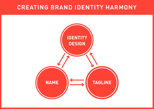
During the brand identity (‘logo‘) design process entrepreneurs often forget that there are 2 other elements that help tell the company or product’s story. They interact and bring value to the brand identity as a whole. Do not repeat the same message, but instead ensure to leverage these 3 core components to create a stronger, deeper brand message:

The 3 core brand identity components need to complement each other, each adding something unique to the whole story, and together forming a cohesive and strong initial brand message.
If your name describes your business, do not focus on showing the same message in your logo; instead use your logo to talk about other key elements that describe and differentiate your business. If you are in the cloud storage business and your name includes the two words cloud and storage (A bad company name, yet good example: Cloud Storage Ninjas), have your logo visualize security and stability, if those are key components of your brand’s message. Contrary, if your name is nondescript, either fabricated or an acronym, ensure that the associated brand identity design visualizes what you are in business for (EG: “Cloud Storage“).
Often forgotten during the brand identity design process (and beyond) is…the tagline. There are many factors to blame for the slowly occurring extinction of the tagline (mainly of digital nature, as tag lines are hard to squeeze into apps and templated web sites), but the power of a great tagline is still immense (Just do it, I say!). The tagline should be alive and kicking even though its placement has changed (from the traditional place below the brand identity design). It can now be used as the first header users see on a brand’s web site, the descriptor below the company name in an email signature, in place of yet another step-and-repeat icon pattern on a back of a business card, or in the often underestimated – yet early – brand touch point, the lobby of a business. The tag line is a powerful tool, that, together with the name and brand identity design, tells a stronger, deeper and more actionable initial brand story. It is a leading actor and you can write the script.
Keep the bigger picture in mind when embarking on your identity design project and use your Brand Platform to ensure these 3 core elements touch on more than just one or two of your core values and differentiators (while keeping it visually simple).
Next week I will talk about why our identity design looks the way it does. Are we not following our own rules, are we lazy, or is there a different strategy at play? Hint: It’s the latter.
Sugarpova VS. Hallmark

As we descend into a holiday weekend here in the US, we thought we’d keep this week’s New Brand Post on the light side. A great time for our second Punny Brand Name Showdown. This time we chose two brands named after their founders, with an added pun.
An added pun with a dash of sugar in this case. Sugarpova is tennis star Maria Sharapova‘s step from endorsements into entrepreneurship with a line of gourmet candy. The 25-year old is targeting a market “that doesn’t have a premium segment” (Bloomberg Businessweek) and she has translated her own brand name into a sugary pun. (How they got away with using ‘Lips like sugar’ as a product name remains an open question. Did Echo & The Bunnymen receive tons of free sugar power to keep them awake at their age on stage when performing their biggest hit by the same name?)
What you might not know is that the established greeting card company Hallmark was actually named for its founder, Joyce Hall. Hallmark also means a mark indicating quality or excellence (Wiki). Voila, an excellent punny brand name has been born.
 But there are winners and there are losers and you can’t be both, or can you? In our second Punny Brand Name Showdown we have two winners and two losers. Sugarpova is a great pun, leveraging the person behind the brand in a memorable and fun way. Yet, it does feel a bit bittersweet by elevating sugar to become the new star of the fun, but not quite healthy brand. Hallmark is a great pun with a personal touch, but if it was a brand launch in 2013 we would stray away from it based on online search and IP ownership difficulties.
CATEGORIES: Blog Your Brand Launch: Naming


