Tag Archives: Identity
I Am With The B(r)and: 5 Ways Your Next Brand Launch Can Benefit From My Obsession With An 80’s Band
I was 8 when I purchased my first Depeche Mode record. I was fooling myself. I did not make this (rather big at the time) purchase because of their music; instead it was the first colored vinyl record I have seen and I fell for the surprise and sheer beauty of it. It was different. A couple of colored Depeche Mode records later I actually started enjoying their innovative electronic sound, because that too was different. And as all of the b(r)and touch points started lining up for me over the years, I turned into a fan.
When I was 18 I took my first step into entrepreneurship by organizing, designing and hosting a concert After-Party in Austria making my first $20,000 (and since had the opportunity of sharing a drink or two with the band on several occasions). The band’s visual design language was mainly crafted by photographer/director Anton Corbijn, who I cite as a major reason I turned to study Graphic Design, enabling me to do what I am doing today. Corbijn also later served as a key inspiration for my photography. Needless to say, my interest in this band for the past 30 years has a deep and personal meaning as it helped inform and somehow shape my own identity.
Over the past weeks I have watched the band perform on its current tour (yes, they are still around) and it gave me time to reflect and think about the sheer power, and design-driven innovation of this band, and how any new brand could benefit from it.
Generally, any band launches a new ‘sub-brand’ every 2-4 years. They call it an album release, but really it is a sub-brand with many objectives that need to be met. The design language needs to introduce a new era of the band that conveys the purpose, signifies change and disruption (‘growth’), yet remains close to the brand’s manifesto. It needs to be able to gain new followers while giving the loyal brand enthusiasts enough nostalgia to hold on to. And of course it requires to be highly adaptable, inspiring the visuals and merchandise for a world tour (a major financial reason for the introduction of the sub-brand) and single releases while being simple enough to turn into an avatar or a fan’s tattoo. Not a short list of brand launch objectives.
Here are some tricks of the trade that I witnessed following a b(r)and over this peculiar long period of time. The least my strange addiction can do is help you create a better brand. Here’s what you can learn and instantly implement during your new brand introduction:
1. Announce A New Era
Your new brand is put in place to do something that has not been done before, or at least not in this particular configuration. Make sure your Brand Atmosphere shows that you are here to disrupt.
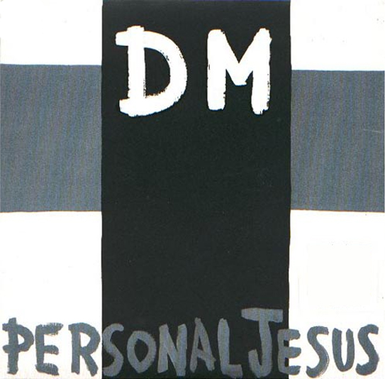
Depeche Mode kicked off their most successful album of all times (Violator, 1990), with the single Personal Jesus, which was highly controversial by its name alone. The simple cross added to it, making DM the crucified. After a big breakthrough record (‘sub-brand’), releasing the first single without the b(r)and’s name on the cover showed attitude, confidence and promised innovation.
2. Allow For Easy Adaptability
Ensure your brand identity stands out, is meaningful and relevant, but always keep it extremely simple to allow for easy application by brand adopters, employees, vendors and of course your groupies.
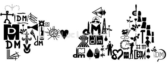
Over the years the band created variations of its b(r)and initials coupled with simple icons that allowed for versatility with stage projections and merchandise, but above all enabled fans to easily create art and avatars to turn into adopters of this particular time of the band’s journey. Above shows a collection of these icons as put together by fan Luce Lambert to form the DM initials of the band’s current record.
3. Create Buzz Through Innovation
If you innovate through your brand marketing, people will notice, and that’s the first step to create a following. The more unique, the more interest it will generate and the more press your brand will receive in return. Yes, unique design will lead to sales.
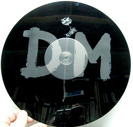
For a limited edition of the band’s mega hit ‘Enjoy the Silence‘, it featured a 15 minute remix of the song on one side while the b-side featured no music at all, but an etching of the band’s identity instead.
4. Explain Value Through Imagery
“Words are very unnecessary, they can only do harm,” is the chorus of the band’s biggest hit, which you may recognize. Music art relies on imagery and imagery alone. In a world of infographics, A.D.D. and information overload, your new brand should adopt that mantra and say less with more…imagery.
5. Create a Brand With Charisma
Nearly a given for any band leader, it also holds true for your brand launch. If you strategically infuse a brand character into your launch, it will instantly make your brand more likable. That persona could be the CEO (‘Richard Branson‘), a fictional character (‘Mr. Clean‘) or a spokesperson hire (‘The most interesting man in the world‘) that embodies what your brand stands for.
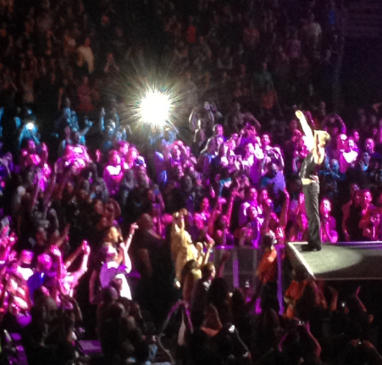
I took this photo of Depeche Mode’s lead singer, Dave Gahan last night at the Staples Center in Los Angeles. Gahan is working the stage and the female audience alike, and became a major driver in the b(r)and’s longevity.
5 b(r)and takeaways that I firmly believe will make your brand stronger at launch. Now look at your own small obsessions and find out why it makes you say ‘I am with the brand,’ then share your findings with us.
The Main Obstacle That Stands Between You And A Successful Brand Identity
You created a robust business (or launch) plan and a solid brand platform. You hired a great branding firm to tackle the important task of creating a brand identity on time and on budget. What could possibly go wrong?
There’s one thing that can come between you and a winning brand identity: You.
Before you start your hate mails, think about it with me for a second. You have superior taste in art and design. You know your new service or product better than anyone else. You need to see it succeed. How could you possibly turn into a road block? Because of exactly these reasons you will want to create a brand identity that you will like. Colors that speak to you, shapes you like, a concept that resonates with you, fonts that feel current to you. That’s a whole lot of ‘you’ even though this is not at all about you, it’s about Julian, Rich and Adrienne. Your target personas. What you need to like is that your new brand identity will resonate and be liked by them.
Will you like the new brand identity design? You surely should. Does it matter if orange is your color and that you prefer sans serif typefaces? No, it does not. Nor does it matter what the Designer or Creative Director ‘likes’. What matters behind every creative decision is why it was made and how it will further improve adaptation by your customer. This is extremely difficult as an entrepreneur, or even CMO, to personally detach from, but it is what will make the brand ID a success for your audience and in turn for yourself.
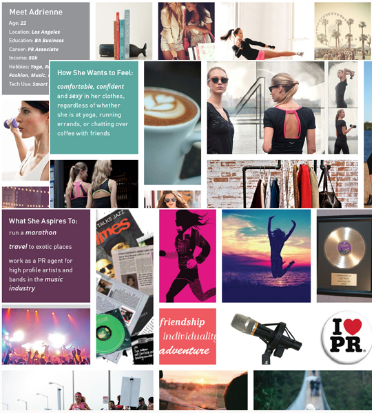
Meet Adrienne: Excerpts from a Brand Platform for a FINIEN client depicting Target Persona A
We advise our clients to dive deep into 3-5 target personas with us. We give them names, research and ‘listen’ to them. We encourage our more advantageous clients to create life size cardboard figures of them to place around the office. Next time you nod your head during a creative presentation and say ‘I like this, the colors are beautiful, the type is cool and the concept really resonates with me,’ take a step back and say ‘Adrienne would really like this, these colors disrupt her world just enough to stand out and I see her adopting the icon easily.’ You will like what you see say.
CATEGORIES: Blog Your Brand Launch: Identity
Why You Don’t Have To Make The Logo Bigger, Even During Your Brand Introduction
Granted, the subject of creative agency clients wanting to make their logos as large as possible to ‘get more bang for the buck’ and to ensure people ‘will notice’ their logo on their brand marketing efforts has been beaten to death and plentiful poked fun at (The Product, The Song, Etc). With new brand introductions this notion feels more in line with reality than any other marketing efforts as you have not only an urge to see your (often first, but definitely brand new) logo large, but you are also under a lot of pressure to ensure the customer notices and recalls your new identity design and brand name.
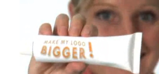
Above: Still from the hilarious ‘Make Your Logo Bigger‘ ‘infomercial’ (2007)
Instead of opting for the ginormous logo though, introduce your brand identity as part of a visually strong and unique design language. Brand is much more than a logo. Of course it is also much more than color and layout, but unique colors with specific application manners (Eg: a vertical bar or a cropped circle of consistently same proportions, within the same locations across all initial communications) not only creates brand design consistency but it makes your marketing efforts be truly your brand.
More so than an existing brand you need to penetrate the market (however small that penetration effort is, may it only be an e-marketing campaign and your web site) with a very unique and consistent design and color approach to get your new brand into consumer’s minds. Upon creation of that distinct visual brand language, step and repeat is the best way to stay in your consumer’s heads in the first phases of your brand introduction. You can slowly minimize the branded aspect and introduce campaigns over the course of time.
After 17 or so years of introducing brand identities, I can attest that this approach works well while using a completely normal sized logo. Guaranteed.
Brand Identity For Hispanics in 2013: How Current Cultural Values Affect Your Brand Launch
Catering this post to those of you who target a new brand launch towards the Hispanic segment makes me aware that you will likely assume you know your niche audience. True that. But what I have deciphered for you are nuances and slight shifts in behavioral patterns based on Thinknow’s U.S. Hispanic Cultural Values 2013 study that, when applied to specific brand identity tasks, can make a big difference in your approach and the success of your next brand identity project launch.
Naming
Brand tonality is where you have to read between the lines when it comes to understanding the new Hispanic audience. If you craft a brand name for the 18-34 audience, be aware that they seek community with other Hispanics more than the above 35 group. Launching a brand for that group lends itself to creating a ‘spanglish’ name as the preferred language (especially amongst males) is English. The need for family unity and Hispanic community is also high on their list, so a Latin touch would go a long way for your brand name. Creating a name for male Hispanics (of all ages) can drift into English as they emphasize the aspiration of living the American dream and your new brand would piggy back on that aspirational connotation. With about 40% of surveyed Hispanics speaking primarily or only Spanish, a nod to both languages recognizes their multicultural experience and is the advised way to creating a new brand name for the Hispanic of 2013.

Above: Branding project we recently conducted for an American corporation offering (mainly) American brand products to the Latin American market. We derived the name ‘Yesimo’ and its correlating brand identity. Both serve as a good example of a name and identity that combine an American with a Latin feel in a warm yet sophisticated manner.
Identity Design
When designing a brand identity be sure to add one important keyword to your list of things you want to convey, pretty much regardless of your specific offering: Family Unity. The idea of familia is on the rise, especially with females and the under $30k income brackets. Combining warmth (warm colors, round sans serif typefaces and round shapes), with aspirations of the new, integrated and more monetary focused US based Hispanic (icons of growth and wealth, modern color hues and a corporate & trustworthy look) will resonate well across product and service offerings.
Digital User Interface and User Experience Design
Think usability times four. As simplicity in navigation design and content is on the rise in the US, you can ride that wave while simplifying your digital design even more so based on the added language barrier. Use infographics and icons to explain steps to take or sequential storytelling. Don’t be obvious when catering your content tonality towards Hispanics as it may conflict with the rise in a need to control their own destinies. Speak to the modern Hispanic in ways you would with any other US counterpart, otherwise you might not be heard at all. Integrate and maximize social sharing tools to enable an easy viral spread of your brand amongst friends and family (#1, 2 and 10 on the revised cultural values list of 2013!) and make sure your site is created in a responsive manner (accessible and scalable for all devices from desktop to iPad to smartphone). If you have the capabilities to create a bilingual site, offer the option of Español in a drop down.
As we see the US based Hispanic audience integrate exponentially, let’s not lose track of the nuances. As we all know, the devil lies in the details, so let’s get ready to create devilish smart and detailed brands!
Match Creative Talent
Creative talent agency Match chose FINIEN to spearhead an all-encompassing re-branding effort of the firm’s dated identity system.
CATEGORIES:
Co-Opportunity Natural Foods
Identity design for Co-Opportunity Natural Foods. Co-opportunity, Los Angeles’ only consumer cooperative, has been a steadfast grocery staple since 1974.
CATEGORIES:
Grossman Design and Construction, Inc.
Identity Design for Grossman Design and Construction, Inc.
CATEGORIES:
Lazyhooks
Identity Design for Music Production Film & Record Label Lazyhooks.
CATEGORIES:
Mindshare
Identity Re-Design for Inspirational Event Platform Mindshare.
CATEGORIES:
Zangpo
Identity Design for New York City Food Delivery Service Zangpo.
CATEGORIES:

