Tag Archives: Identity
Your new brand’s logo cannot be hip
I was asked the question, ‘What current trends in logo design do you truly hate?’ at a panel discussion at NYU back in December. I felt it was time to manifest my strong feelings towards trends in logo design. It’s an oxymoron. A logo shall never be trendy. Trends come and go, your brand identity is created to stick around for a mighty long time, hence ruling out even the remote possibility of making it trendy.
Your logo can still be modern, exciting and speak to a young audience – it just can not look like a trend. How would you know? Your idea might have been derived from something you saw, maybe you liked it because it looked hip – maybe you’ve seen similar logos before and you felt yours should follow the lead. Don’t. Lead rather than follow. First with your logo, then with the rest of your brand.
Hip logos? X that idea out.[Click to Tweet]
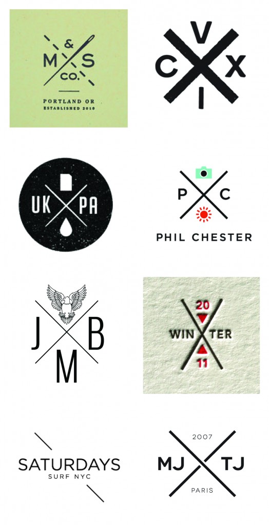
I hope the very painful overly retro compilation below will make the point even more convincing. If it’s a trend, others will follow and you will end up blending in, and there’s nothing hip about blending in. It’s tough because you thought you finally had the chance to jump on the hip bandwagon. Your logo is not the right channel for that, but you can always use a one-off campaign to do something trendy with your brand instead.

Hipster Logos
Your New Brand Shall Live without a Style Guide
I proclaim the death of the style guide. For decades new brands have been equipped by their branding agencies with expensive and thorough style guides explaining how design elements, such as the logo, typography and brand colors shall and shall not be used. Most are obvious and none will be followed, so why continue with the tradition?
Style guides are an important part of keeping your newly formed visual identity in check, one may argue, but does anyone care about using, or more importantly, reinforcing them? Over the past 11 years of running my branding agency I learned that it is more of a pricey exercise of ‘feel good’ and ‘make believe’ than an actionable tool. It will be presented to your employees in a big setting and over a period of 6 months it will be completely neglected. There is employee turnover mixed with new media adaptations and suddenly the lengthy and hard to navigate PDF is lost in some complex folder infrastructure and only gets found – and referenced – in order to point fingers, not to creatively implement.
Looking at a very traditional brand manual from 1970 for the New York Transit Authority (of the great design legend Massimo Vignelli), one can appreciate the ideology and craftsmanship, and one might even buy into the need for it. It seems logical, after all you just spent a good chunk of your marketing budget on establishing the brand, or re-establishing an organization, but this is not 1970, this is 2013 and your employees are spreading your brand through tens, often hundreds of channels. Channels change daily and new company cultures have changed from top down to hands-on employee empowered brands.
We stopped creating style guides at Finien, instead we create Brand Atmosphere© books for our clients. We highlight the language of the brand and focus on the flexibility of the just established identity rather than restricting it from the get-go. Different chapters provide actionable insights to jump-start the thinking process for usage in specific media types, the ones that are important to your specific brand based on your positioning and target audience. We show examples, in lose sketch form, that provide your staff an idea of what makes the brand strong within certain applications, but allows them to think and implement the brand’s voice in their own ways. I believe that leading by inspiring examples and providing the right tools and empowerment over the new brand will result in a better culture and a better, consistently evolving brand for your new company. You need simple, actionable tools that not only ensure a consistent brand, but more so, tools that ensure the brand can grow and adapt to new media channels.
It’s time to kill the style guide and provide new brands with actionable tools.[Click to Tweet]
Will your logo have the correct amount of white space around it and not get stretched beyond belief without the style guide? Yes, I think it will. Times have changed and style guide books get thicker and pricier without addressing your needs.
Spend your budget wisely – if your agency places a style guide as a budget line item, ask them why you will need it, how you will implement it during employee turnover and media outlet changes, and more importantly how they ensure the guide will fit your company’s specific needs and culture? Let me know what they say.
CATEGORIES: Your Brand Launch: Brand Atmosphere


