Tag Archives: Make The Logo Bigger
Why You Don’t Have To Make The Logo Bigger, Even During Your Brand Introduction
Granted, the subject of creative agency clients wanting to make their logos as large as possible to ‘get more bang for the buck’ and to ensure people ‘will notice’ their logo on their brand marketing efforts has been beaten to death and plentiful poked fun at (The Product, The Song, Etc). With new brand introductions this notion feels more in line with reality than any other marketing efforts as you have not only an urge to see your (often first, but definitely brand new) logo large, but you are also under a lot of pressure to ensure the customer notices and recalls your new identity design and brand name.

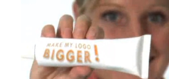
Above: Still from the hilarious ‘Make Your Logo Bigger‘ ‘infomercial’ (2007)
Instead of opting for the ginormous logo though, introduce your brand identity as part of a visually strong and unique design language. Brand is much more than a logo. Of course it is also much more than color and layout, but unique colors with specific application manners (Eg: a vertical bar or a cropped circle of consistently same proportions, within the same locations across all initial communications) not only creates brand design consistency but it makes your marketing efforts be truly your brand.
More so than an existing brand you need to penetrate the market (however small that penetration effort is, may it only be an e-marketing campaign and your web site) with a very unique and consistent design and color approach to get your new brand into consumer’s minds. Upon creation of that distinct visual brand language, step and repeat is the best way to stay in your consumer’s heads in the first phases of your brand introduction. You can slowly minimize the branded aspect and introduce campaigns over the course of time.
After 17 or so years of introducing brand identities, I can attest that this approach works well while using a completely normal sized logo. Guaranteed.


