Tag Archives: ROI
Why You Don’t Have To Make The Logo Bigger, Even During Your Brand Introduction
Granted, the subject of creative agency clients wanting to make their logos as large as possible to ‘get more bang for the buck’ and to ensure people ‘will notice’ their logo on their brand marketing efforts has been beaten to death and plentiful poked fun at (The Product, The Song, Etc). With new brand introductions this notion feels more in line with reality than any other marketing efforts as you have not only an urge to see your (often first, but definitely brand new) logo large, but you are also under a lot of pressure to ensure the customer notices and recalls your new identity design and brand name.
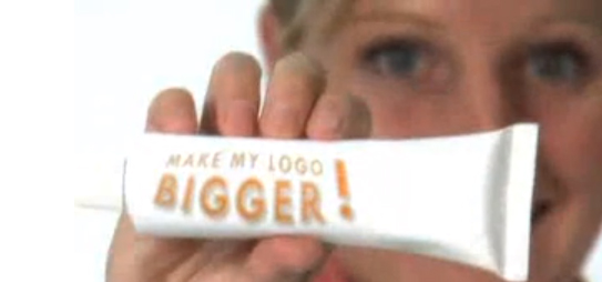
Above: Still from the hilarious ‘Make Your Logo Bigger‘ ‘infomercial’ (2007)
Instead of opting for the ginormous logo though, introduce your brand identity as part of a visually strong and unique design language. Brand is much more than a logo. Of course it is also much more than color and layout, but unique colors with specific application manners (Eg: a vertical bar or a cropped circle of consistently same proportions, within the same locations across all initial communications) not only creates brand design consistency but it makes your marketing efforts be truly your brand.
More so than an existing brand you need to penetrate the market (however small that penetration effort is, may it only be an e-marketing campaign and your web site) with a very unique and consistent design and color approach to get your new brand into consumer’s minds. Upon creation of that distinct visual brand language, step and repeat is the best way to stay in your consumer’s heads in the first phases of your brand introduction. You can slowly minimize the branded aspect and introduce campaigns over the course of time.
After 17 or so years of introducing brand identities, I can attest that this approach works well while using a completely normal sized logo. Guaranteed.
How Do You Measure Brand & Design ROI On A New Brand Launch?
We get asked this question a lot. The simple answer is: You can’t. Will a strategic and design-driven brand launch generate ROI? Definitely. As you have no before/after metrics and are dealing with a new, often innovative and disruptive brand, this is a tough nut to crack.
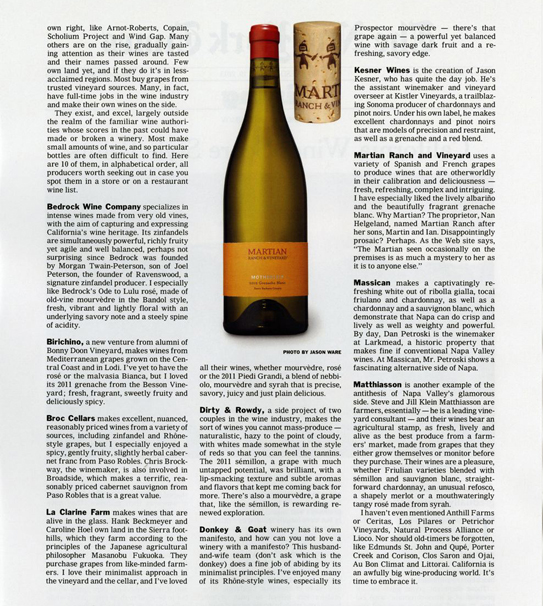
Yesterday, FINIEN client Martian Ranch & Vineyard sent us above reprint of a New York Times article that ran a couple of weeks ago, entitled “California Wines Score Style Points.” We were grateful and proud of our collaborative achievements. Their wines are truly other worldly so it comes as no surprise that the winery receives praise on the highest media levels. But as one of ten featured wineries, their product is the one that has been picked by the editors to be featured with a rather large photo of the product packaging, including…the cork.
Now that is true ROI on a strategic and design driven brand launch. Seeing the wine brand rather than just reading about it creates immediate product recognition, leading to impulse buys and elevated brand perception. Most wineries make their branding effort the last agenda item with the smallest piece of the overall budget left over and they wing it days prior to bottling their wines. Martian hired us to create a brand with a focus on product packaging that stands out on the shelves and has a cohesive brand story to tell that is unique and interesting.
It showed…and now it sells.
CATEGORIES: Blog Your Brand Launch: Brand Atmosphere
KISS 3 times during your next marketing effort
Creating a brand is only half the battle. Now you have to continuously keep building it. Over time, your brand requires carefully and well orchestrated crafting of one consumer message and marketing piece at a time. The truth is, this is where brands usually lose focus very early on. It’s time to KISS and make up. Our version of KISS (Keep it simple, stupid) is: Keep its soul, stupid!
As I have declared the death of the style guide in an earlier post, now that the brand is on its own two feet, there needs to be a constant reminder of why your brand came into existence in the first place. It’s about your brand’s soul and with all the talk about metrics, ROI and the latest shiny marketing gadgets being rolled out in front of your eyes, one tends to forget the why and instead focuses on the what. The what can feel like the sexier, easier and, often times, safer choice.
In a recent client meeting discussing creative round 1 of a website launch, the Marketing Team proudly shared our work for the first time with the CEO. She was delighted with the strategy and visuals, but having users go through a pop-over opt-in form prior to entering the site made her pause. ‘Whose decision was it to make the user go through this step prior to seeing our landing page?’, she asked, ‘Who was involved in that decision outside of our Marketing Team?’ The room fell into complete silence. For the duration of the project, the Marketing Team had been pushing for the form to take over the site prior to entering the site’s full content, in the hopes of receiving immediate ROI on the project upon launch. After a long pause, the CEO said ‘The only people who will like this idea is Marketing.’ It was an awkward, yet powerful moment as everyone in the room realized their error. If your project’s success is primarily measured by conversion rates, it may seem like a logical conclusion to push for the opt-in screen. However, this is the moment you lose sight of your brand’s soul. You no longer have your customer in mind first and foremost, instead your focus drifts towards your own success. That’s the time to take a step back and look at the brand’s broader success metrics, instead of the project brief.
In your next creative marketing project, we suggest you schedule 3 milestones labeled as “KISS” (Keep its soul, stupid) for the purpose of ensuring that your project stays in line with the brand’s soul. It is important to consider how a short-term campaign fulfills the brands’ values while also serving its long-term goals. Labeling them as “KISS” milestones will serve as a reminder of the true goal of the task. When it comes to brands, let’s keep its soul, stupid.

