Tag Archives: Samsung
New Brand Adopter: Steven Balaban Adopts The Samsung Galaxy Gear Smartwatch

Steven Balaban is the founder and CIO of Mink Capital. He has read over seventy business books in the last six years and has recently launched the site Best Business Books To Read to share his knowledge.
Our burning question: Which recent brand launch do you admire?
“I am fascinated by the launch of the Samsung Galaxy Gear Smartwatch. I first learned about the watch through a social media campaign that focused on a video that shows characters in TV shows, such as The Jetsons and Star Trek, using futuristic watches. The campaign claims that “The Next Big Thing is Here” and the video definitely gives that impression!
I remember the days when I was backpacking around Europe with my old camera and eight rolls of film. Now, I can travel with a 1.9 megapixel digital camera around my wrist. Am I really that old?”
Samsung Galaxy Gear- A Long Time Coming on Vimeo.
FINIEN Weighs In
Although launched only about 3 months ago, in the cell phone and gadget market, the Galaxy Note 3 is by now light years away from being a ‘new brand.’ Steven selected a truly innovative product, one I was curious about for a while and one that makes it hard to do our job; discussing the name, identity and digital brand atmosphere. We like to be challenged:
The Name
Cell phones fall into the category Fax and Copy machines once fell into. The inaugural product name (The iPhone, The Galaxy) sound sexy and/or inspirational, and at the time the iPhone 5c and the Galaxy Note 3 launch, they turn into fax machine names. More troublesome for Samsung though is the naming strategy behind the truly innovative part, the introduction of its Smartwatch. It has been degraded to ‘Gear’. Verbatim: The Samsung Galaxy Gear. Representing the only such ‘gear’ (there is only the watch), the choice is baffling to myself and confusing to the consumer, when all they want to call it is ‘the watch’.
FINIEN Brand Happiness Barometer: Name 2 (out of 10)

The Brand Identity Design
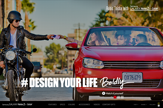
The name is the first step to defining a brand’s identity, and with a 4-part name the brand identity design is quite a train wreck that is as hard on the eyes as it is on your tongue. You won’t fall in love with the name, nor the logotype, so what to do? Throw in Robin Thicke, add a hashtag (#DesignYourLife) and let’s not bring up ‘Samsung Galaxy Note 3 + Gear’ too often. Nor the Jetsons, Thicke replaced you and Knight Rider as of now.
FINIEN Brand Happiness Barometer: Brand Identity Design 1 (out of 10)

The Digital Design
Seems as though the majority of the budget was spent on the highly produced Robin Thicke commercials, hence they occupy the landing page in its entirety. A bold move, one that leaves the user ‘interacting’ with the brand and ‘exploring’ the site, but truthfully, it means that they are lost looking for details on what the SGN3+G (Forgive me for not spelling out the full name) can really do for them. We soon learn that the site itself has been overproduced as well, taking advantage of many bells and whistles of today’s web design yet leaving functionality and plain product info, features and calls to action behind. The web site is the number one informational source for gadgets, being so cumbersome to navigate, it leaves me thinking that the SGN3+G might offer the same clunky experience.
From a brand experience perspective I might leave the ‘gear’ behind and wait for a ‘smartwatch’ after all, as there will be many to chose from shortly. For now I, and perhaps Steven, will hold off on Robin Thicke and wait patiently to live the Jetsons’ life instead.
FINIEN Brand Happiness Barometer: Digital Design 3 (out of 10)
CATEGORIES: Your Brand Launch: Brand Atmosphere


