Tag Archives: Silicon Valley Logo Design Trap
Does Your Innovative Brand Look…Innovative?

I see this sign every time I drive to my gym (I leave it up to you to guess how often that is, but let’s say it’s not as frequent as it should be). A tire company put it up and it always makes me smile and think about how wonderful of an industry I am working in; being able to collaborate with innovators, playing a part in what’s next, shaping the future one brand at a time. That sign also shows how, as an invention, the electric car category had to re-invent everything, including the industry terminology. (Electric cars do not have gas pedals, they have accelerator pedals).
And this brings me to my point: If you are starting an inventive, innovative – or may I even use the term – disruptive brand, does your visual (or verbal) identifier indicate that? Is your brand identity in line with your product or service, or is it falling right smack into the ‘Silicon Valley Crap Trap?’ What is that you ask?
Let me visualize it for you:
![]()
Now that is the Silicon Valley Crap Trap (pictured a few years back, a more modern take can be seen here).
All of these companies were innovative tech startups, all were real disruptors (yes, even vimeo). They worked hard to kick the status quo in its behind with their products, yet why did they all look the same, in that same crappy and uninspired way? Lack of money? Lack of inspiration? Lack of design skills? None make a good excuse given these are driven and highly talented entrepreneurs with a big vision. The answer of course is their determined focus on product (and product alone) that leaves all else, including the first thing people will see – the branding, crumbling in the dust.
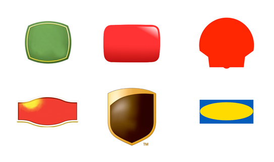
Think about it (and this is where you come in): You are here to change things, to propel things forward. Shouldn’t your brand identity ache to stand out from the ‘competitors’, the landscape, the segment – just the way your product/service does? You can tell most of below brands from the unique shapes mixed with the specific color of their logos alone. Now picture a blue script font and ask: Which early tech startup comes to mind? Tough call…maybe Skype? Twitter? Any of the pictured above?

(You got it, but just to confirm, pictured from top left: John Deere, YouTube, Shell, Lipton, UPS, IKEA)
So let’s recap:
Your disruptive FinTech brand can not have a bank logo. Makes sense.
Your unique coffee bean brand can not have a hip coffee shop logo. Yup, we’d agree.
Your innovative…and on it goes – you get the point: Don’t fall into the trap and have your logo do what everyone else in your industry is doing unless your brand is doing exactly what everyone else in your industry is doing, in which case I digress and leave you to climb a mountain and ponder the bigger issues.


