Tag Archives: Web Design
The 3 W’s That Will Make Or Break Your Website Launch
What’s important when you launch your brand, besides your crystal clear vision and superb offering? Great brand strategy and positioning, a name that resonates with your target, a brand identity design that can grow with your new venture, and of course it all comes together in one crucial place: Your key online presence, your website.
Much can be read about user experience, information architecture, programming languages and SEO. None of which I will repeat, and much of it I see as knowledge that you will eventually receive from your web design and programming teams. And then comes the time where they will ask you for copy and assets, and that’s where it all breaks apart.
Today, I sum up the 3 most important questions you, as an entrepreneur, need to have clarity on in order to create your brand’s site, the www’s of www design:
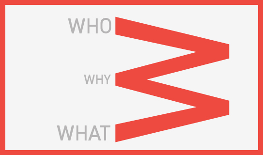
1. WHO
Who are you talking to, who will you engage with? Ensure you have them up front and center, and not your typical pitch talking points, product specs or service capabilities list. Think about them. Then write for them, talk to them.
2. WHY
Why should they care? Care to click further, care to leave their E-Mail with you, care to spread the word, care to contact you? What do you want them to care about? Focus on those questions and provide answers that make them care – the way you want them to care. Many online marketers make CTA’s (Call to Actions) larger. You instead, make the copy and visuals resonate. If they care, they will click. Guaranteed.
3. WHAT
What are you selling? No really, what is it that you are selling? We are selling branding for new ventures, but really we are selling brand launch enablement and peace of mind. What are you really selling?
Once you are clear on your 3 w’s, everything else will derive from it. If your consultants focus on CMS, responsive design, site architecture and everything else but these questions, make sure to put the breaks on the project. These 3 w’s will bring your brand launch online the right way. The rest is the engine of your car, which should be reliable and powerful, but if no one likes the design, the color, the badge and the comfort, no one will ever open the hood to take a closer look.
CATEGORIES: Startup Advice Your Brand Launch: Digital
3 Design Trend Predictions Based On Apple’s New iOS (And How It Will Affect Your Brand Design)
In case you were stuck in an all afternoon meeting, or took an afternoon off during yesterday’s WWDC 2013 announcement, Apple revealed its new Operating System design. Even if you are not an Apple Brand Advocate (anymore), your brand (launch) will be feeling the aftermath of the design language Apple just unleashed on millions of earthlings. Here is how I predict it will affect your brand design:
1. 2D is The New 3D
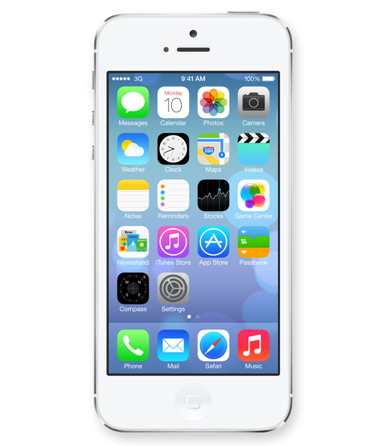
Icons lost their 3D look and this will finally spill back into the design of corporate identities. Days of pricey re-designs of Fortune 500 logos that basically added a 3D effect (AT&T, Capital One, Etc) are finally gone and simplicity in identity design will reign once again.
2. 50 Shades of Transparency
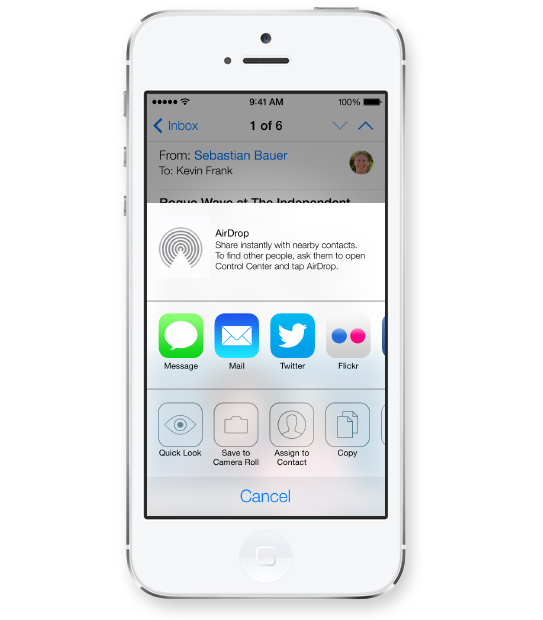
Apple’s use of transparency for navigational panels will trigger a move towards multiple translucent layers creating depth within digital interfaces. This would allow for multitasking and kill the traditional ‘top level navigation’ bar, allowing users to open multiple levels of navigational hierarchies based on transparency levels. Users will see the ‘page’ they are on while transparent layers will allow for unobtrusive ways of navigating down a couple of levels without ever leaving sight of your current ‘screen’.
3. White Is The New Black
Long gone are the days of black being the go-to color to convey luxury and sophistication. I predict layers of transparency quickly moving off screen and popping up across all media from print to on-air commercials, making white the predominant color (Is white a color you ask?) despite Pantone’s color predictions for 2014.
Images Courtesy Of Apple.
New Brand Adopter: Alex Osterwalder adopts Sifteo
Alex Osterwalder is the lead author of the global best seller Business Model Generation and inventor of the Business Model Canvas. Currently, working on Strategyzer.com, a strategy and innovation platform. Blogging at http://www.businessmodelalchemist.com
Our burning question: Which recent brand launch do you admire?
“I was pretty impressed by the launch of Sifteo Cubes. The online presentation, the packaging, and the product itself are great. I’m a big fan of the “unboxing experience” I got used to with Apple products. Sifteo provides the same for their cubes. The packaging is so beautiful, well designed, and practical that you can only love unpacking their product. So what about the product itself? My kids, the final users, simply love playing with the cubes.”
FINIEN Weighs In
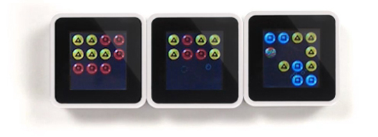
We did not expect anything less inventive coming from Alex after hearing him deliver the keynote address at the Front End Innovation Symposium in Boston two weeks ago, Sifteo Cubes are just plain cool. “Sifteo Cubes are small computers that display graphics on their top surface and sense one another and how they are being moved….were developed as a platform for hands-on interactions with digital information and media (Wiki)” No surprise that they were derived by two MIT grads. OK, let’s talk brand.
The Name
We love names without preconceived notions. They eliminate domain name fights and they are ready to be branded by the sole marketing of themselves. Sifteo is easy to say, but it’s not the easiest to remember. For a kid, it’s not sticky, a kid wants something fun to say that evokes an emotion or recollection of the product. Sifteo sounds latin, which is to say rather serious. So what does Sifteo mean? It is not clear if much sifting is going on, unless we go deep down into metaphor abyss of which we will spare you. Siftables was the name of the prototype product, which must have turned into Sifteo, the company and then Sifteo Cubes, the product. What’s next? If their product offering grows in the future, will all product names be sifted through the same siev? Matching names between a parent company and its product lines can limit expansion opportunities and create a dynamic between products in which successes and failures hinge upon one another. A short term solution that is missing long term naming and expansion strategy.
FINIEN Brand Happiness Barometer: Name 2 (out of 10)
The Identity

The identity design is as uninspired as the product itself is inspired, and inspiring. The type is bland (very ‘techie’), the colors are expected and as a combo it simply fails to stand out. The attempt of a somewhat, not really square typeface could have been explored further and as such starting with the letter ‘o’ (aka a real square) a story could have been told by integrating the three cubes (aka the product) into the logotype. It would have served as a strong foundation of the brand identity as a whole. A lost opportunity.
FINIEN Brand Happiness Barometer: Identity 4 (out of 10)
The Digital Design
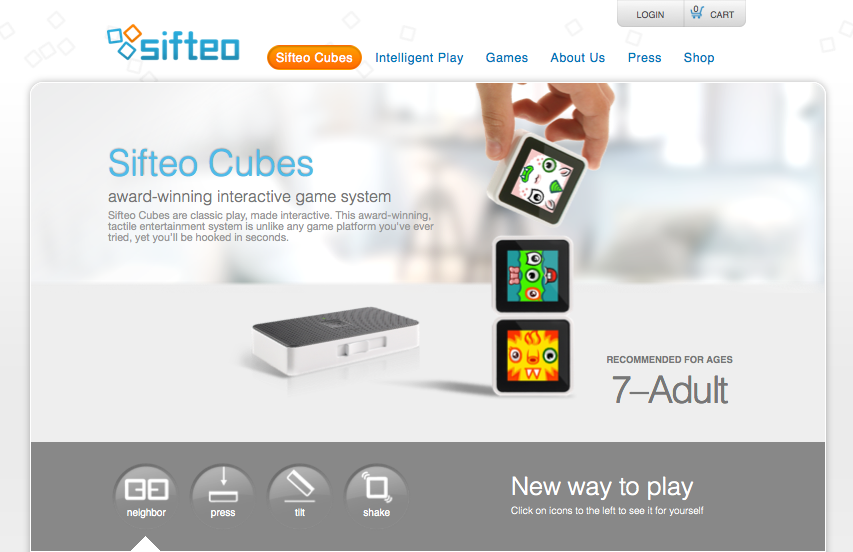
Alex praised the packaging, to say the least, it nearly sounded erotic, so we take his word for it. From the outside, the packaging takes the same straight forward, clean and product focused path that the web site promises. The online experience often being the first touch point of parent as well as offspring (aka ‘end user‘), the site fails to connect with the target audience on an emotional level though, may it be with the kids looking for a fun and engaging element or the parents looking for an online experience that matches the product price point. An experience needed to be crafted and content catered to a specific audience. The sifteo web site feels like a site where strategy and design were derived by an overwhelmed developer and content strategy by the sales team. All of it organically, so it seems. With that being sa(i)d, we do prefer its clean and to the point design over bad design and UX altogether. Gotta go and play with these shiftable, ah, siftable cubes now.
FINIEN Brand Happiness Barometer: Digital 7 (out of 10)
CATEGORIES: Your Brand Launch: Brand Atmosphere

