Climb Credit Union Brand Strategy
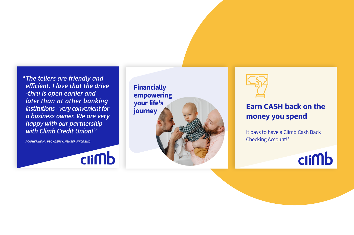
Before embarking on a re-branding journey that involved a major name change, it was important to envision the next decade of this 70-year-old not-for-profit financial co-operative. Through our Resonaid strategy workshop, we jointly developed a new positioning, refined mission, and powerful new core values, all with the newly derived motto of 'we exist to financially empower your life's journey' in mind.
Climb Credit Union Naming
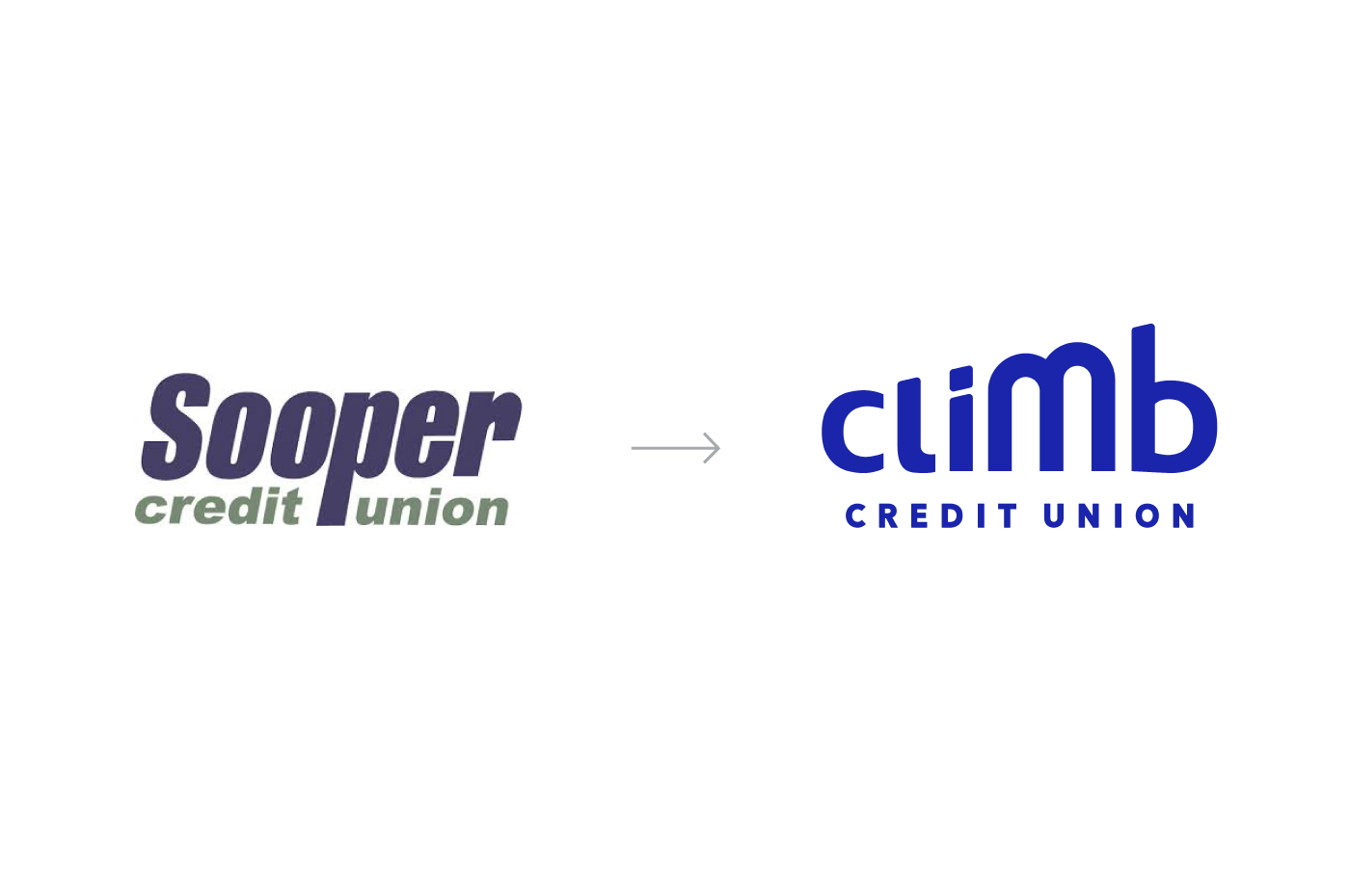
Sooper Credit Union, serving 40,000 members across Colorado, felt that its name was holding back its growth and failing to resonate with the next generation of potential members. The new name, "climb," reflects Sooper's goal for its members to achieve financial growth. The credit union aims to support its members every step of the way, and the new name also gives it a more modern and competitive edge, resembling a fintech rather than a traditional credit union.
Climb Credit Union Identity
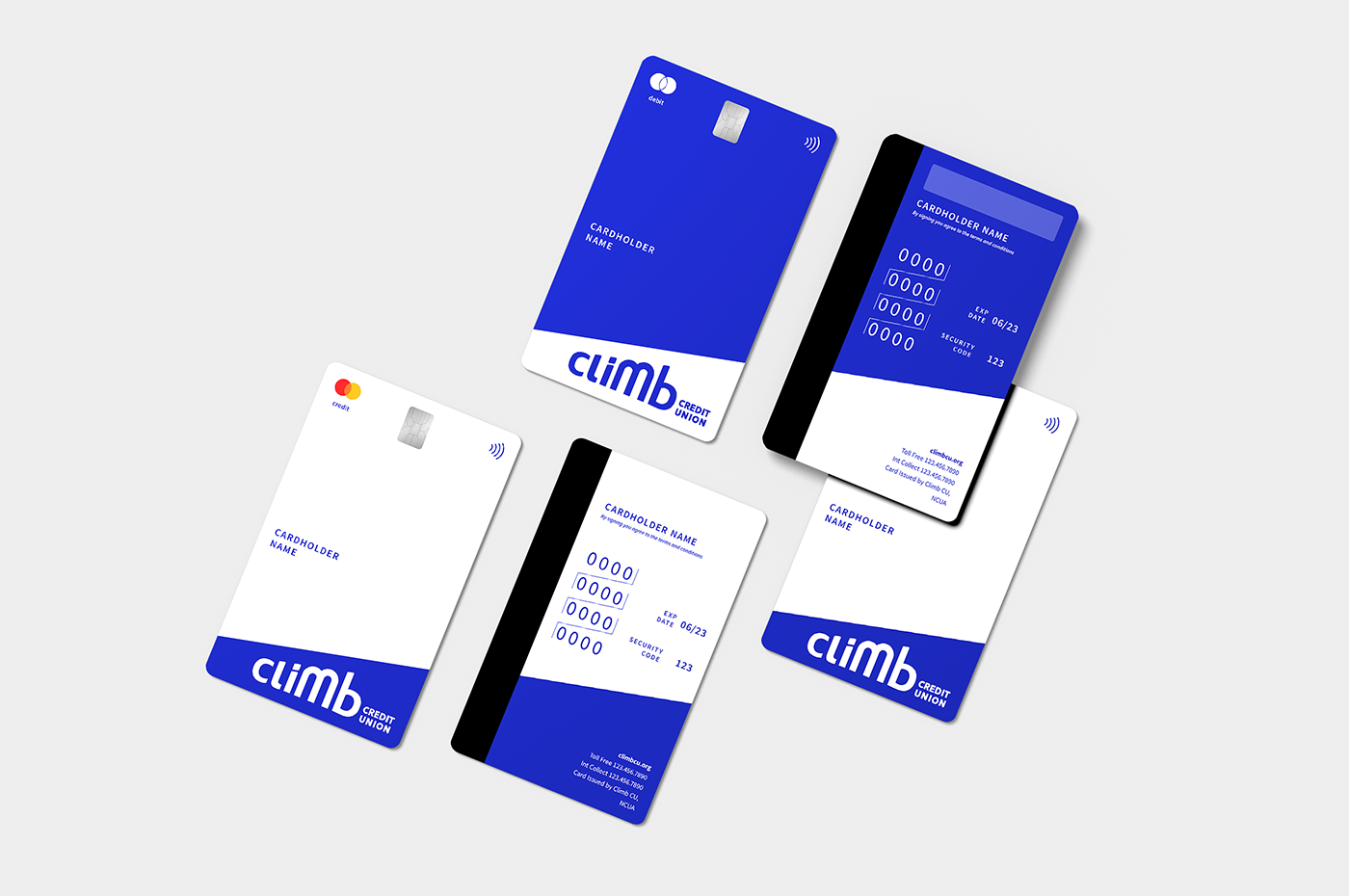
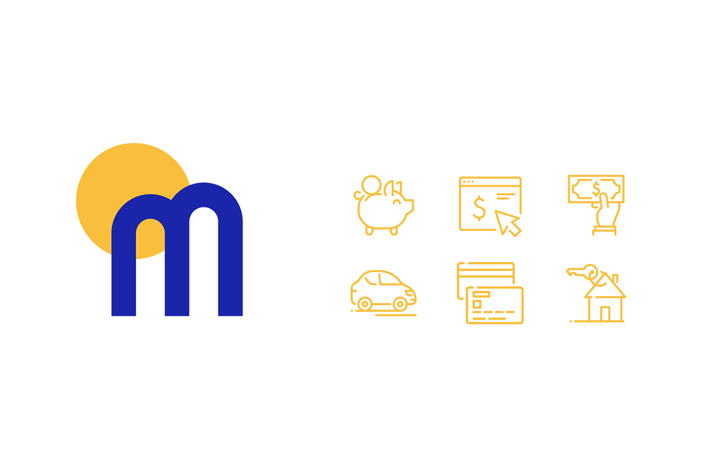
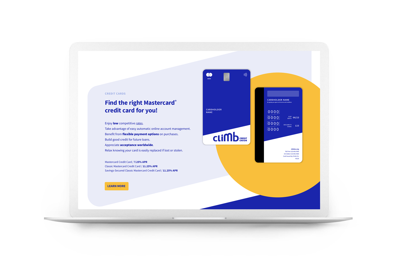
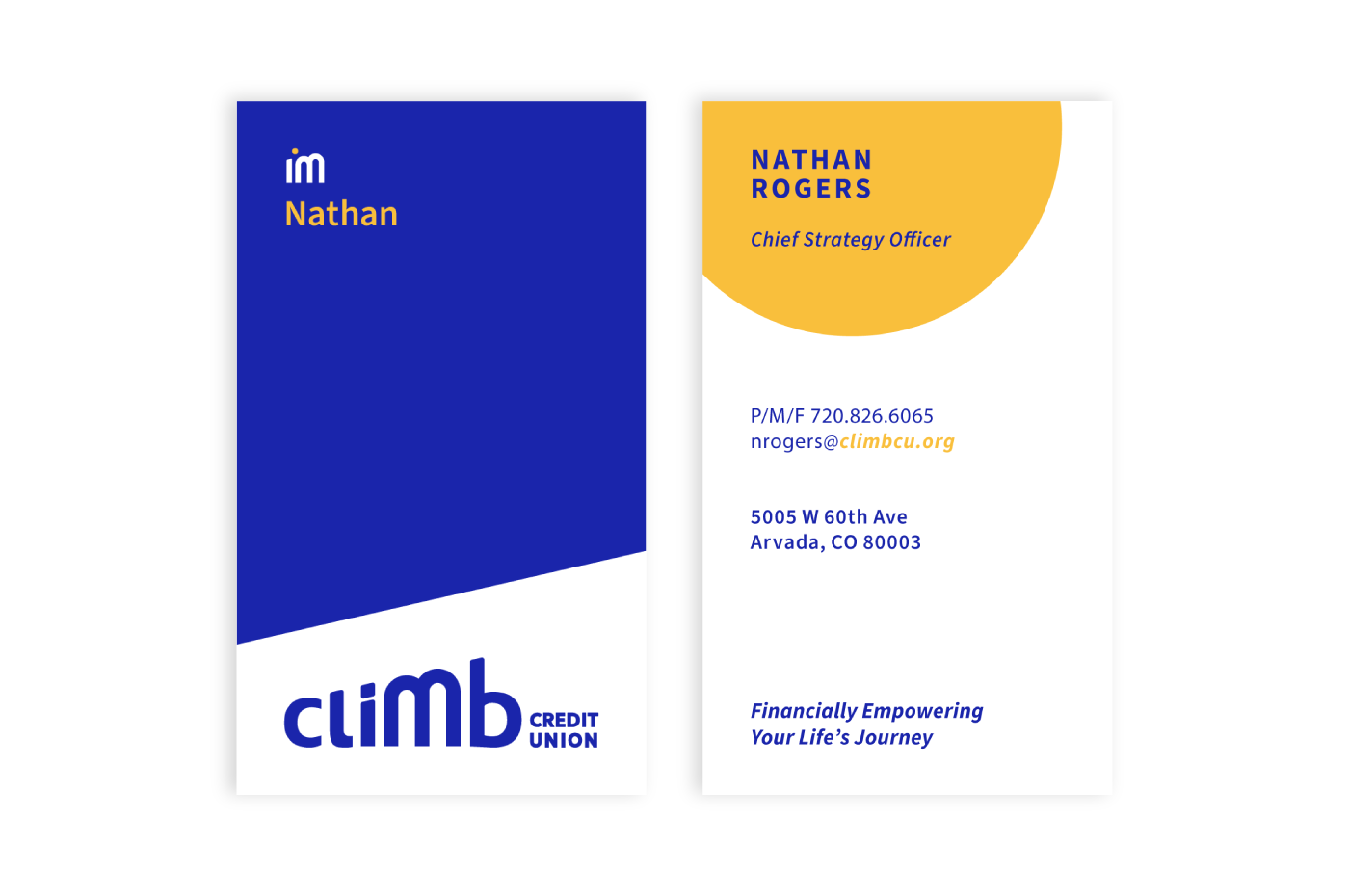
The bold Climb logotype represents the brand's core values of empowering individuals financially throughout their life journeys. Using a lowercase font creates a welcoming and approachable feel, reflecting the friendly nature of the brand. The custom wordmark also conveys a modern and tech-forward impression, catering to the next generation of members. Each letter has been designed with rounded edges to evoke warmth, and the letter 'm' subtly nods to the brand's Colorado heritage and locations. To further emphasize the brand's identity, the iconic 'm' was extracted from the typeface to serve as an icon. Placed within a bold yellow circle, it symbolizes the rising sun, capturing the spirit of ascent and growth as its members climb toward their goals.“Terrific to work with. FINIEN has a wonderful process of taking a team through the branding journey!”
— Cherise Lemoine Meany
VP of Marketing