Coviance Brand Strategy
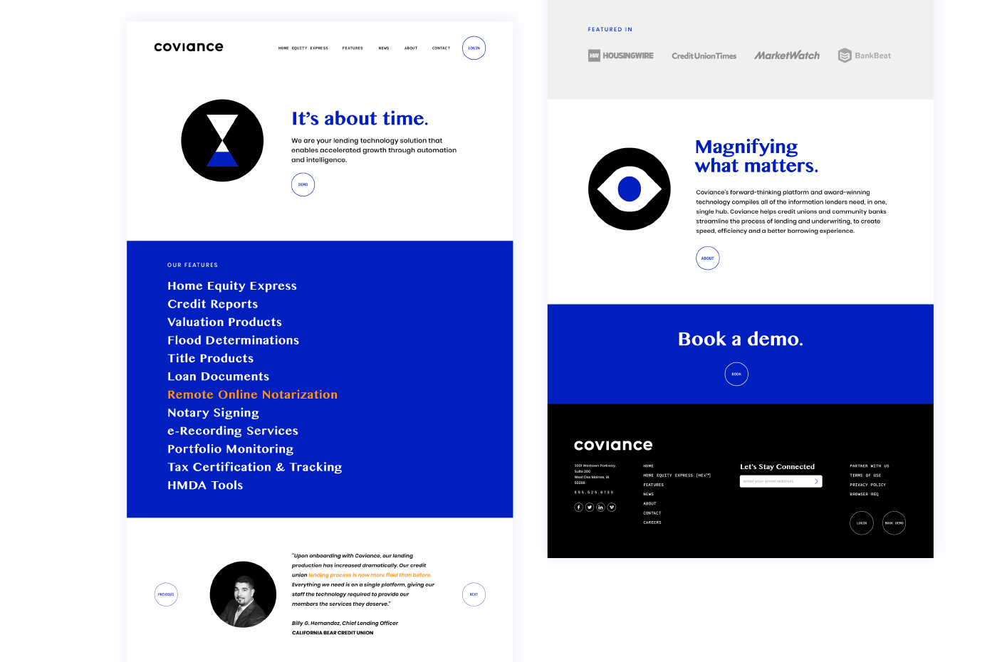
Lenderclose was a fast-growing fintech company helping credit unions and community banks accelerate digital transformation and automate residential real estate lending processes when they approached us. As they were readying a pivot into SaaS, they needed to pressure test their competitive advantage and derive a new brand strategy to carry them through a re-brand. A core focus became the idea of time; time the company spends with their clients, and time they save for them as well as for the end customers. Derived during a remote Resonaid brand clarity workshop, 'Magnify what matters' turned into the core philosophy and platform for the subsequent re-branding effort.

Coviance Naming
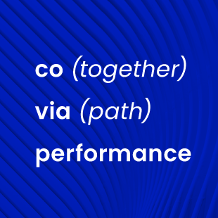
The name Lenderclose was a barrier to the upcoming pivot of the brand, so we used the newly derived brand strategy as a platform to derive a new, future-proof, brand name. Coviance was born out of the core ideas of collaboration (Co: together), a direction (via: path), and growth (performance: the action or process of carrying out or accomplishing an action, task, or function). A name that can tell its story in many ways but was derived using the pillars of a brand that was now set up for infinite growth.
Coviance Identity
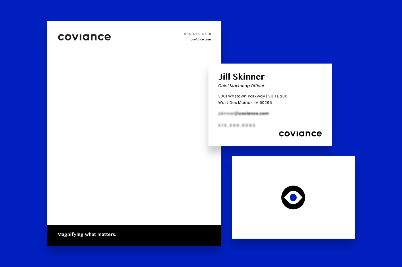
The custom Coviance logotype takes advantage of its round forms, giving a friendly and streamlined appearance that accentuates the brand's collaborative personality. Using black as the main color adds a premium feel while playing on the rebellious side of the brand. One can also see a keyhole in the letter 'c,' which talks to Coviance unlocking amazing experiences and leans on the core value of empowering others. A simple logo with deep meaning and legs that play out in stark iconography throughout the creative language.
