depsys Brand Strategy
depsys is a leading Swiss technology company that provides evolutive solutions enabling traditional electricity networks to cope with the new constraints of decentralized production from renewable energy sources. FINIEN was brought in to align the brand strategy and identity with the next chapter of the company's story. Fabian Geyrhalter conducted the Resonaid brand strategy workshop on-site in Switzerland that served as the conduit for the re-brand. Next to defining the brand's DNA and pillars, incredibly powerful values have been derived that represent the core ethos while providing day-to-day guidance for the brand.
depsys Identity
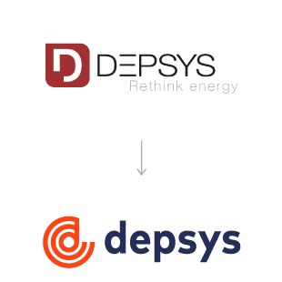
The new depsys brand identity design is based on three circles, which represent the three phases of an electrical grid. Similarities in color, shape, and negative space within the logo capture the transition from the former depsys identity to the new logo, disabling customer confusion while signaling massive change at the same time. A line connecting the center to the outer circle forms the letter ‘d’ while a visual continuous loop feels electric, the upward motion supportive and positive. The color orange is bold and energetic and often represents encouragement and stimulation while the lowercase font showcases the brand's uncovered personality of 'friend.' Last but not least, the icon works in unison with the company's key offering, GridEye, hence creating a brand family.Appreciative of the very structured process and the resulting brand consistency.
- Marc Schreiber
Head of Marketing


