Survios Identity
Brand Identity Design in partnership with the team at Survios, a revolutionary tech company focusing on virtual reality gaming and immersive entertainment research and development. The symbolism will remain a mystery due to the confidential nature of this fast growing VR company, but give it a second and you might realize a few strategies that have been derived to equip this bold startup with the lasting icon it demanded.

Audiolife Identity
Our brand launch for direct artist-to-fan music fulfillment service Audiolife created visually powerful, dynamic, and intuitive results for its 300,000 users, ultimately leading to the acquisition by the top ranked distributor. ‘The power of music’ was given back to artists and fans alike and was successfully communicated through an iconic brand identity. When there is one key message of empathy, don't hide it. Shout it through the identity, and the tribe will proudly support, wear, and tattoo it. Yes, this was that kind of iconic logomark.

California Community Foundation Identity
The California Community Foundation, a 100-year-old organization, holds nearly $1.5 billion in assets making it one of the largest community foundations in the nation. We were hired to undertake a large-scale re-branding effort to re-envision the brand identity and align it for the next decade to come. Signifying growth, stability, and origin (California) was the center-piece of the brand identity design and its iconic mark. Growth was shown through the green pillar that angles upwards, while sunbeams - or a wave - creatively nod at the origin of the foundation. 5 lines signified the 5 core values. Nearly a decade later, CCF still uses the icon we crafted as a visual translation of their wonderful and inspired organization.

Park Tahoe Inn Identity
Tasked to create a brand identity for a remodeled hotel in beautiful Lake Tahoe, we knew we had to find a way to showcase the majestic area in the most simplistic and modern manner, while standing out from the sea of hospitality logos in vicinity. Within the simple typographic identity, we focused on the elements of the lake as well as the mountains: the key attractions that draw visitors to this majestic area on the Nevada-California border year-round. The brand image was carried through all brand atmosphere touchpoints and continues to inspire guests to indulge in the surroundings of its beautiful location.

YelloUmbrello Identity
Crafting the brand identity for this new high-end chain of pet groomers, we knew we needed to shake things up with a dash of unexpected color and a playful, memorable and unique name. And of course it had to be damn cute, without that grooming kitsch with which we are all too familiar. While cats and dogs found a safe place under the yellow umbrella (yes, it's how we tricked them into getting a good wash), the brand atmosphere touchpoints found its differentiation through strong color and icon-language.

Yelloumbrello Naming
The name for this high-end pet groomer was derived from the notion of pets getting a good wash, which many canines don't list as their top ten things to do. The fun name YelloUmbrello defined how different the groomer was, while it also alluded to the franchising model (a brand umbrella). Most importantly though it created a sense of trust, ensuring pets were in a safe and clean environment. We also joyfully crafted the tongue-in-cheek tagline ‘Happiness is a pampered pet.'

Match Creative Talent Identity
Creative talent agency Match chose us to spearhead an all-encompassing re-branding effort of the firm’s dated identity system. Our solution revolved around the symbiotic relationship of talent and hiring party, the foundation of the company. Each letter consists of two parts that make it work, that hold it together, that create the company. It talks about co-dependency as much as leaning on each other to successfully fulfill a task. The symbolic letter A turned into the scalable icon while alluding to the transformation into a digital-first workflow (the hint of a cursor) that Match embarked on at the time of the re-branding. Match Creative Talent got acquired by Onward Search a few years after the re-branding initiative.Fabian and his group did an outstanding job on re-branding my company. I would recommend FINIEN as a very strong brand design firm and will continue to use them for our ongoing needs.
- Mark Armstrong
Owner


Thumbroll Identity
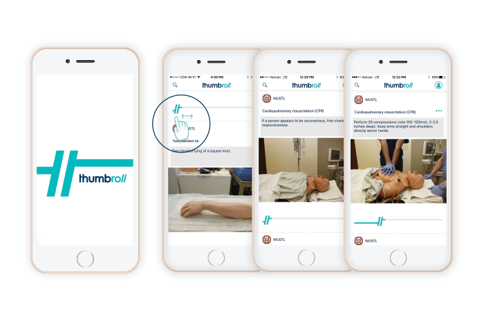
Thumbroll is a Los Angeles-based medical education startup. The app allows medical students to learn critical techniques and procedures at their own pace through a proprietary scrolling functionality. The iconic mark represents forward motion while resembling a shifting pause button, thereby combining the two key points of the user's brand experience. The identity design further alludes to the relationship between medical procedure and the medical student and uses contrasting blue tones that fit into the vertical while resonating with the next generation of students.
QBase Identity
The brand identity derived for data management company Qbase focused on the firm being ‘the connecting element’ as well as an overall elevated look to disrupt the IT segment as it launched over a decade ago. We were tasked to establish a visual identity evoking trust and commitment on a global manner for its clientele of Fortune 500 CTOs. Today, Qbase has 250 clients in 18 states and three countries, including the US Air Force, and we are proud to have played our part in the early successes of the company.

Striders Naming
This San Diego-based startup set out to create a unique entertainment experience, combining great tasting, casual dining, classic cocktails, craft beers, and a unique high-end Las Vegas-style Turf club lounge. The name Striders was crafted to hint at the horse racing portion while making it easy to refer to as a location in conversation. It further evokes the casual club lounge with a sense of motion and urgency, while lending itself to a scalable brand concept.
innopri Naming
This San Diego-based HR consultancy startup approached us when the founder realized that working with major tech clients demanded a name with energy. The name Innopri was derived from a mash-up of the terms “innovative” and “imprint”. The term “imprint” connected with the client to leave a positive impression (or “imprint”) on the client organizations, while innovation alludes to the consultancy's unique process as well as the innovative nature of their clientele. A lasting imprint was crafted.

